Within one of our reseller partnerships, we have a Free/Premium model. I've previously trained our Customer Success team on how to pull GPX reports to compare Free/Premium usage. However, it was pretty time consuming for them and not all of them are data fiends like I am 🙂
So I took this opportunity to build a dashboard to compare usage highlights between free/premium accounts and users for this partner. That way, the partner manager can easily get a snapshot of what's going on.
- left column = free
- middle column = premium
- right column = totals for that partner
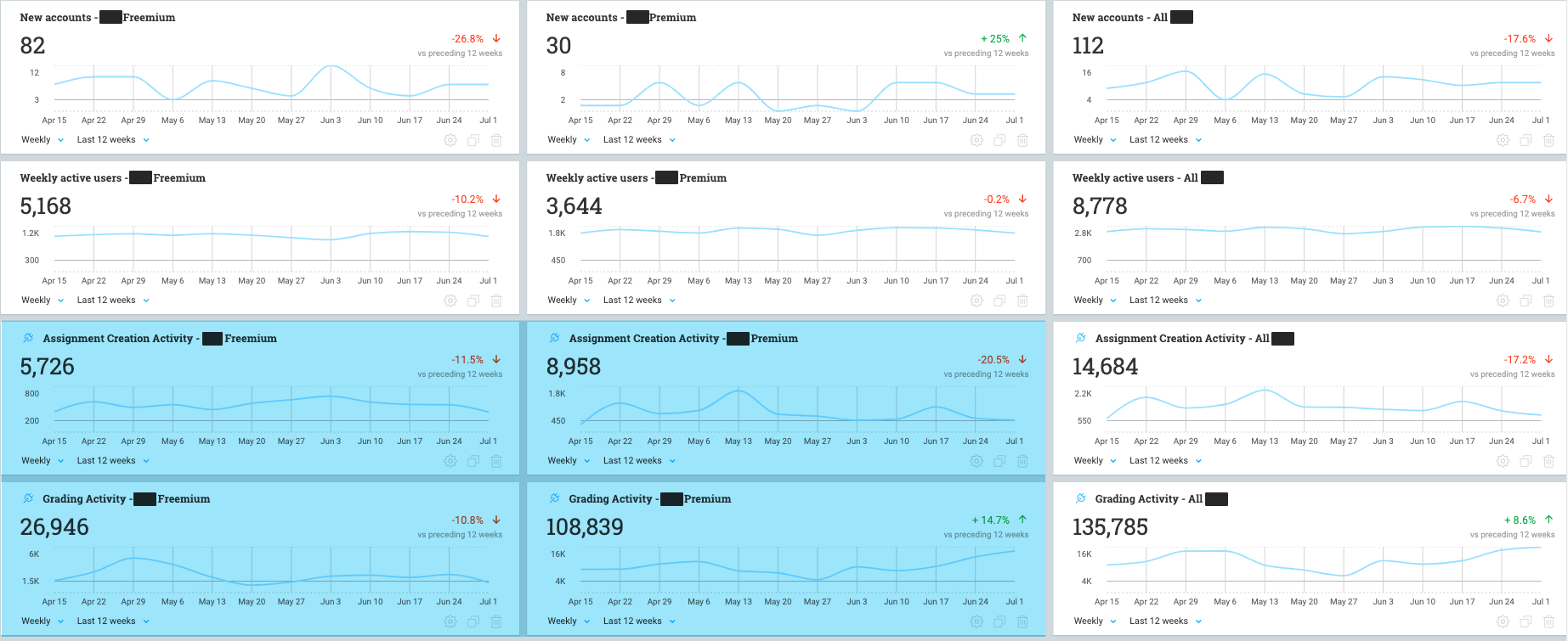
- The level of assignment creation activity for Premium users is 57% more than free users (even though they have access to way more types of assignments)
- The level of grading activity (the theoretically "sticky" feature) for Premium users is 304% more than free users
- This tells me that Premium users take advantage of the grading aspect far more, even though the features for that workflow are basically identical between free/premium
So rather than our CS team constantly encouraging our users to create assignments - we may take a different approach and get the assignment creation out of the way so users can dive into the grading aspect.
I may create more feature-focused dashboards after seeing this view.

