

Choosing the Right In-App Hub (formerly KC Bot) Layout - Design With Intent, Not Default
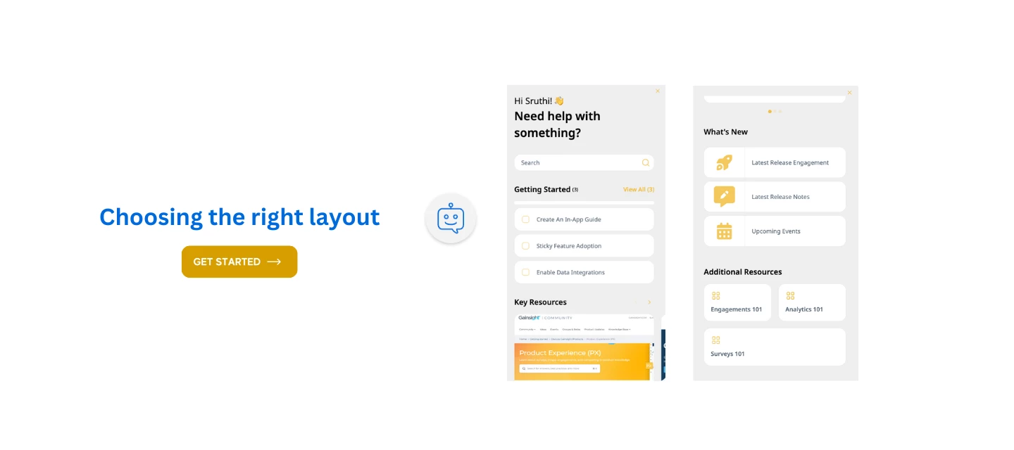
So you’ve got your content , maybe it’s onboarding checklists, feature guides, or help articles — and you’re ready to surface it through the new KC Bot.
But then you hit the decision point:
Should I use a Task List or a Content Group?
Should the layout be List, Grid, Card, or Thumbnail?
These aren’t cosmetic choices.
They directly impact how your users discover, engage, and act on the content you’ve worked so hard to build.
Here’s how to decide - based on your user’s goals, not just what “looks nice.”
Step 1: Start with User Intent
Ask:
🧭 What is the user trying to do at this moment in their journey?
Examples:
- Just signed up → They need a path
- Visiting a new feature → They need clarity
- Struggling with an error → They need resolution
- Curious to go deeper → They need learning resources
That intent is your anchor. Now let’s match it to structure.
Step 2: Choose the Right Widget for the Job
Task List
Use when you want to guide action , like a mini playbook.
Great for onboarding steps, setup flows, and habit-forming tasks.
- Good for: “Do this now” moments
- Avoid if: Content is passive or read-only
- Only one Task List is shown per user based on rules and priority
Content Group
Use when you want to organize information for discovery.
Perfect for help docs, feature guides, and videos.
- Good for: Browsing, learning, exploring
- Avoid if: You need structured progression
- You can include up to 5 content groups per bot
Search
Use when you have a large help base or users prefer to explore.
Pairs well with either widget above.
Step 3: Pick the Layout Based on Content Type
Once you’ve picked a Content Group, here’s how to choose its layout:
| Use Case | Best Layout | Why It Works |
| Step-by-step guides or onboarding | List | Presents clear order; easy to follow from top to bottom |
| Multi-topic content (e.g., by stage) | Grid | Balanced, scannable, and structured for multiple categories |
| Educational or visual content | Card | Emphasizes visuals and calls-to-action |
| Quick links, updates, or tools | Thumbnail | Small and punchy; ideal for visual quick-hits |
Choosing the Right Layout & Structure for Your KC Bot
Pro Tip: Combine Layouts with Targeting
| Goal / Use Case | Recommended Widget | Best Layout | Why It Works |
| Onboard users step-by-step | Task List | List | Helps guide users through a structured set of actions with check-off progress |
| Group feature guides or best practices | Content Group | List or Grid | List for clear reading order; Grid for quick scanning by topic |
| Surface help docs or FAQs | Content Group | List | Offers a sequential or category-based reading experience |
| Showcase educational videos or tutorials | Content Group | Card or Thumbnail | More visual layouts for engaging, click-to-learn content |
| Group content by lifecycle stage (adopt, expand, etc.) | Content Group | Grid or List | Cleanly organizes resources into defined stages or themes |
| Highlight quick links to product updates/tools | Content Group | Thumbnail | Visual layout draws attention and encourages quick clicks |
| Support self-service exploration | Search Widget | Search UI | Great for large libraries where users prefer to search than browse |
Want to show different content to Admins vs. End Users?
Use audience rules to show only relevant Task Lists or Content Groups per role.
User Scenario: A new Admin logs in for the first time.
Your Intent: Get them activated and exploring.
Workflow:
- Start with a Task List:
- “Set up your first group”
- “Invite users”
- “Explore reporting”
- “Set up your first group”
- Follow with a Content Group (Grid Layout):
- “Admin Help Center”
- “Feature Guides”
- “Best Practices Library”
- “Admin Help Center”
This gives them both guided direction and flexible discovery, in the same bot.
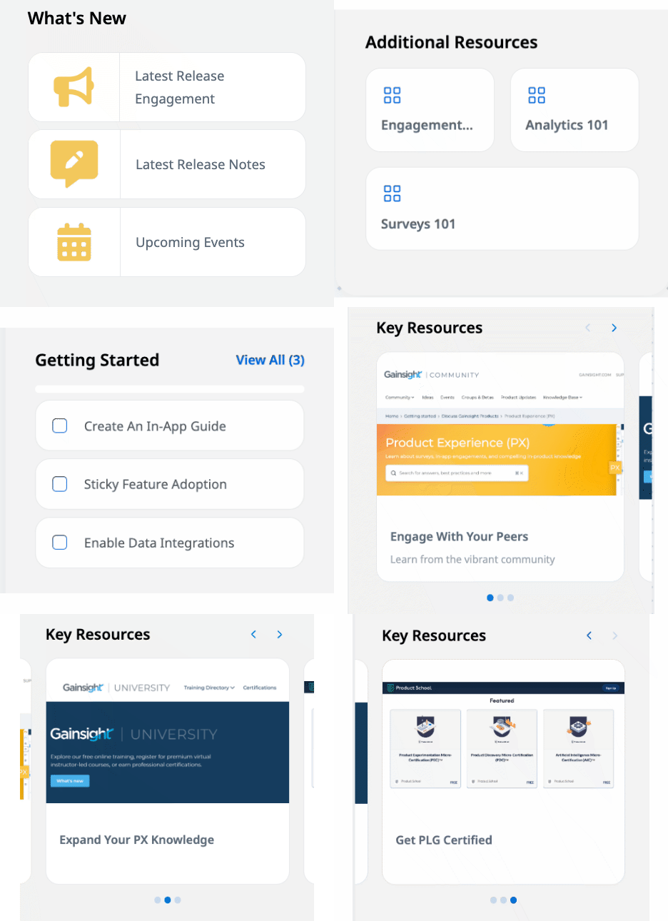
Here is how we put them together to stack various types of resources in different layouts:
With that, let’s dig deeper into more workflow and use case scenarios in our next post :-)
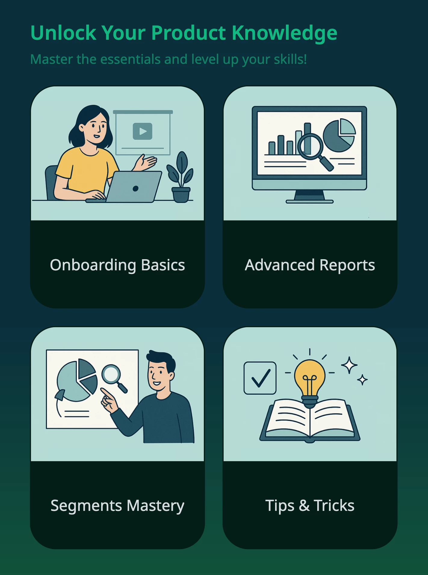
There is a update on Layouts : We got a new one - Tile Layout!
Where you can use it?
-
To offer goal-based onboarding (e.g., "Learn the basics", "Become a power user")
-
To structure role-based enablement (e.g., Admins vs. Managers)
-
To centralize training or certification journeys
-
To drive progressive engagement across maturity stages
Title: Unlock Your Product Knowledge
-
Onboarding Basics → Links to setup guides + walkthroughs
-
Advanced Reports → Analysis use cases, sample reports
-
Segments Mastery → Deep dives into user segmentation
-
Tips & Tricks → Productivity hacks, pro moves, shortcuts
Will keep adding as we get more of these enhancements :-)
Stay tuned!