Morning fellow Gainsight PX'ers!
Thank you for joining me last week on the topic "User Centered Approach to Product Mapping.”
If you missed my spotlight talk with
I had a blast discussing and answering questions about how we are using the UX team's skills at Acquia to make sure our product maps are accurate across our product suite.
To recap our process for those who were interested:
-
Select your people
- Choose a team with a cross functional skill-set: Content strategy, Accessibility, Visual design, Technical expertise, and Leadership.
- This team should also have a diversified understanding and familiarity of the UI’s of each product as well as the user personas who use them. Working with multiple products and understanding how they work together was key in the mapping process as we would like to eventually see how our users work across the product suite.
- Keep the group small. Too many hands on the product mapper without proper communication could result in a myriad of issues such as features being mapped multiple times, incorrect taxonomy, structure issues, etc.. These are types of issues we experienced with past tools that we wanted to learn from.
- Try a RACI chart to communicate expectations to the rest of the organization.
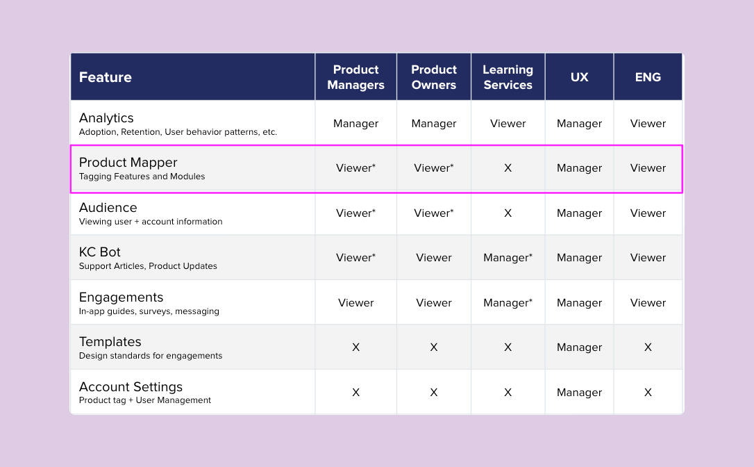
RACI chart using the PX user permissions language to show the organization the type of access they will have to the tool.
-
Teach the tools
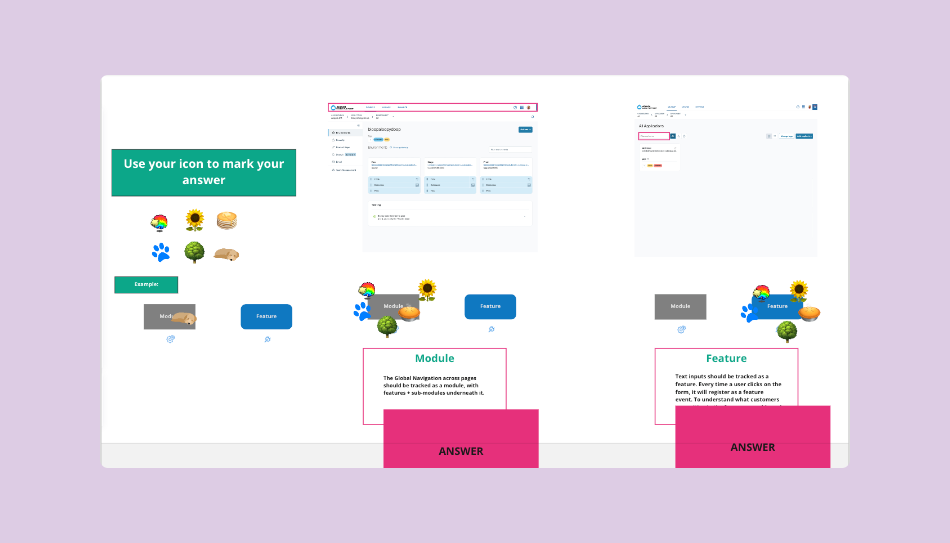
Activity for designers learning the terminology of PX and the context in which it will be used within Acquia’s products. -
Break down the process into manageable steps. Define a list of steps that can be replicated over time.
-
Create referential documentation, such as a guide deck of step by step instructions. This helps to outline the details with screenshots and descriptions, and show what the intricacies are. For example: Where certain buttons are in the PX interface, like how to right click on a submodule to quickly add a feature under it.
-
Make learning the tool fun!
-
-
Execute the process
-
Delegate to your team's strengths
-
Start with documenting the information architecture of your product. This is a common task in UX design. We use a whiteboard tool called Miro, but you can use really any visual creation tool you are comfortable with.
- Use Module + Feature context. I started with mapping the top modules of the product first (we used major feature sets, tailored to main persona goals), then mapping each module section underneath.
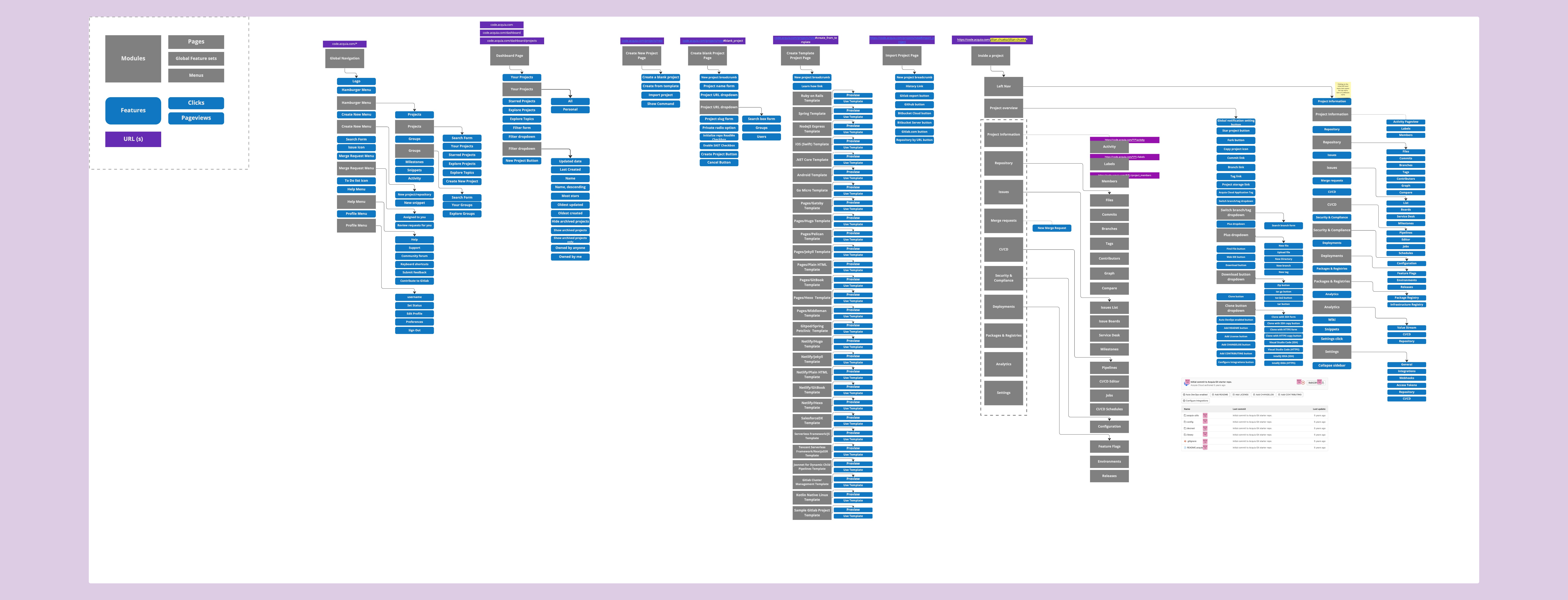
Information Architecture map in context of PX’s module + feature hierarchy -
These maps are a good place to start identifying what selectors or urls need to be accounted for later in the process.
-
Some actions that users take can happen on multiple urls depending on the type of customer or permissions a user has.
-
Some selectors need to be added to the code by engineering, which the sooner we figure that out the quicker we can ask for engineering resources and help.
-
-
Transfer the IA map information into PX. You've already done the work of thinking how to layout your product.
-
Go through each feature from top to bottom and add the CSS Selectors and rules
-
Test every click! From page to page of our products, we’ve established this as a way to make sure the correct selectors are being mapped on the correct URLs.
-
Some things we have learned along the way:
-
Making sure the urls are correct across all customer instances of our products. Use the wildcard (*) to help capture the data no matter what customer account view you are on.
-
A keyboard mapping trick when using the visual product mapper: Pressing control, option, M allows you to click around in the product and open menus, like in this example. Pressing it down again after the menu has been opened restarts the PX mapper where you left off, making it easy to select the menu item.
A duel view of PX on the left and Cloud Platform on the right. Testing how we map dropdown menu items. -
Learning what CSS selectors work best is key to making sure the data is just right. If a unique ID isn’t available, using another selector plus the text match can sometimes work. Opening the inspector and viewing the code was another way we were able to ensure we had the correct CSS. Data-test-id’s are your friend.
-
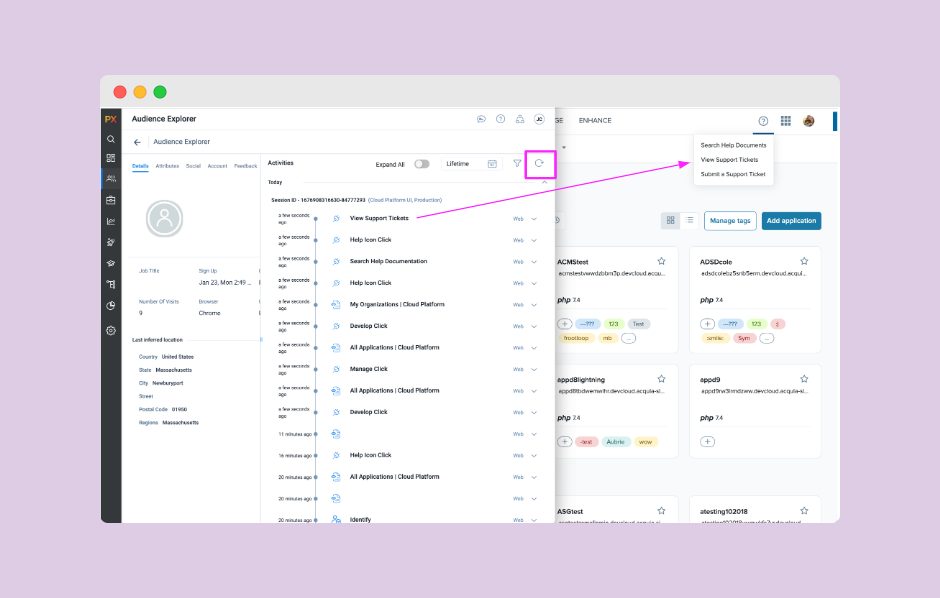
TEST every click: Using the audience explorer to find my unique user id, I was able to track along when a feature was being mapped.
You can see on the above page of the Cloud Platform Product, I was mapping the help drop down menu. After I chose the selectors and added them as rules to my map, I went into the product and clicked each menu item that I had mapped.
Using the refresh icon in PX, my user activities reflected each of the options I had mapped. This told me I had chosen the correct CSS. You’ll know when you’ve chosen wrong if it doesn’t show up in this activity feed :)
Just as UX design is iterative, so is the Product Mapping process.
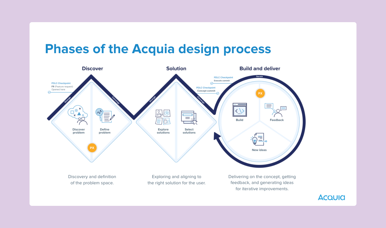
It was important to set attainable goals on what the definition of done looks like for product mapping. Aligning this task to project work on the products helped us align our focus for tasks in the UI, especially knowing that some of the UI will change based on design work that our team completes.
-
As we continue to improve our products, it will be important for this team to continue to alter what our product maps look like. Adding product mapping to the build and deliver phase is important for us in our communication with Engineering as they build out our designs. This is also where we can benchmark how new improvements are performing.
-
Now that we have all this great insight into how the personas are using the products, which can help us inform discovery and generative work during the problem solving phase of design. This directly relates to product engagement scores and helping our product managers see where high and low levels of user engagement are.


