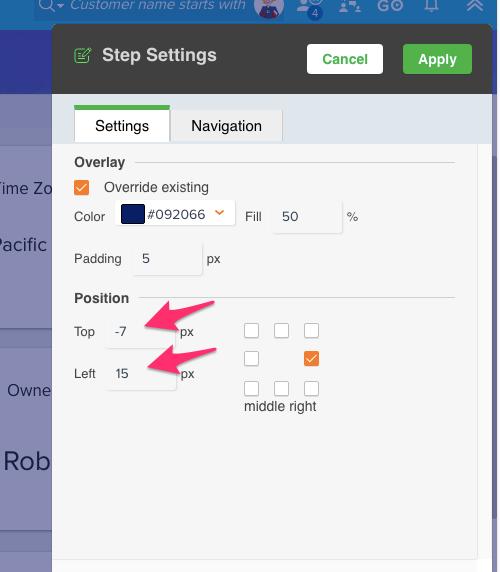
One tip I picked up is to make sure your walkthrough tooltips are not too crowded over the element you've selected. This can be tweaked by going to Step Settings > Position and offsetting the step by a certain number of pixels. The result is a more professional and attractive walkthrough.
Before edit:
After edit. Notice the tooltip is no longer touching the element:
How I changed it:
Sign up
If you ever had a profile with us, there's no need to create another one.
Don't worry if your email address has since changed, or you can't remember your login, just let us know at community@gainsight.com and we'll help you get started from where you left.
Else, please continue with the registration below.
Welcome to the Gainsight Community
Enter your E-mail address. We'll send you an e-mail with instructions to reset your password.


