
Which accounts are driving usage spikes? (Bonus: picture of my dog included)
Hey all! I've got a quick and simple (I promise!) use case for the Analytics > Features > Adoption view.
Some team members noticed, through some monitoring systems we have, that our users broke previous usage records in July. This is especially surprising to us, since our user base primarily follows the academic calendar. We also had very few support tickets, so we really weren't expecting a high amount of usage that month.
Question: Which accounts were driving a spike in usage?
I was able to pull up a quick report in Analytics > Features > Adoption:
With this view, we were able to determine that 2 accounts in particular (blue and green above) were the main drivers of the usage spike.
If you want to end here, you can skip down to the picture of my dog. 🙂
Then this got me thinking... we saw that
Which features were those accounts using frequently without generating a high volume of support tickets?
Date Range: 7/1/19-7/31/19
[/list]
I was able to find that all but 1 one of the top 10 features in this view were related to one area of our product. This is encouraging to us, since that area of our product is what our CS team is focused on driving our users to!
As promised... here's a picture of my dog 🙂
Some team members noticed, through some monitoring systems we have, that our users broke previous usage records in July. This is especially surprising to us, since our user base primarily follows the academic calendar. We also had very few support tickets, so we really weren't expecting a high amount of usage that month.
Question: Which accounts were driving a spike in usage?
I was able to pull up a quick report in Analytics > Features > Adoption:
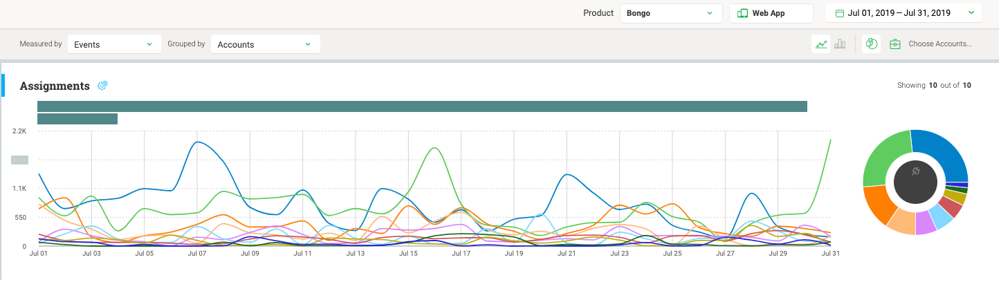
With this view, we were able to determine that 2 accounts in particular (blue and green above) were the main drivers of the usage spike.
- Events Grouped by Accounts
- Date Range: 7/1/19-7/31/19
- Pie Chart Enabled [list]
- Note: It was very helpful to have the pie chart in this case. We weren't necessarily interested in the day-by-day events per account; we more wanted to see the frontrunners in total for the month. That said, it would be nice to make the pie chart the primary view, rather than being small and to the side.
If you want to end here, you can skip down to the picture of my dog. 🙂
Then this got me thinking... we saw that
- These accounts had a high amount of usage AND
- Very few support tickets
Which features were those accounts using frequently without generating a high volume of support tickets?
- Events Grouped by Features
- Account filter set to OR [list]
- Account name is _____, _____, _____ (I filled these in with the top 3 identified in the report above)
[/list]
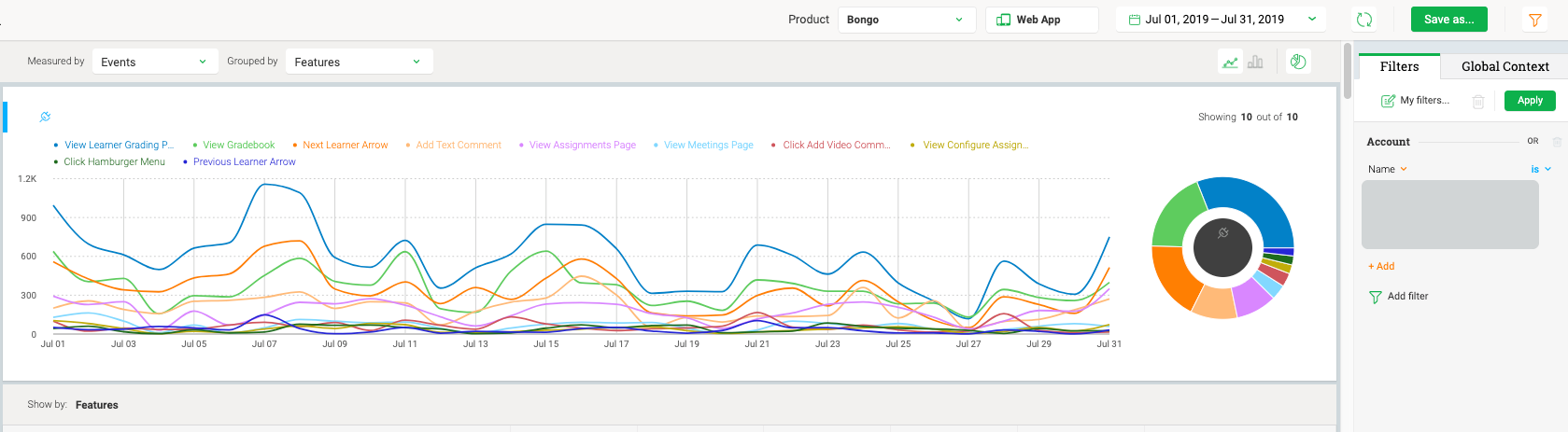
I was able to find that all but 1 one of the top 10 features in this view were related to one area of our product. This is encouraging to us, since that area of our product is what our CS team is focused on driving our users to!
As promised... here's a picture of my dog 🙂