

Design Update
Article image: design specs and changes
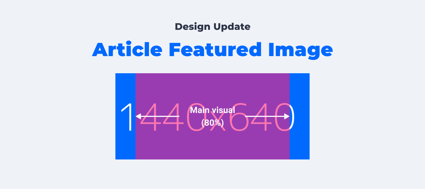
As a follow-up of Visual Guide 2.0, We've made improvements to article featured image and updated its design spec. Read on to learn what is changed and how to prepare a good article featured image. :)
Improvements:
1. Article featured image in desktop topic list (Coming up soon)
* The following guides will be merged to Visual Guide 2.0 after all changes are done.
What do you think? Leave a comment and let us know your opinion. :)
Improvements:
1. Article featured image in desktop topic list (Coming up soon)
- Currently on desktop, article featured images in topic list are displayed in original proportion in a 3:2 container (168*112px). We've noticed some featured images contain a wider visual or long text, which would be cropped quite a lot.
- What will be changed: To provide a better view, the width of the image container will be changed from 168px to 200px.
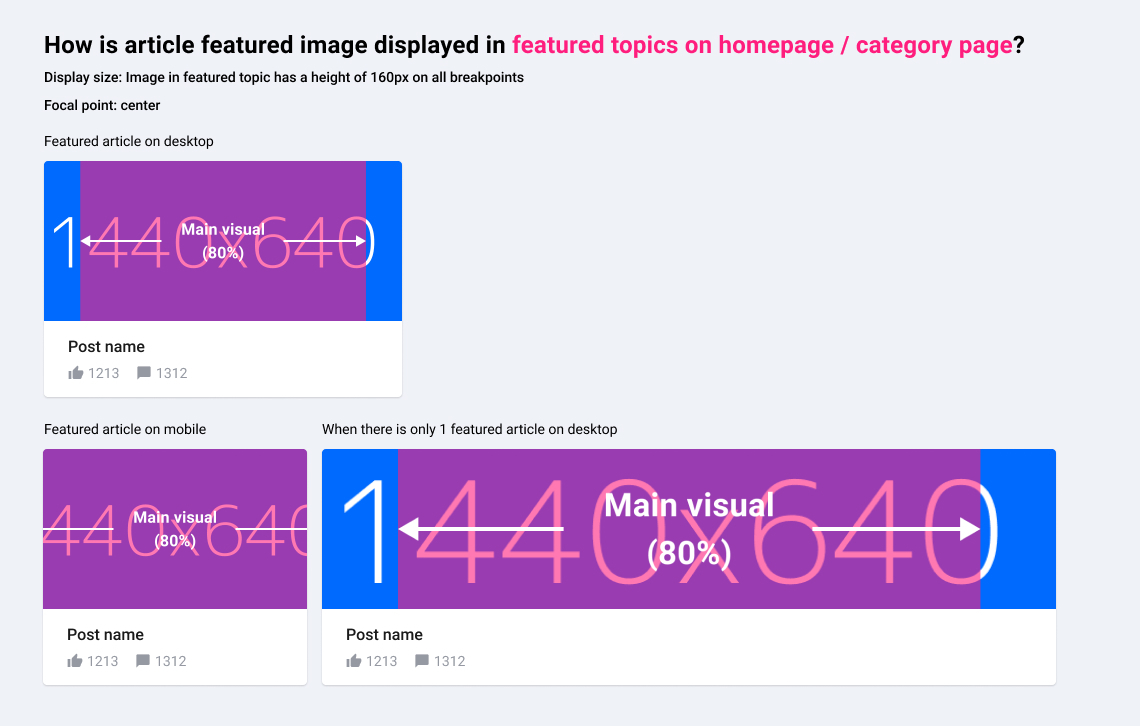
- Action: If you have featured images containing main visual/text, make sure they are visible in the centre. And be aware that featured image will be slightly cropped (10%) on each side in topic list.
- What is changed: A clearer instruction of the featured image has been added to control on the "new article"-page and on the "moderate topic"-page.
* The following guides will be merged to Visual Guide 2.0 after all changes are done.
Article featured image
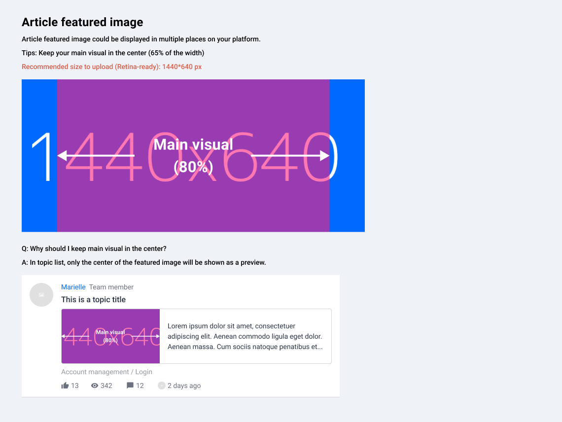
Where and how would article images be displayed on your platform?
Topic page
Example: https://community.insided.com/getting-started-customers-only-33/visual-guide-v2-0-1462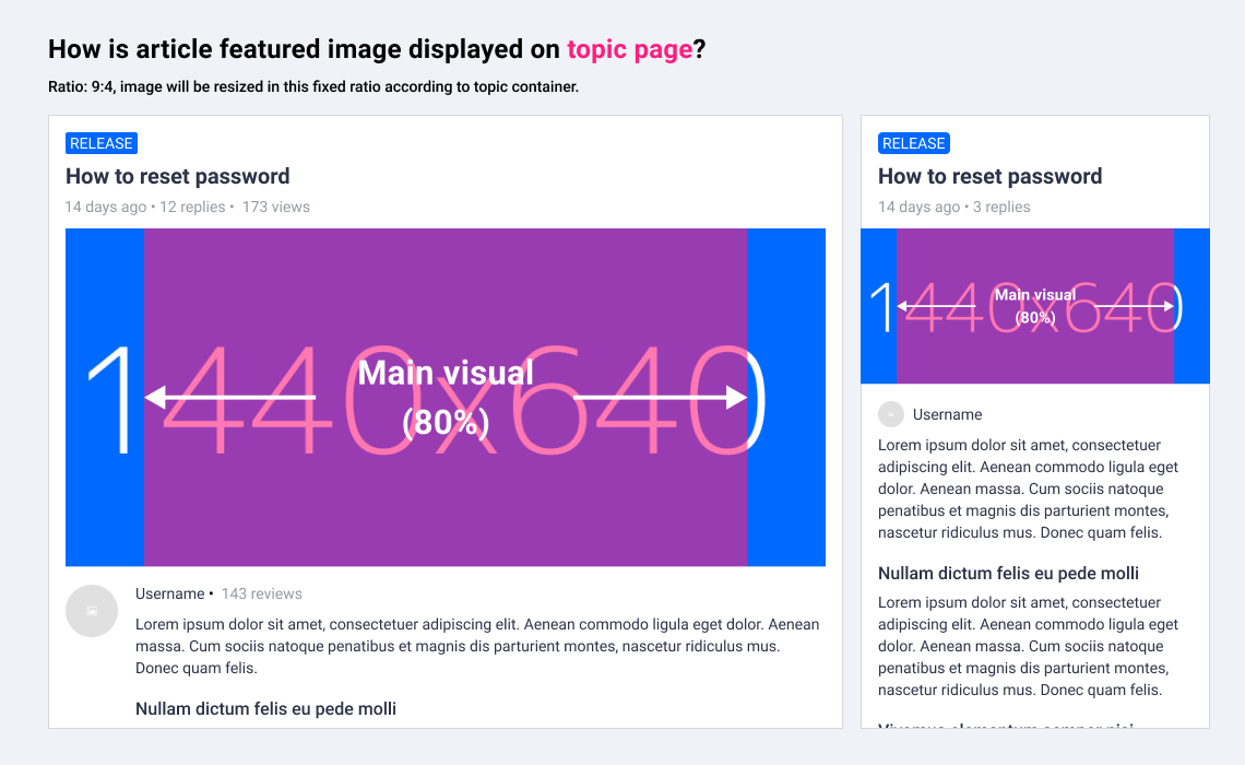
Topic list on homepage/search results/category page/etc.
Example: https://community.insided.com/news-platform-updates-16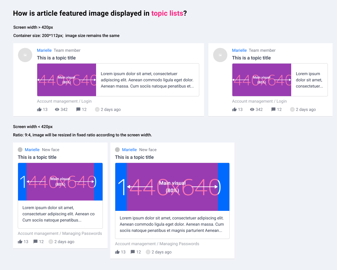
Curated content list on category page
Example: https://community.insided.com/news-platform-updates-16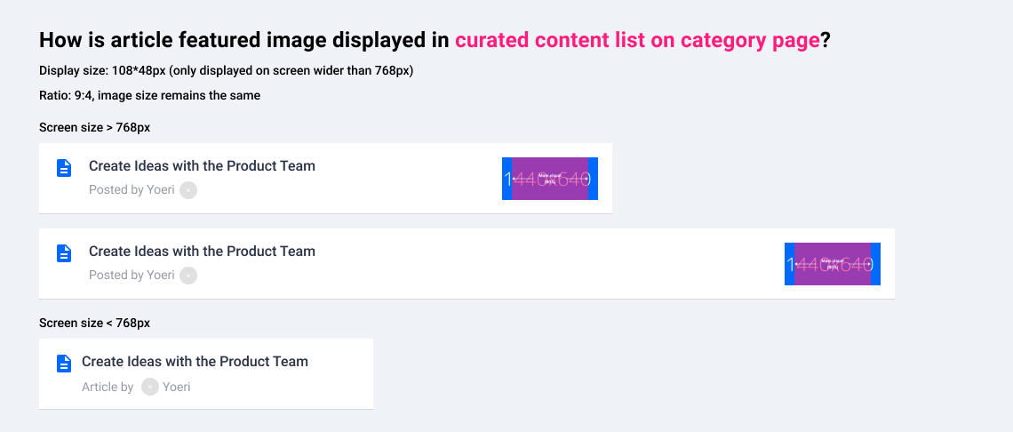
Topic list
What do you think? Leave a comment and let us know your opinion. :)