Hi there,
Currently the product puts a limit on the # of fields allowed for the summary section. I understand the balance/concern on loading time. However, need some help on the UI improvement as it's getting difficult.
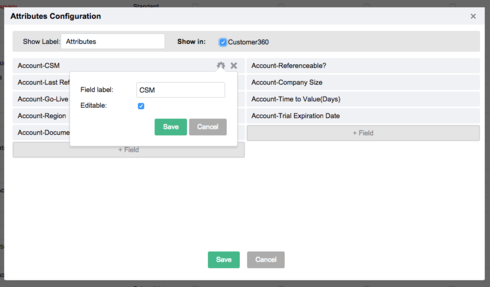
1. Summary section.
I've already used up my 12 fields limit. But need a couple more there. they are from different objects so using report 2.0 to create a new section is very space inefficient. Also, it's a lot to ask for the CSM/team managers to wait for 30 seconds for all the sections to load, and click on a section that is after #5 to find an important summary field for the account.
To present it differently, there are more than 10 reference fields that I would like to put at the fingertips of the CSMs. Again could be from different objects. Need a better way to deliver it in the UI so that it stretches the click through journey for something basic.
2. Section created by Report 2.0.
I appreciate the improvement of section tab via report 2.0. There are things you can now do with it which is not possible in the old way. e.g. setting a ranking order.
However, when I'm using it to resolve my reference fields need. It's also very clumsy. Can't attach a screenshot here so I will explain in text:
I have 12 fields to be pulled in. All have relatively long field names.
Issue A - I can at most pull in 5-6 fields in one row, otherwise we run out the horizontal vertical space to read the field name properly. (the report will truncate the field name for display).
Also, even it's 1 account --> 1 field value, no multiple record issues, the report 2.0 setup locks in a one vertical display, instead of the more intuitive table display (aka, showing the first 5 fields in first row, the second 5 fields in second role, in one single section).
Issue B - In order to work around it, I created two sections, each for 6 fields. However, this means I have wide blank space in each section. Since those fields really should be read together, toggling on these two sections is quite inefficient way to get the information (and it seems to slow down the loading as well).
In summary, really need some help to pull in fields in a way that is easy to read, easy to edit (if it's on customer info object), and easy to load
This c360 UI has not seen significant enhancement for about a year now. Would very much appreciate an upgrade in the near future. Thanks.
Question
Ui limitation - c360
1 person likes this


Reply
Rich Text Editor, editor1
Editor toolbars
Press ALT 0 for help
Sign up
If you ever had a profile with us, there's no need to create another one.
Don't worry if your email address has since changed, or you can't remember your login, just let us know at community@gainsight.com and we'll help you get started from where you left.
Else, please continue with the registration below.
Welcome to the Gainsight Community
Enter your E-mail address. We'll send you an e-mail with instructions to reset your password.