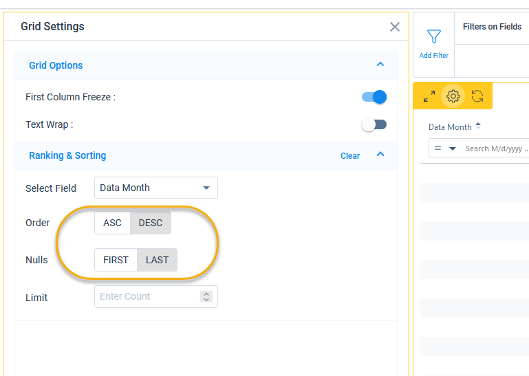
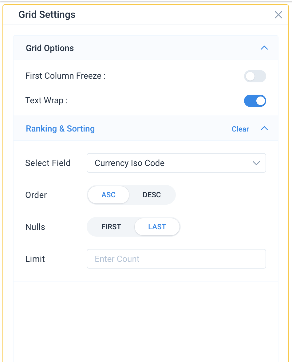
The new report builder is nice, but the settings schema is confusing. Typically grey colors in a slider show Inactive option(s) in the selector… but grey means Active in the current UI. Consider changing the highlight to blue which matches the rest of the Ops/Admin experience.


