Discovery

Show Data Points in Report Builder

Related products:CS Reports
scott_superko
sara_hoeffler
logan_kvaternik
nithya_yarlagadda
shane_niles
+10
  • scott_superko
    scott_superko
  • sara_hoeffler
    sara_hoeffler
  • logan_kvaternik
    logan_kvaternik
  • nithya_yarlagadda
    nithya_yarlagadda
  • shane_niles
    shane_niles
  • olivia_derr
    olivia_derr
  • leslie_diephuis
    leslie_diephuis
  • katie_duffield
    katie_duffield
  • elaine_cleary
    elaine_cleary
  • darkknight
    darkknight
  • rachel_hocevar_freeman
    rachel_hocevar_freeman
  • kelly_808f79
    kelly_808f79
  • chris_messier
    chris_messier
  • jd_griffis
    jd_griffis
  • dhastings
    dhastings

cameron_wright
I have a customer that uses the Report Builder tool outside of Gainsight to put in her presentations at work. Report builder works as it should. (confirmed with L2). 

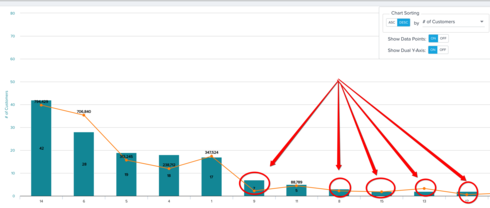
The part in question is "show data points", it only shows above a certain threshold depending on the data in the report. 

In the image you can see that Show Data Points is "ON" but data only shows at certain points. Can you make it to where all data points show? 

Use case: I want to screen shot the image and put it in a powerpoint to show the data over time in an image. In a screenshot you wont be able to "hover" to view the data. 

idupulapati_tharuni_sai
There are few limitations for showing data points label; stacked charts we are considering >=15% and for other charts it is >=9% then only data points will be appeared in the charts. 

darkknight
Forum|alt.badge.img+4
Similar issue with pie charts.   There HAS to be a way to enable all chart types to display the data points.


michael_sweeney
Forum|alt.badge.img+1
Hey Guys I wanted to follow up and see if there are any updates on this one.......Is there any way to include all data points? The reason this is important is that when you are sending an outreach the reports get sent as images and the customer loses the ability to hover the mouse over the data point to view the label. Also, for someone that doesn't know how the graphs where created, it looks like they are incomplete.


Cookie policy

We use cookies to enhance and personalize your experience. If you accept you agree to our full cookie policy. Learn more about our cookies.

 
Cookie settings