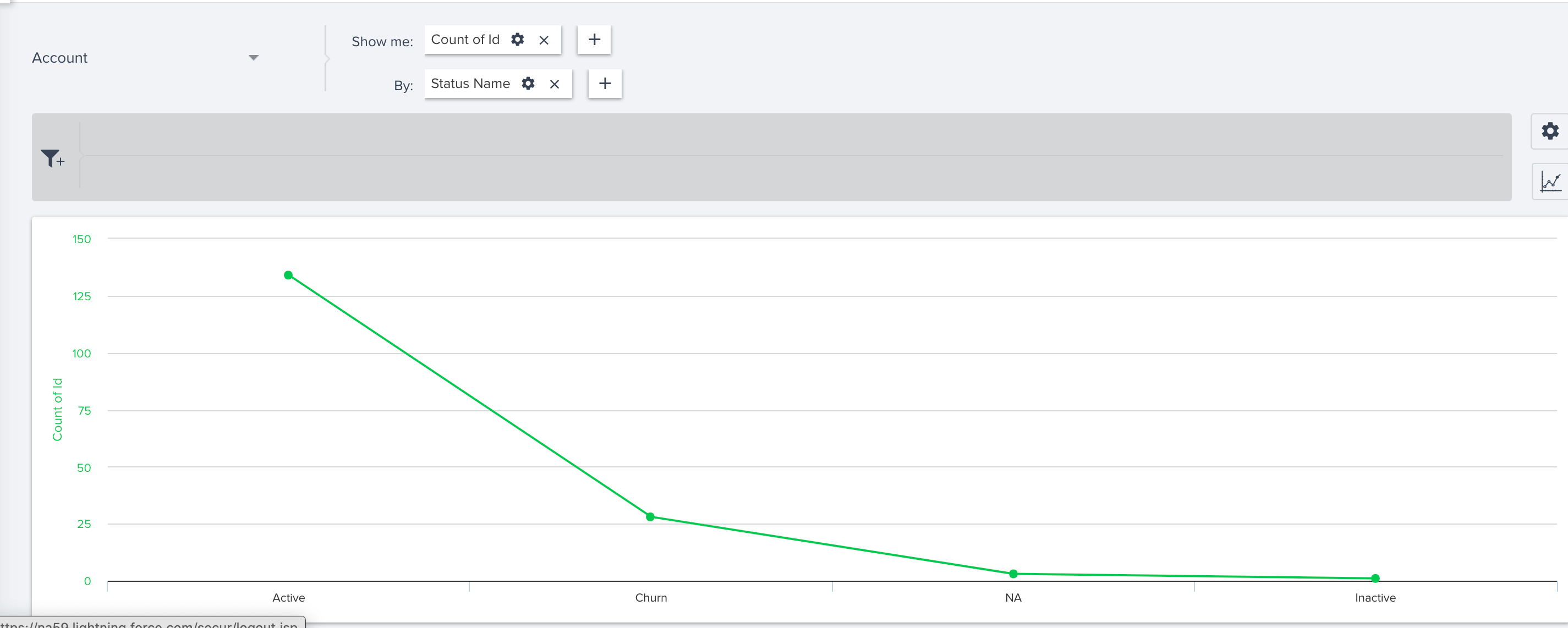
Would it possible for having the X and Y Axis show up for all Graphical Representations?
One example is when we go with a Line graph we don’t get the X-Axis label show up.
Both X and Y Axis don’t show up in this case.
Is there a reason behind this design?
Best answer by rakesh
We understand that you would like the control on more aspects of a chart. We are currently working on a feature called Chart Editor which can give that control to admins from Report Builder. I will update the thread once we pick it up for development or have more clarity on the dates.
Additionally, I would love more control over the x and y axis. Since they’re both numbers, it would be nice to set a right/left or top/bottom alignment of a zero value. Additionally, label editing is what we’re really looking forward to. We just had a really successful email campaign with a generated report in the email, but had to leave the x-axis unlabeled because that functionality does not yet exist.
We understand that you would like the control on more aspects of a chart. We are currently working on a feature called Chart Editor which can give that control to admins from Report Builder. I will update the thread once we pick it up for development or have more clarity on the dates.
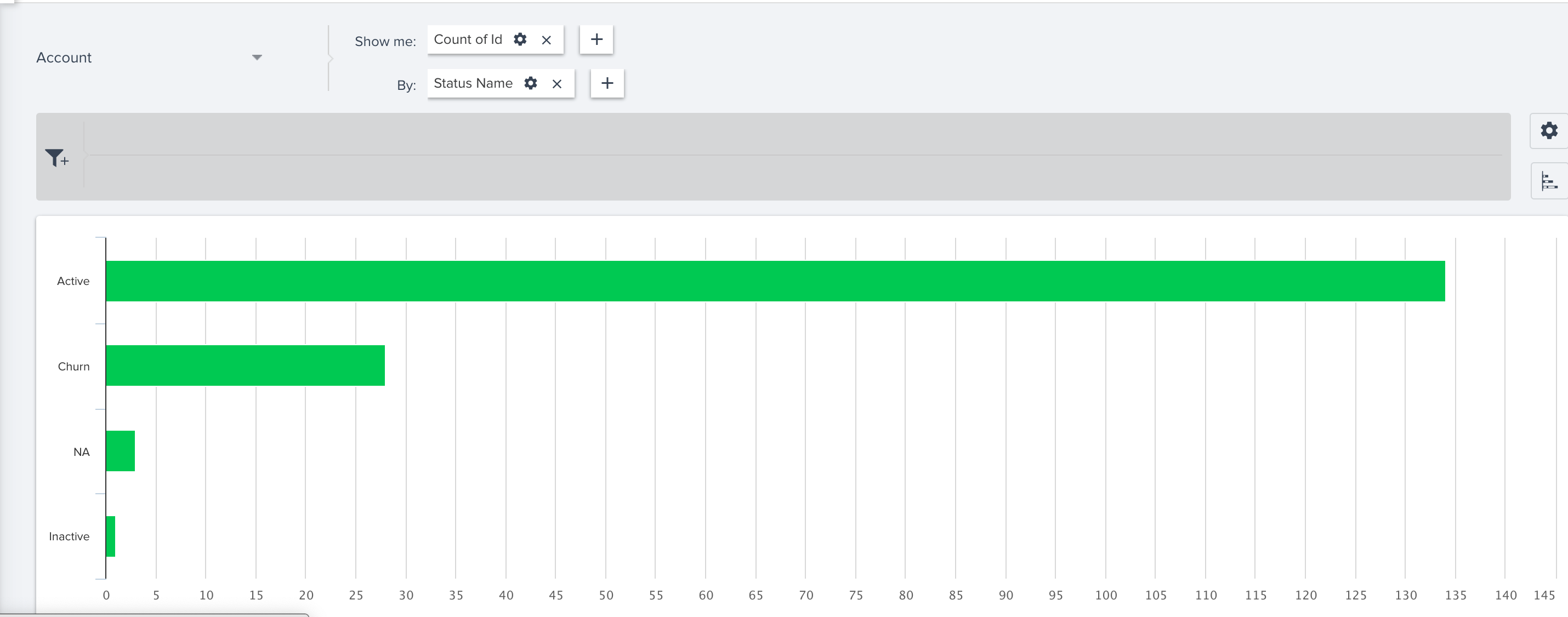
This still presents in Horizon analytics. A column chart will label the Y-axis but a bar chart will not. Stacked bar and columns also do not display the Y-axis. Can we make this consistent so it is easier for interpretation on dashboards and exports?
If you ever had a profile with us, there's no need to create another one. Don't worry if your email address has since changed, or you can't remember your login, just let us know at community@gainsight.com and we'll help you get started from where you left.
Else, please continue with the registration below.
We use 3 different kinds of cookies. You can choose which cookies you want to accept. We need basic cookies to make this site work, therefore these are the minimum you can select.