Creating a report that shows data points per month
Hey all,
We are trying to create a report that will show the growth in accounts per month, meaning - for each month to show how many new accounts we have, how many churned (0, of course!) and how many active accounts we have overall each month.
At the moment we are doing this report manually in Klipfolio as it doesn’t seem like GS allows for historic data representation in graphs, but perhaps there is a way around it? Any suggestions?
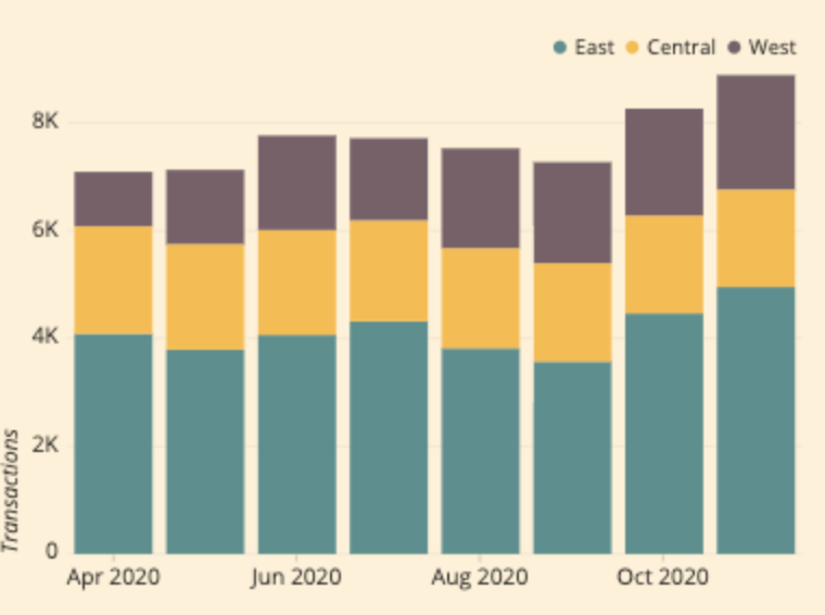
This is an example of what the graph should look like visually, just ignore the parameters and imagine it shows - new accounts / churned accounts / overall accounts - per month.
Any suggestions would be highly appreciated!
Page 1 / 1
Great information you’re attempting to visualize, @TalAmor .
I don’t think there’s a simple way to accomplish this, as it’s tough for many tools to provide historic look-backs. One potential solution would be to create a new MDA Object to support these monthly “Snapshots”. At the end of each month, a Rule could populate this MDA Object with your customer counts for each category (New, Overall, freshly Churned).
A variation on this idea, which I have seen implemented with my own eyes, is to snapshot not just your aggregate counts of customers, but to snapshot key datapoints for all of your customers. For example, on the last day of June, take a snapshot with a Bionic Rule of each customer’s status, ARR, renewal date, health score, CSM, etc and store it in an MDA Object. That will give you more granular data for trending and historic data. For example, you can start asking “How much has our CSM-supported ARR been for each month of the last 6 months...and therefore how many new CSMs can I now justify based on the data?” You’ll still be able to build a Report to visualize your counts.
That should allow you show changes over time if you have a date field that corresponds to the date you want to show (e.g. Churn date, activation date, etc.)
So I would build a new MDA object specifically for this purpose. If I have a CSV with the aggregated numbers per month from a few months ago until now, can this be included in the MDA in order to have the previous months’ “snapshots”?. And also, what kind of rule would I build to hold the aggregated data for each month, will I need to literally create a separate field for each month in advance?
Having some difficulties conceptualizing the actual how-to of the process…
@TalAmor , you should be able to seed a new MDA table with data from your CSV.
While there are probably several ways to tackle this, my strategy would be:
Create a new MDA object
As fields, include Date, # of New Customers, # of Active Customers, # of Churned Customers, and any other noteworthy datapoints. (Note that for Date, I would probably use the first day of each month: 1 Apr 2020, 1 May 2020, 1 Jun 2020)
Each row in the new MDA object is a month of data.
To populate the history, import the CSV using Data Management.
To populate going forward, use the Rules Engine to author a Rule which Counts the New, Active and Churned customers in any month, and write the results to a new row in the new MDA table.
I would run the rule monthly, at the beginning of the month, looking back at the month just concluded.
In the Rule Action, Add Custom Field, mapping “First Day of Previous Month” to the Date field in the MDA. In that same action, bring in the Counts of New, Active and Churned customers.
Thanks so much for the help, I was able to create the report looking at the historic data from the CSV.
My only remaining issue is about building the rule to populate this graph going forward - how do I create the rule so that it knows to create a new row, and to name it “01/07/2020” and so on? Something about that process is not clear to me yet…
Thank you, really appreciate the help!
Great progress, @TalAmor .
Here’s my approach to populate a new row with each month’s data:
Write a Bionic Rule. I would likely run the Rule early in the month, to write data for the previous, just completed month. Write the queries such that the number of new, active or churned customers for the previous month are available.
In the Actions, either Insert or Upsert (personally, I like Upsert in case you have to run a correction later) to a Gainsight object. Find the MDA object already created.
Inside the Action, use the Add Custom Field (it will be in the upper-right as you construct the Action).
Inside the Custom Field’s row, map that Field to whatever you named the Date field in your MDA, then set the value to be “First Day of Previous Month”. This is the answer to your last question: In this configuration, the Date field will always be the 1st Day of the Previous month (so if I run it today, 23 Jun 2020, that field would be set to 1 May 2020.)
Make that field an Identifier, so if the data is 100% new to Gainsight, it creates a row. If you have to make a correction (perhaps some data was changed after you ran the rule), Gainsight will update the row.
Thank you so much!
So some probably basic questions:
To know how many new accounts we have per month - is this the filter you would suggest, or is there a better way to do this?
Which filter would you use to identify accounts that churned per month?
Thanks, it’s really helpful!
I’m glad you’re making progress, @TalAmor .
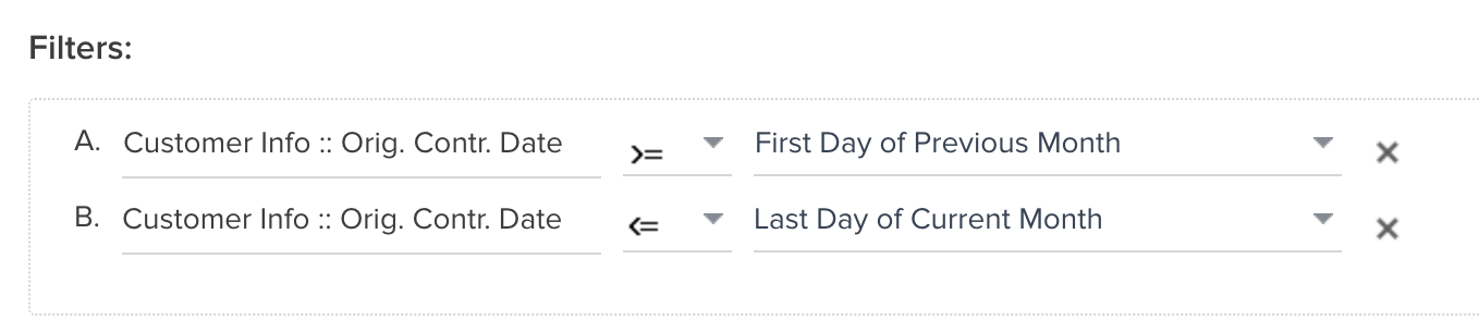
I’m attaching how I would filter (which is actually 2 filters working together). The advantage here is that you can run at any point in the month, and it always ‘boxes in’ the previous month.
Churn Dates are a bit harder if you’re not currently recording the date of Churn. While it’s a bit more work, the way I would approach this for the long-term is to create a field for Churn Date and either require your team to populate it at Churn, or write a rule to populate it with logic. Once you have that data in a field, you can use Filters similar to above.
The reason I like having a field for Churn Date is to support reporting. You start answering questions like “How many customers churned each month?” and “How much ARR churned each month for the last 12 months?” and “For churned customers, how long were they a customer?” (You’ll can find the difference between the Orig. Contr. Date and your new Churn Date field.)
Hey Matthew, do you perhaps mean less or equal to last day of previous month? Or am I missing something? Last day of current month would look at the previous plus this month...
Hey Matthew,
I have another question.
Basically I have 3 aggregated fields - # of churned accounts, # of new accounts, and # of existing accounts - basically the number of active accounts in the previous month. And overall accounts is an aggregation of these 3 fields.
What rule do I build to populate the “# of existing accounts” on a monthly basis? I had a column for that in the CSV, but not sure how to configure the rule that will populate it going forward, any thoughts?
Thank you!! :)
@matthew_lind Thanks for your quick response here! Did you get a chance to view comments posted by @TalAmor ?
@TalAmor Sorry...I missed the additional replies.
On the filters, you’re exactly right. “Less or equal to last day of previous month” would be much more logical.
On the # of existing accounts, I would build a Bionic Rule. Use COUNT against the number of existing customers you have (using whatever criteria denotes a current customer in your instance), then push that value on a monthly basis to the MDA object you generated in an earlier step.
If you ever had a profile with us, there's no need to create another one. Don't worry if your email address has since changed, or you can't remember your login, just let us know at community@gainsight.com and we'll help you get started from where you left.
Else, please continue with the registration below.