Hi all,
In the last iteration of our NPS Survey we moved from a dialog to a banner. Since then we’ve noticed more “0” scores and, upon follow up by CSMs, it seems they’re often “false” scores in that the user isn’t particularly unhappy, they are just trying to dismiss the survey from their screen. Those “0” scores then screw up our metrics.
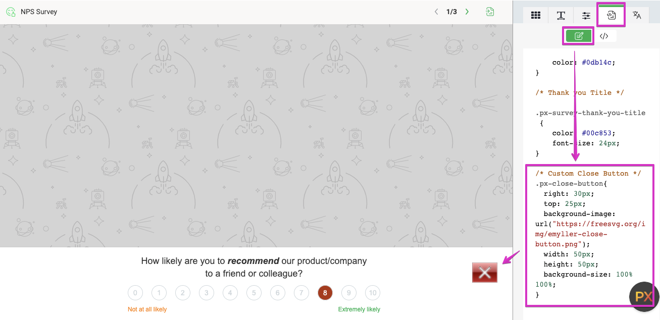
The dialog has the close (“x”) icon in the top-right, which is where users would expect a dialog close button to be. The banner also has the close icon in the top right, but because the banner occupies the full width of the window, the close icon is a long way from the user’s focus. Could that account for the difference in response patterns? Would a “Dismiss” or “Remind me later” button closer to the center of the page save us from these false scores?
BTW, We moved from dialog to banner because some anecdotal research suggested that users found the dialog obtrusive and somewhat annoying. :-)
Just wondering if anyone else has seen similar differences. We’re probably going to run an A/B test to see if it makes an ongoing measurable difference.