New Idea

Remove KPI icon in Gainsight Home Summary Ribbon

Related products:CS Other Features
  • October 25, 2024
  • 3 replies
  • 31 views
link_black
rketharaju
silasramsden
  • link_black
    link_black
  • rketharaju
    rketharaju
  • silasramsden
    silasramsden

sarahmiracle

The new Gainsight Home is really flexible and customizable - a far cry from the old version. I love to see it.

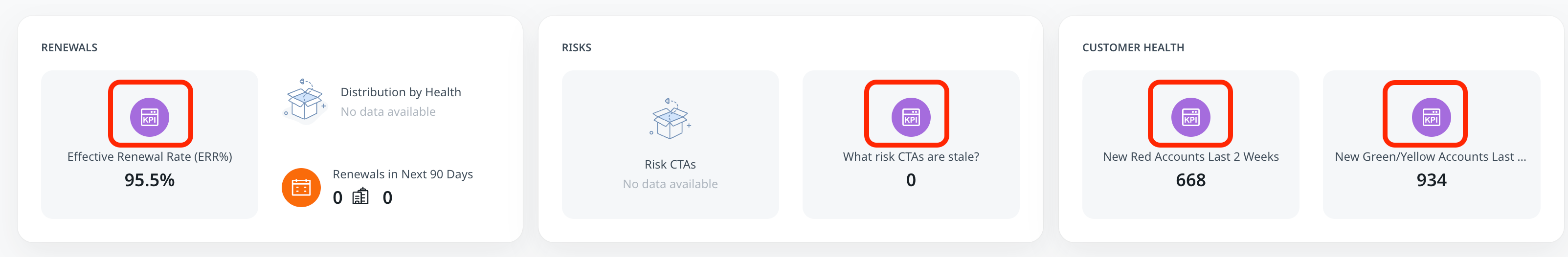
However, there’s some unnecessary design elements going on. This KPI icon in my custom KPI reports for the summary ribbon is completely unnecessary. It takes up valuable space, and actually makes the KPI less noticeable.

The purpose of a KPI report is simplicity - just a title and a number. Adding this icon puts the focus on the icon instead of the report. The number is smaller than the icon….

Please remove the unnecessary KPI icon.

In fact, there was a similar post in the old version of report builder (pre-Horizon) where people also wanted the icon removed. That says a lot to me.


3 replies

sarahmiracle
Forum|alt.badge.img+10
  • Author
  • VIP ⭐️⭐️⭐️⭐️⭐️
  • 354 replies
  • October 25, 2024

cc @ophirsw - please take a look for this design request. I’m sure you can see how this design is negating the intention of a KPI widget. The KPI itself (the actual number the report is displaying) is smaller than the unnecessary KPI icon...


jason_metzler
Forum|alt.badge.img+1
  • Helper ⭐️⭐️
  • 70 replies
  • October 25, 2024

Agree completely. I’d like to be able to select my own icons (either from a list, or via upload in addition to having a toggle for whether or not we have an icon at all.


bradley
Forum|alt.badge.img+7
  • Expert ⭐️
  • 1128 replies
  • October 25, 2024

They somehow found a way to add more whitespace without it technically being whitespace.


@dstokowski @ophirsw @revathimenon I get that design may not rank as a high a priority as functionality, but what is the deal with these kinds of things? Why, despite literal years of complaining about losing information density to what is essentially just negative space, not only not improving but getting worse in new and novel ways?

Who is this for? What is the company wide user story for “more fluff, less stuff”?

The amount of space dedicated to being useless is so egregious at this point, that it actually does have functional impacts because you simply can’t display all the information you want.

If it isn’t going to get better, at least help us understand.


Reply


Cookie policy

We use cookies to enhance and personalize your experience. If you accept you agree to our full cookie policy. Learn more about our cookies.

 
Cookie settings