New Idea

How do you adjust the y-axis scale in column reports?

Related products:None

ben
  • Helper ⭐️⭐️⭐️
  • 314 replies
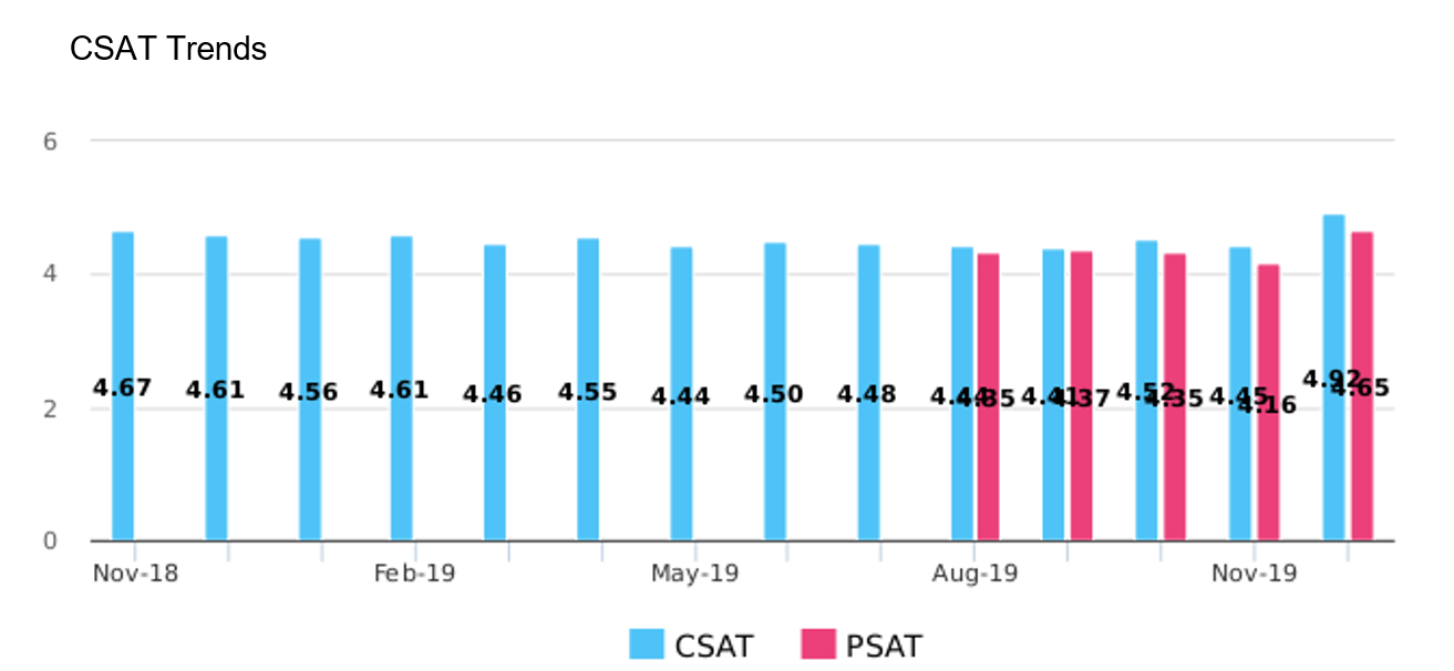
I am doing some reporting for our CSAT-style survey questions and hitting some confusion charts. The question itself can yield one of five possible numeric answers: 1, 2, 3, 4, 5. Therefore, the maximum average value of a group is 5.00. However, when making a report where the average is above 4.00, the report shows a max y-axis range of 6. This is silly and something I would like to change.

Does anyone know how to set a specific value range for the y-axis in a column graph?

Per the above, I would like to to be min of 1.00 and max of 5.00 (depending on the data, I might even do a min of 3.00 if I am feeling crazy).

Thanks for the help as always!

13 replies

pele
Forum|alt.badge.img+3
  • Helper ⭐️⭐️⭐️
  • 164 replies
  • March 6, 2018
I've been struggling with this as well. In general, it'd be great if we could format more of the axis attributes. e.g. bounds, units, labels, label position, etc. 

We're sending monthly emails to customers that contain reports, and it would be ideal if we could dress the reports up a bit before embedding in an outreach. 

Thanks for posting Ben :) 

mindy
Forum|alt.badge.img+1
  • Helper ⭐️
  • 52 replies
  • March 12, 2018
Is it possible to set the y-axis in any type of report? I'm with you that this would be very helpful. Like Pele we send reports via CoPilot and the report can sometimes show "dramatic" drops (of 1) because of the scale. I commented on this 3-year old thread a couple of months ago asking for an update on this topic, but it seems like it's still a feature request based on the lack of response that I got?

venky_reddy_k
This is not possible today in the product. We plan to bring the ability to adjust the y-axis scale in the future. Have added this to the roadmap and will update here on ETA when we take this up.

Thanks
Venky

ben
Forum|alt.badge.img
  • Author
  • Helper ⭐️⭐️⭐️
  • 314 replies
  • May 9, 2018
Awesome thank you Venky! I look forward to hearing more!

davebrown2242
Forum|alt.badge.img+3
  • Helper ⭐️
  • 179 replies
  • October 28, 2019

One other thing to consider is expanding filters on reports. For example, if we do get to configure the y-axis scale for Gainsight dashboard reports we need to ‘lock in’ that scale if the time frame is expanded.  We have reports that works in the current CQ showing activities per distinct count of accounts, but when the data set is expanded to Previous CQ (which contains a lot more CTA data), the scales on the y-axis that counts Accounts displays higher than the activities because the scale, well, scales. 

If we admins get to designate the initial scale of both axis's, whatever changes happen when applying filters should maintain the same scale. 

Looking forward to more advanced dashboard capabilities!


lila_meyer
Forum|alt.badge.img+5
  • Gainsight Employee ⭐️⭐️⭐️
  • 1447 replies
  • October 28, 2019

@venky_reddy_k Is this something we’re still considering and/or is on the roadmap? And should this be converted to an Idea for better tracking?


davebrown2242
Forum|alt.badge.img+3
  • Helper ⭐️
  • 179 replies
  • October 29, 2019

@lila_meyer & @venky_reddy_k - I think all can see what the main issue is with having no control over the axis scale of the dashboard graphs, but just in case see attachment of our activities and distinct accounts report on a manager dashboard.


Note that the lesser amounts on the graphs are represented as the higher value.  This skews the entire reason for visualizing the information in dashboards.  Hope to have this converted to idea and see the graph controls (like @pele mentioned  e.g. bounds, units, labels, label position, etc.) implemented.  


This would be an incredible value to us admins who support our Customer Teams.


dan_ahrens
Forum|alt.badge.img+2
  • Expert ⭐️⭐️⭐️
  • 1984 replies
  • October 29, 2019

Hi @davebrown2242 - in your specific example, the issue is that you have dual axis turned on, so a separate axis for the blue values and a separate axis for the red values. The dual axis feature is useful if the two data series are significantly different in min/max ranges (usually 10x or greater), but if the two series are in a similar range (like your data is), then it’s best to turn off the dual axis. 


davebrown2242
Forum|alt.badge.img+3
  • Helper ⭐️
  • 179 replies
  • October 29, 2019

Ha, good catch @dan_ahrens. I was just trying to help by snapping a quick snapshot and missed that.  Also I fixed that graph. Thanks again.


lila_meyer
Forum|alt.badge.img+5
  • Gainsight Employee ⭐️⭐️⭐️
  • 1447 replies
  • October 29, 2019

I went ahead and converted this to an Idea / feature request.


werickson
  • Helper ⭐️⭐️
  • 14 replies
  • December 17, 2019

This would be a VERY, VERY beneficial feature.  I too have the CSAT problem.. Executives sure don’t like it when I tell them I KNOW our CSAT scale is 1-5, but the product doesn’t let me pick the scale


Similarly with the data score placement.. inside end, center, inside base, … 


sai_ram
Forum|alt.badge.img+1
  • Expert ⭐️⭐️
  • 3727 replies
  • March 17, 2020

@werickson we have our eyes on it, I will update it here once we push it to release,


Hello Everyone,

Happy to announce that your request has been considered and implemented in the Horizon Analytics. Gainsight has now enhanced the Chart Editor settings in both SFDC & NXT versions.

Thanks for posting!


Reply


Cookie policy

We use cookies to enhance and personalize your experience. If you accept you agree to our full cookie policy. Learn more about our cookies.

 
Cookie settings