We often hear that you’re pulling traffic metrics from tools like Google Analytics to combine with community data from inSided for your monthly reporting.
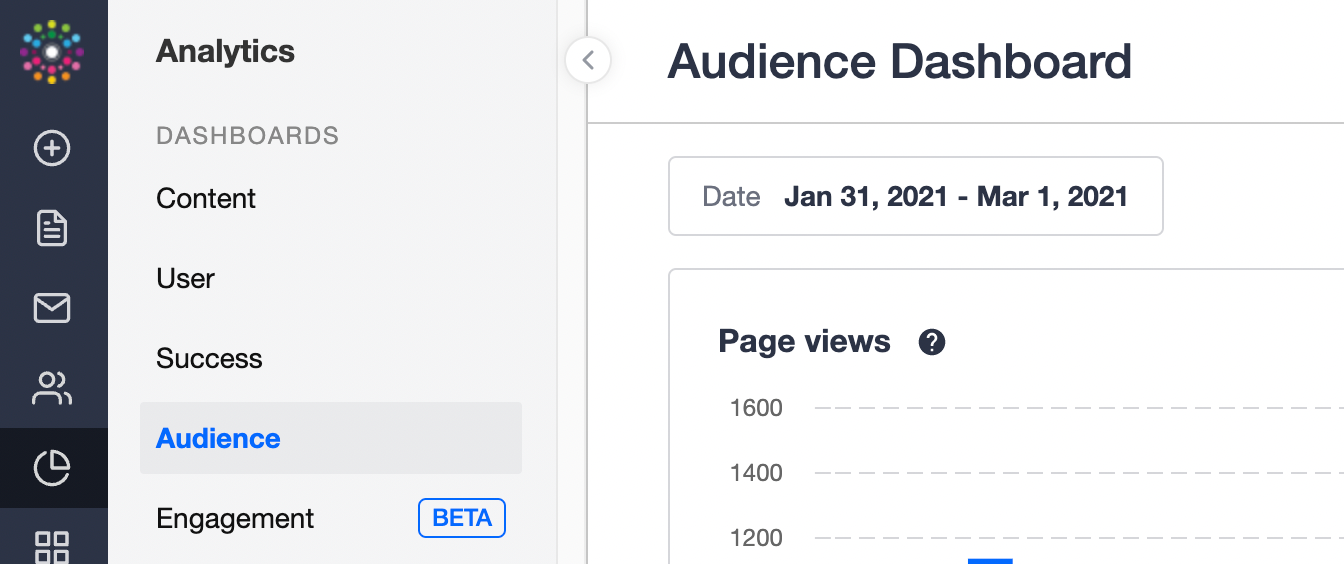
To help you simplify your reporting, we’ve delivered a first step towards helping you understand your community traffic: the Audience Dashboard.
With the Audience dashboard you can:
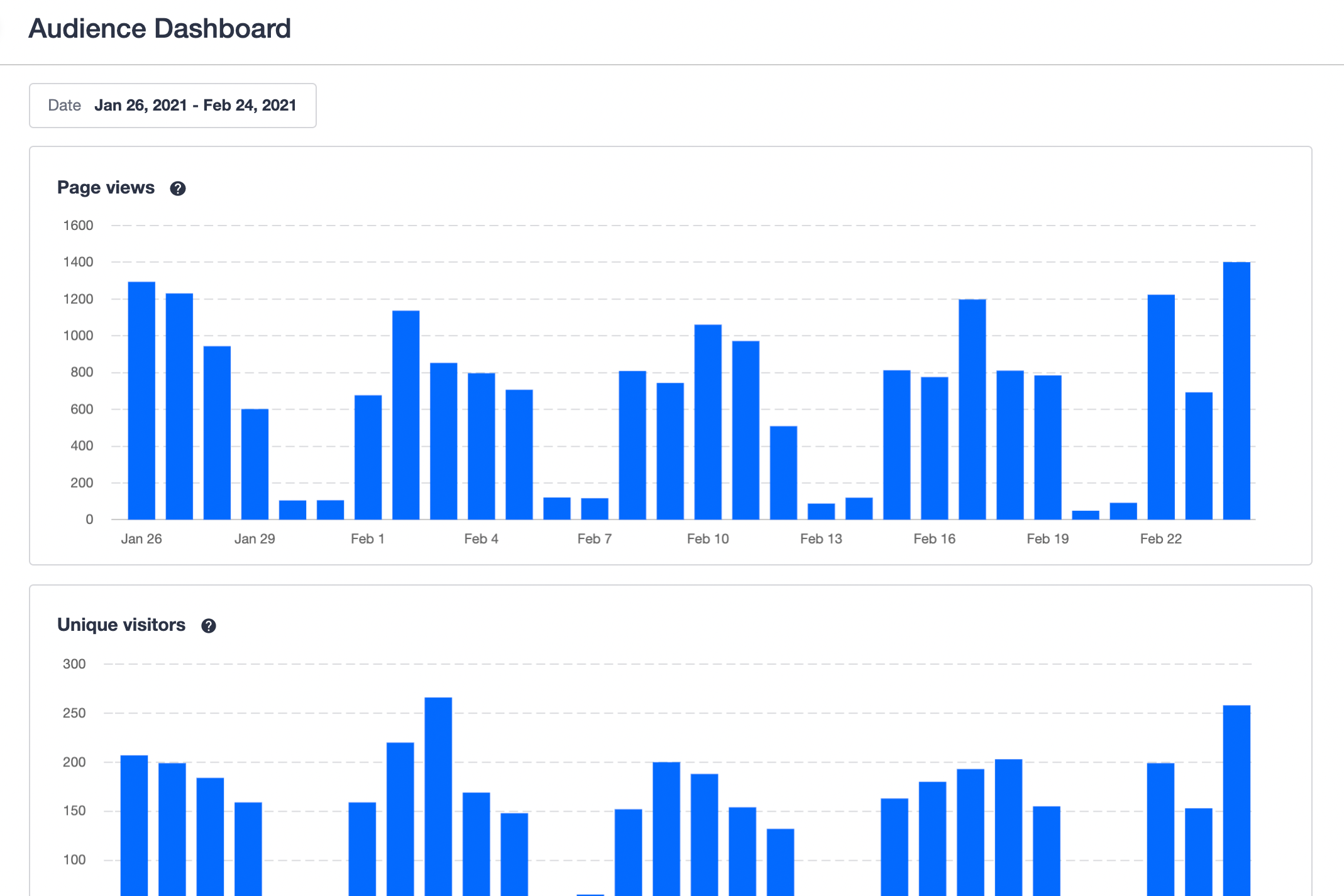
![]() Track page views on your community, to get a helicopter view of user behaviour trends.
Track page views on your community, to get a helicopter view of user behaviour trends.
![]() Track unique visitors to your community, to understand how your audience is growing over time.
Track unique visitors to your community, to understand how your audience is growing over time.
These metrics will be used to power our upcoming Engagement Dashboard and Monthly Active Customers metric - learn more below!
How are the Audience Dashboard metrics defined?
Page views
The total number of community pages loaded or reloaded in the selected time period. Page views from bots are automatically excluded.
Unique visitors
The total number of unique visitors within the selected time period, identified by tracking cookie. Both logged-in and anonymous visitors are included. Visits from different devices are counted as separate, unique visitors.
Our metrics are filtered for bots. We see that when compared to tools such as Google Analytics, our metrics have a definitive correlation, although they typically report higher numbers. This difference can be attributed to the fact that a subset of users block Google Analytics using privacy-enhancing/ad-blocking browser extensions.
Any plans to improve the Audience Dashboard further?
- As a next step, we’re planning to add scorecards to the dashboard, so you can see the aggregate number of page views and unique visitors over a specific time period.
- Other than that, we’re also considering (although it’s not planned yet) to add the ability for you to select the date interval (day/week/month) on the charts. Let me know in the feedback if you’d like to see this, and how it would help you.
Shout out to
Please let us know if you have any questions, feedback, or any other ideas to gain more insights about your community audience.