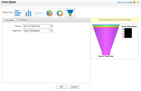
New Idea

Need Funnel Chart - Ability to decide if I want all data in one stacked column

Related products:None
  • November 16, 2016
  • 8 replies
  • 43 views
andrew_cummins
sierra_evans
broghanzwack
  • andrew_cummins
    andrew_cummins
  • sierra_evans
    sierra_evans
  • broghanzwack
    broghanzwack

andrew_cummins
I think a funnel chart would accomplish this but currently I am unable to create a stacked chart with a 1:1 (show me/by) that gives me all the data in one column. The by field always breaks out the columns. The only way to get close to this is to put another field in the by section that is in common with all records like a date set to show yearly, monthly, etc. The problem is when I add the date field if it spans over two years and I want to display it all in one column I am never able to do this. It would be nice to just allow me to use a 1:1 with show me /by fields and decide if I want it all in one column stacked chart or more columns. 

8 replies

dstokowski
Forum|alt.badge.img+4
  • Gainsight Employee ⭐️⭐️
  • 533 replies
  • November 16, 2016
Can you describe more about the use case report you are trying to create, Andrew?  

andrew_cummins
Forum|alt.badge.img+1
  • Author
  • Helper ⭐️
  • 270 replies
  • November 16, 2016
Yeah, I tried but I can see how it was not really clear. I need to be able to create a stacked bar chart that only has one stacked column of the total sum of cost for escalations by the type of escalation. The problem is I get multiple bars even if I select stacked columns. The only way I can get this is by selecting a date range of current fiscal year and but the created date in the by field setting it to show yearly so it only shows 2016. Problem is I will get two stacked bars when I move into 2017 and have to change the filter to include last year. 

dstokowski
Forum|alt.badge.img+4
  • Gainsight Employee ⭐️⭐️
  • 533 replies
  • November 17, 2016
I tried it too and got the same thing - it is not showing a stacked bar

andrew_cummins
Forum|alt.badge.img+1
  • Author
  • Helper ⭐️
  • 270 replies
  • November 17, 2016
Right. A funnel is a neat way of showing it and would be cool but stacked bar would be fine as well if it worked how I thought it would...maybe this is WAD?

  • 0 replies
  • December 14, 2017
Is there an update on this feature? 

sierra_evans
Forum|alt.badge.img
  • Contributor ⭐️⭐️⭐️⭐️⭐️
  • 70 replies
  • April 6, 2021

+1 for idea to incorporate funnel chart in reports 2.0 and data designer.


rakesh
Forum|alt.badge.img+1
  • Lets put your data to work!
  • 835 replies
  • April 7, 2021

Hi all.

Want to update that we have picked up Funnel chart capability in our new Horizon Analytics for development. We should be able to deliver this in short term horizon.


  • Contributor ⭐️⭐️⭐️⭐️
  • 49 replies
  • November 28, 2022

@rakesh - Thanks for implementing the Funnel chart in Horizon Analytics. But, still it doesn’t serve the purpose. The funnel chart must have the ability to do the cumulative calculation. What I mean is, when I build a funnel chart, I should have the ability to define the stage 1, stage 2, stage 3 and final stage. Lets say, if there are 20 Opps in Stage 1, 30 Opps in Stage 2, 25 Opps in Stage 3 and 50 Opps in Final Stage. The chart should show (20 + 30 + 25 + 50 = 125) 125 Opps in stage 1, (30 + 25 + 50 = 105) 105 Opps in Stage 2, (25 + 50 = 75) 75 Opps in Stage 3 and 50 Opps in Final Stage. By this we will be able to understand/visually see how many opps were there in each stage in a given period. 


Cookie policy

We use cookies to enhance and personalize your experience. If you accept you agree to our full cookie policy. Learn more about our cookies.

 
Cookie settings