Separate the columns of the exports
The downloaded report is in CSV format, which means the columns first need to be separated with a comma before you’ll be able to create a dashboard.
N.B. Some Excel versions automatically separate the columns when you open the file, if that is the case you can skip step 1 to 5.
- Open the downloaded export file in Excel, select the first column and click on Data – Text to columnsThe setup of your dashboard depends on the data you want to report on. The explanation of creating a dashboard (and updating an existing dashboard) which is provided below is based on the use of Excel, but you’re free to use any other tooling you’d prefer. Contact your Community Consultant for an example dashboard (also created in Excel).
- Select the option Delimited and click Next
- Choose delimiters Tab and Comma, and click Finish.
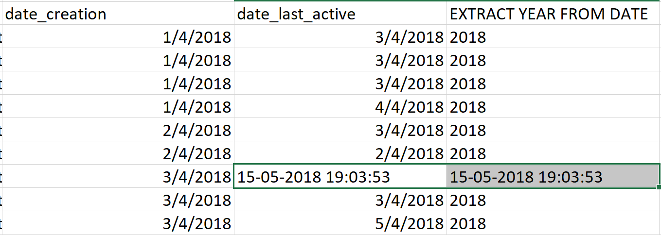
- Copy paste each export in a separate tab in one Excel documentIn addition to the existing columns of each export it is recommended to add extra columns enabling you to filter data for specific time ranges. For example month (=month(X)), week (=week(X)), day (=day(X)), day of the week (=weekday(X)), hour of the day (=hour(X)).
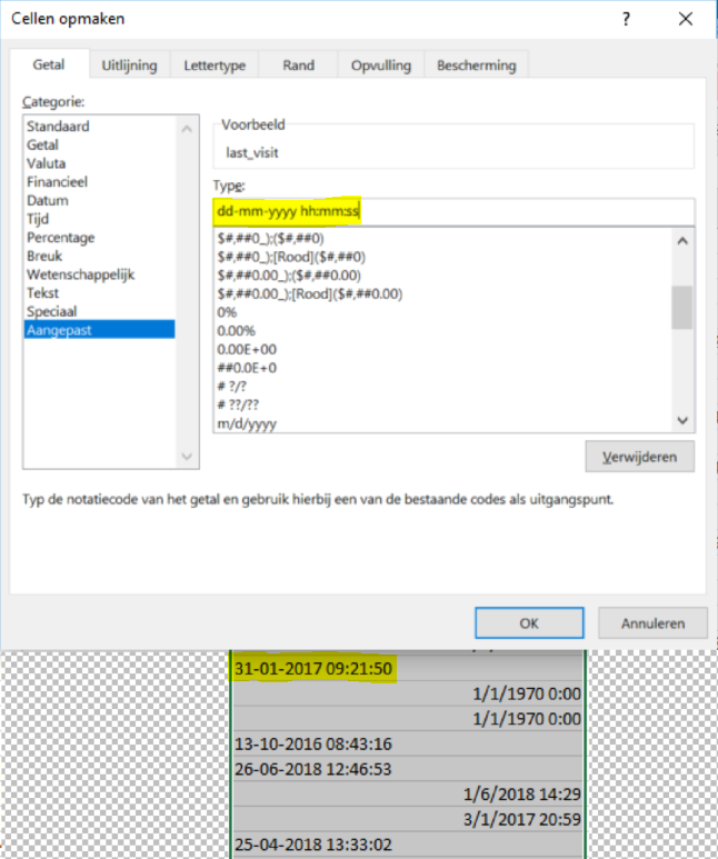
Especially in the mark as answer export extra columns are needed to calculate the SLA. To make a calculation on an SLA of 24 hours, use the following formulas:
Add a column (Column Y) to the mark as answer export which calculates the difference between the post_answered_creationTime (Column R) and post_1_creationTime (Column K) by using the formula =Integer((R2-G2)*24). Add a column to calculate the SLA based on a conditional formula =IF(Y2<24;”yes”;”no”).
Create a new dashboard
After all exports are added to the Excel document and after adding these columns, start making pivot tables to create the dashboard.
- Click on Insert - Pivot table
- Select the data you want to analyse by selecting the reach of the specific export
- Select where you want the PivotTable report to be placed. This can be either a new worksheet (when no other pivot tables have been created), or an existing worksheet that already contains other pivot tables to create a full dashboard in one worksheet in the Excel file.
- Click on OKWhen you have selected the input to create a pivot table you get to see the PivotTable Fields menu. Choose the data you want to show, for example the topics with the most comments in month X (row = topic_title, value = total_comments, filter = month)
Update an existing dashboard
When you already have a dashboard in place there is no need to create a new one. It saves a lot of time to use the existing dashboard and update it with newly derived exports. All exports can be copy-pasted directly under the present exports in the worksheets. However, data such as number of comments, views, public and moderator tags (topic export) and user profile information (user export) won’t be updated in the exports that are already in the worksheet. If you want them updated you should get the full export of that time range as well.
- Select the pivot table in the dashboard
- Click on Analyse – Change Data Source in the menu bar
- Click on the table/range selector to select the new range in the worksheet
- Click OK
Create a report
The setup of your report depends on the goals of your community and the data you want to report on. Contact your Community Consultant for an example report that shows a basic setup of a community report.