In this article you’ll learn more about the different homepage widgets, their characteristics and how to use them.
Widget position
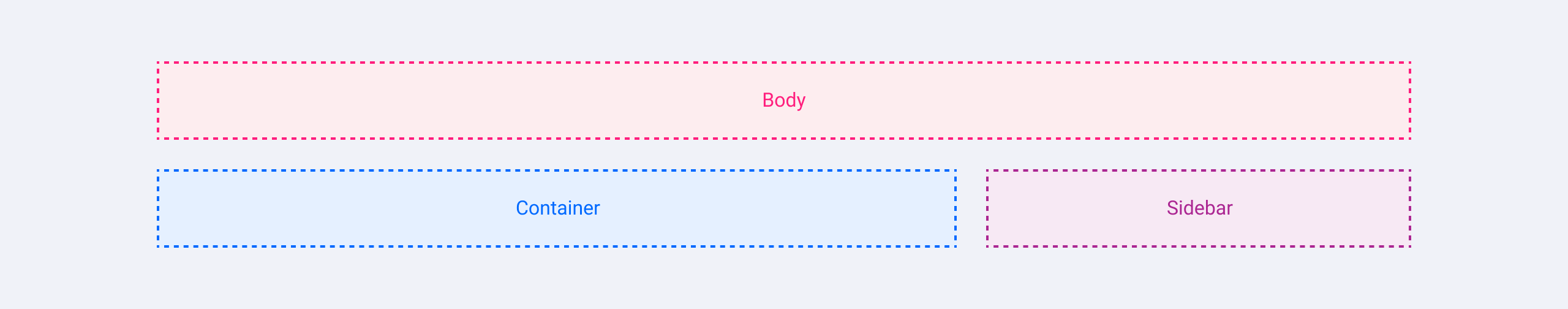
There are three positions where a widget can be added:
-
Body (expanding the full-width of the page)
-
Container (expanding two-thirds of the page width)
-
Sidebar* (displayed at the right side)
*sidebar widgets can only be added when a sidebar is configured
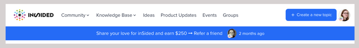
Mega Menu

Position: body
Always appears directly below the header. Consists of the menu entries, a search bar, a call to action to create a topic and login/register link (when logged out) or a users’ profile information (when logged in). This widget cannot be deleted.
Topic Banner
Position: body
This view is very popular when you want to grab the user's attention to a specific, important topic. For example an outage or an important announcement.
Search Banner

Position: body
An image banner with headline and search bar. Typically shown directly below the navigation to welcome users to the community and let them search for information.
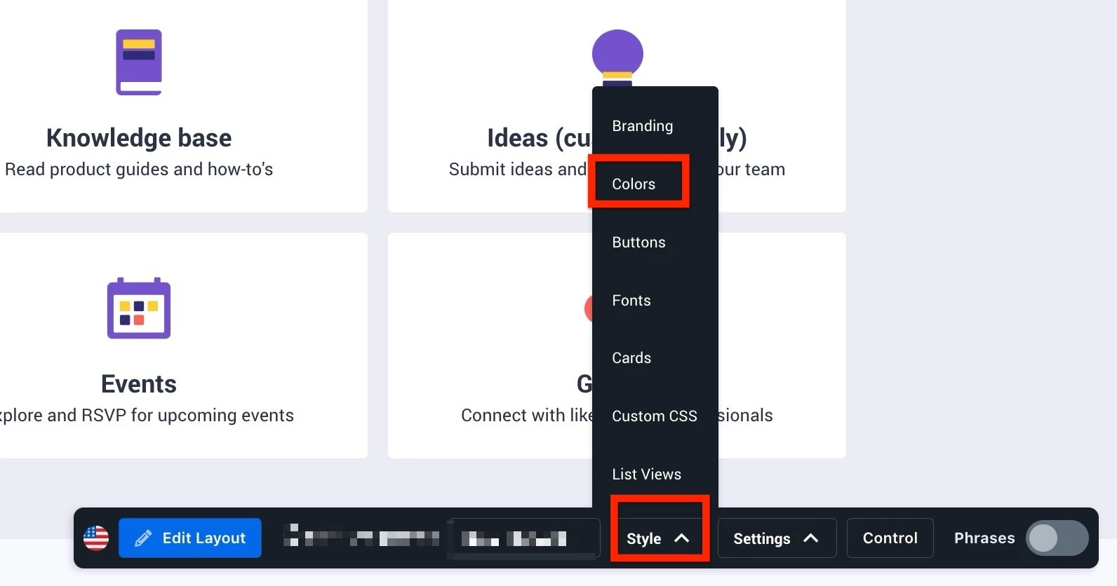
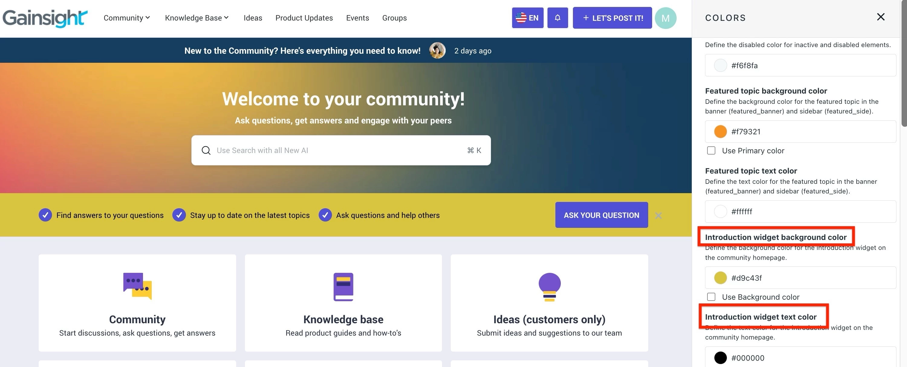
Introduction Bar
Position: body
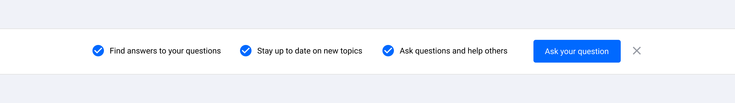
Community introduction for new users. Introduce your community in 3 simple steps. Creating a topic button will direct users to the create new topic page. This widget can be ‘closed’ by the user. Text changes can be made via the phrases tool.
Statistics Bar
Position: body
Display community statistics (topics, replies, members) and members who have been online most recently. The members count aligns with the User Dashboard # Total users metric in Control.
Quick links
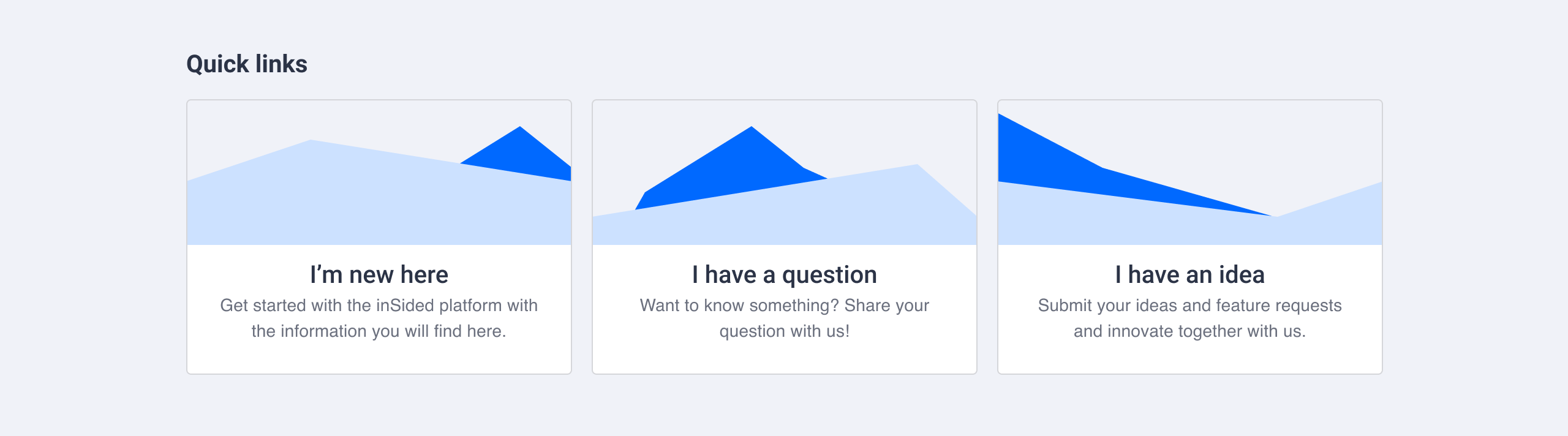
Position: body, container, sidebar
Card styled links. Cards have a title, URL and description (optional) and can be displayed as plain text or with a visual in the form of an icon/image. Up to 6 quick links will be visible, if you configure more than 6 quick links they can be loaded by triggering a ‘Show more’ button.
Banner Widget
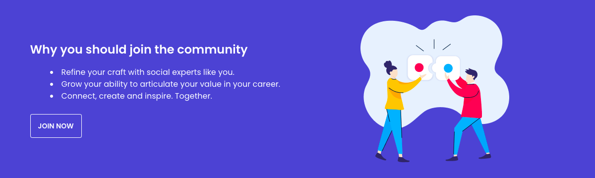
Position: Body
A full-width section to better display images, text and buttons and draw your visitor’s attention. Both text and image can be aligned left, right or centre within the widget.
Knowledge Base

Position: body, container
Links to knowledge base parent categories in card form. Displays thumbnail image, title and amount of articles that can be found within the categories. Has different templates to pick from.
Community category

Position: body, container
Links to community parent categories in card form. Displays thumbnail image, title and amount of (new) topics and replies that can be found within the categories. Has different templates to pick from.
Tabs
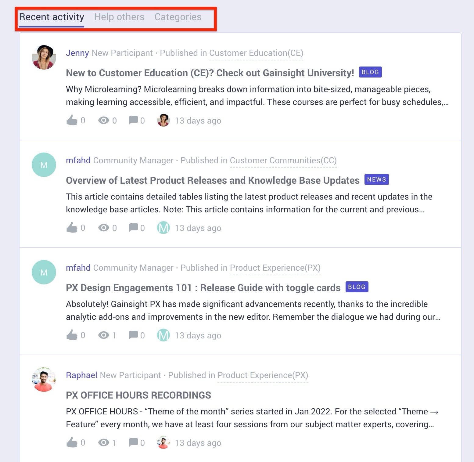
Position: body, container
The tab container has three configurable streams, displayed as tabs:
-
Recent activity— shows a list of recently active topics.
-
Help Others— shows a list of recently asked questions that don’t have a best answer assigned yet.
-
Categories— shows a list of community parent- and child categories.
The default first tab in the list is the Recent activity tab when visitors visit your community.
You can rearrange the tabs and use the filter option to show specific category topics.
For more information on filters, refer to the Filter topics on Categories article.
Featured topics
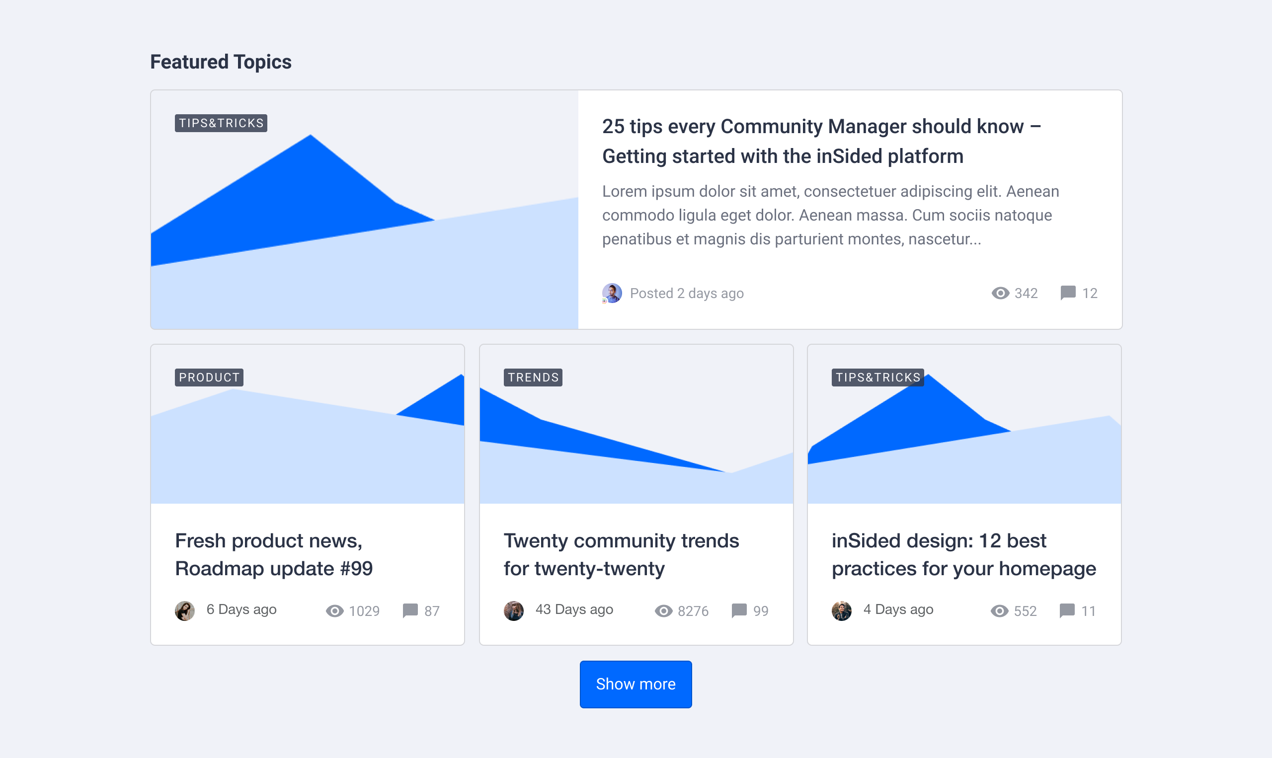
Position: body
Feature topics in card style. Manually choose the topics you want to feature by search or by copy/pasting a topic URL. Feature as many topics as you like and determine how many topics should be shown in a big card. Each topic type has its own card style (e.g. an article will display a feature image and an idea will show its status). We recommend to feature multiple of the same topic types to maintain visual consistency. Optionally, you can add a title above, and a button below the featured topics card.
Featured topics (moderator tags)
Position: body
Feature topics with moderator tags. This is a legacy widget with limited capabilities. We recommend using the Featured topics widget described above.
Recommendations
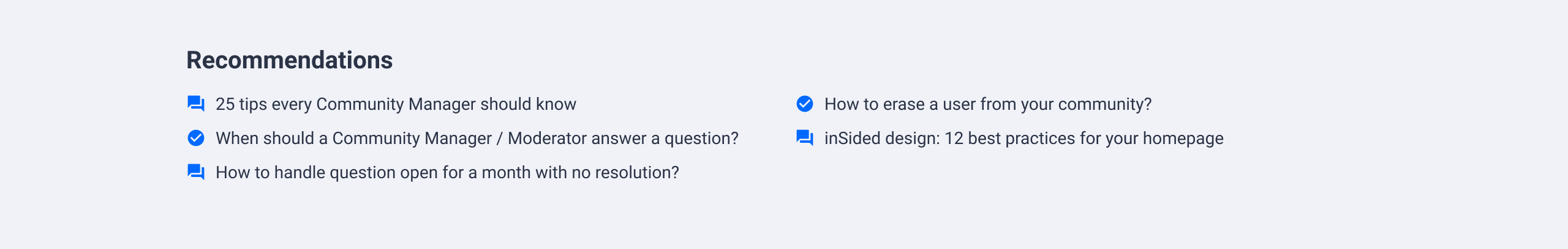
Position: body
Recommend topics in a minimal list style. Displays the topic type as an icon and the topic title in a minimal 2 column list. Add as many topics as you want to feature by searching or by copy/pasting a topic URL.
Container 2:1
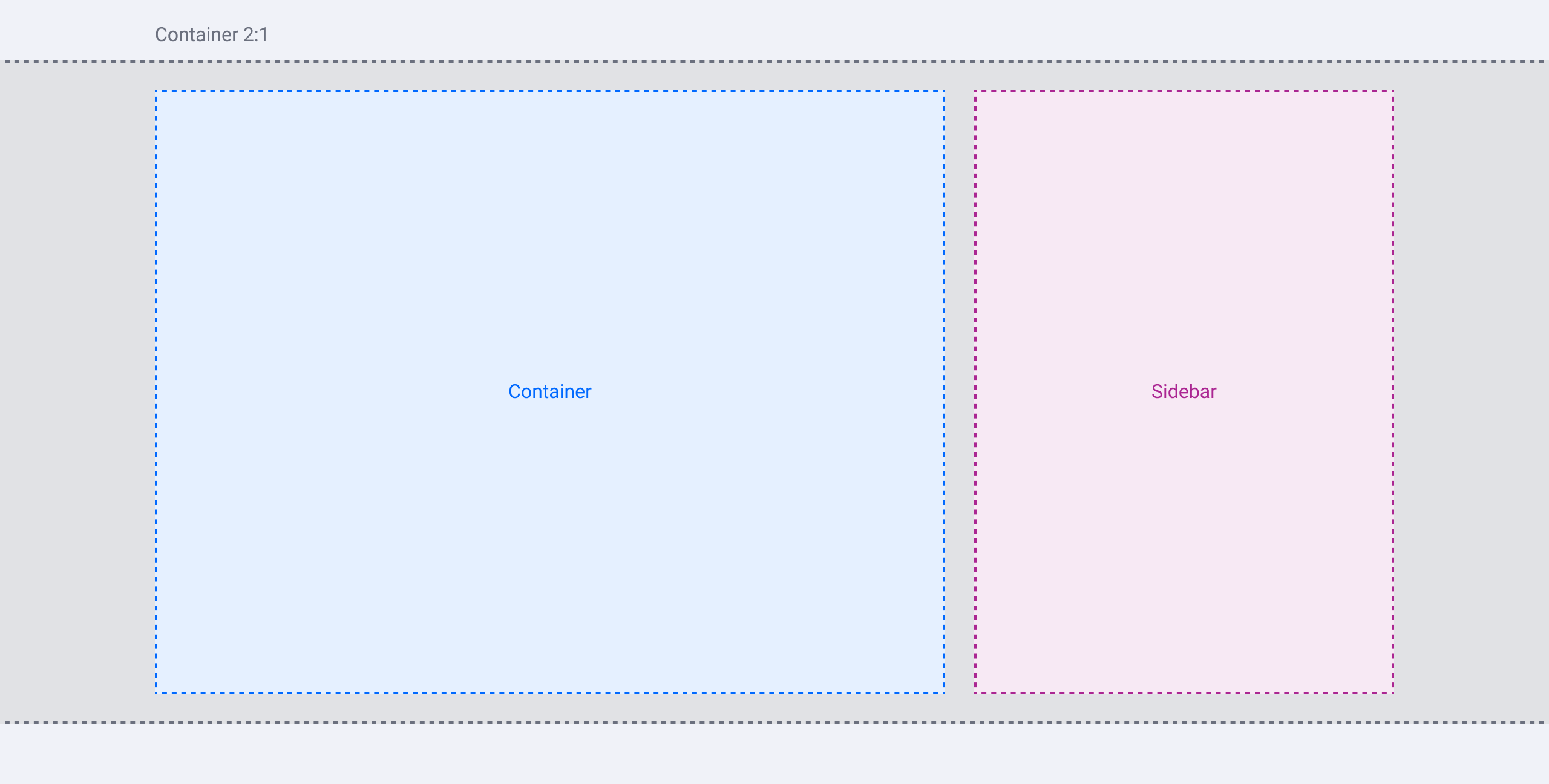
Position: body
Insert a container and sidebar ‘frame’ to the body. Add individual widgets to the container and sidebar.
Note: You can only configure the sidebar for the homepage. The sidebar for other community- and topic pages need to be configured in Control > Customization > Sidebar
HTML widget
Position: body, container, sidebar
Build your own widget from scratch with the help of HTML&CSS. Often used to embed a Youtube video or Twitter timeline, but the possibilities are endless.
Leaderboard
Position: sidebar
A list of users that gain the most points*. Configure the widget title, amount of users to display, time range and which user roles to exclude (e.g. exclude your moderator team). Configure a message to be shown when the leaderboard is empty or has fewer than 3 users to display. Configure whether a link to the dedicated leaderboard page is shown (i.e. community.com/leaderboard).
*Point configuration has to be set up in Control in order to populate this widget.
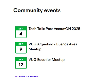
Event calendar
Position: full-width or sidebar
Displays a list of upcoming events. Configure the widget title and the number of upcoming events to display. A link/button to the event overview page where end users can see a list of all upcoming/past events is also shown.
*At least 1 upcoming event has to be set up in order to populate this widget.
Groups
Position: full-width
Promote a set of groups. Configure the amount of groups that you want to display. Optionally, you can add a title above, and a button below the groups widget.
*At least 1 group has to be set up in order to populate this widget.
Awarded badges widget
Position: sidebar
A list of users that recently received a badge*. Configure the widget title and the number of users to display.
*At least 1 badge has to be set up in Control in order to populate this widget.
Announcement card
Position: sidebar
One topic featured by a moderator tag. This is a legacy widget with limited capabilities.
Tag cloud
Position: sidebar
A cloud of the most public used tags. Configure the title and the number of tags to display. Clicking a tag will take the user to a search result page showing all topics with the same tag.
Solved topics
Position: sidebar
A list of topics that recently got a best answer assigned. Configure the title and the amount of topics to display.
Most liked
Position: sidebar
A list of users that received the most likes on their topic and replies. Configure the title, amount of users to display and the time range in which likes are collected.
Community statistics
Position: full-width
Display community wide statistics. Configure the title and determine which statistics (topics, comments, users) to show with checkboxes.
What’s next?
Time to put some widgets into practice! Let’s try to set up quick links, feature some topics, and add navigation elements to your community and knowledge base.
