The new InSpired home page, community overview page, and knowledge base overview page all use what appears to be rows of 4 quick links.
When I configure the quicklink widget on my home page, adding a fourth quick link reconfigures the layout to be 2x2, rather than 1x4
How is InSpired doing this? Or how can I achieve the same result?
This article says this in relation to quick links and featured content, but doesn’t reveal how it’s setup
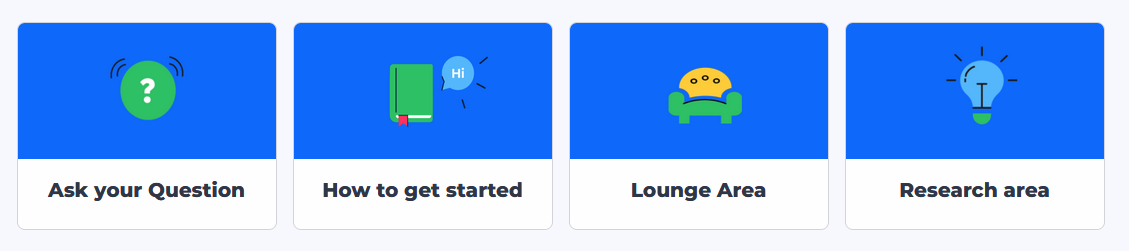
On inSpired, we also showcase a few categories that we want to highlight a little bit more:
Best answer by Marion Frecaut
Hi @DannyPancratz thanks for asking that question. Actually we used custom CSS to achieve that on InSpired. HOWEVER, we are currently working on an improved version of the quick links to allow to add 4 quick links in a row out of the box. This is something planned relatively short term. I can involve you once we have a testable version :)
Of note: I’m nearly positive I’ve seen versions of the InSpired Knowledge Base overview page that had a 1x6 or larger row of quick links to articles on Insided integrations. Right now it’s showing for me as a row of 4 and a second row of 2.
Hi @DannyPancratz thanks for asking that question. Actually we used custom CSS to achieve that on InSpired. HOWEVER, we are currently working on an improved version of the quick links to allow to add 4 quick links in a row out of the box. This is something planned relatively short term. I can involve you once we have a testable version :)
If you ever had a profile with us, there's no need to create another one. Don't worry if your email address has since changed, or you can't remember your login, just let us know at community@gainsight.com and we'll help you get started from where you left.
Else, please continue with the registration below.