Solved
Why is Copilot Outreach Analytics Limited to 20 Customers?
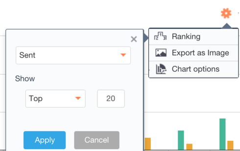
In the first tab of the analytics page in the copilot, none of the graphs show the full outreach, but rather just a sample that appears to max out at 20 customers. I'm not quite sure why it does this nor how to have it show the next 20 customers. I even tried changing the report type to a simple table, and it was still limited. As it is now, I am not able to easily see the opened/clicked/bounced rates for my entire outreach. Please expand this capability.
Sign up
If you ever had a profile with us, there's no need to create another one.
Don't worry if your email address has since changed, or you can't remember your login, just let us know at community@gainsight.com and we'll help you get started from where you left.
Else, please continue with the registration below.
Welcome to the Gainsight Community
Enter your E-mail address. We'll send you an e-mail with instructions to reset your password.


