
Hi team,
I want a report to demonstrate the Product Analytics health over time. This is a group health measure vs. the overall health score.
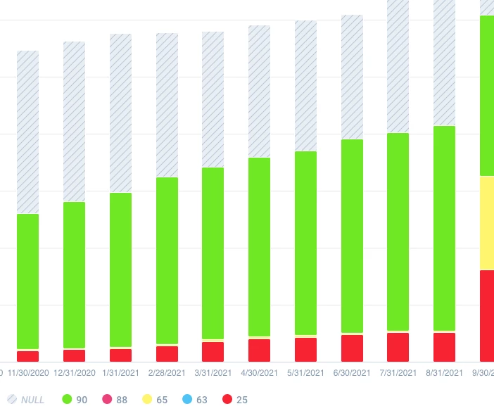
It looks like this (image above) but instead of showing numbers, I want to show red/yellow/green. Specifically,
- A report to show health over time (monthly)
- Focused exclusively on the Product Usage health measure group
- Simplify to red/yellow/green (RYG) instead of numbers so executives can easily understand and interpret
- Retain the NULL values to show that we still have many accounts without Product Usage data
