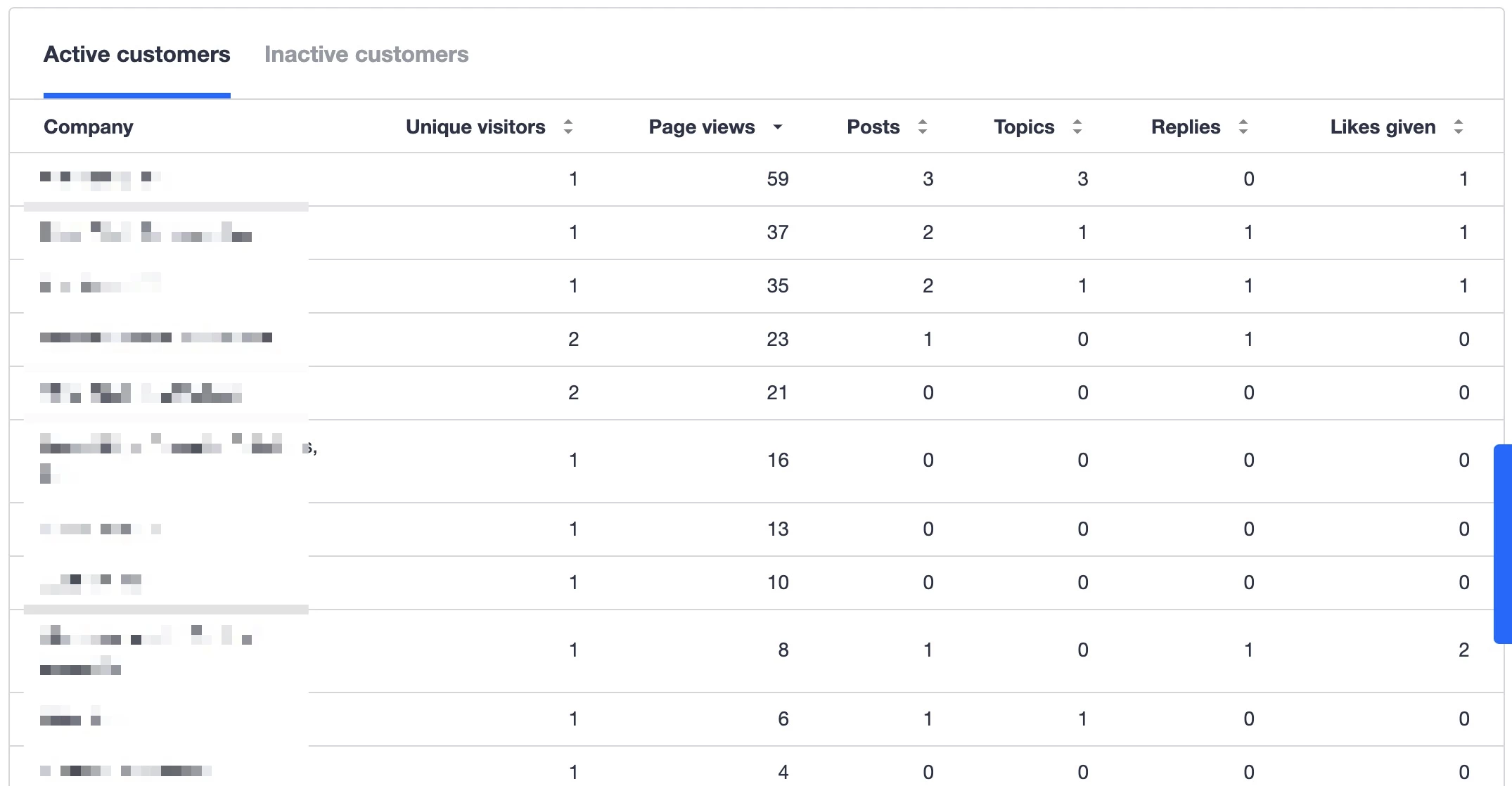
Every week, I put together a dashboard for the community and use several components of dashboards available in Control.
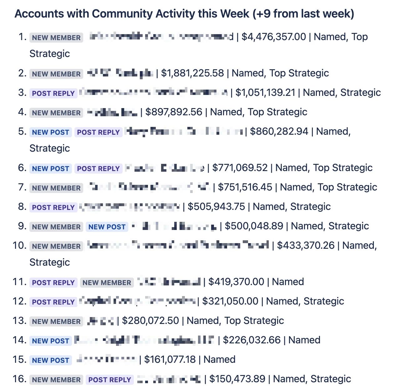
One thing I manually put together is account activity in the community for the week (ie. what companies have been in the community). Below is an example, though I blurred out the company names. As you can see, it has the company, what type of activity they had (new member joined, new reply, new post), and some of the ARR and Account Classification from Salesforce.
I think the Engagement Dashboard table is VERY close to being able to be sufficient to replace this manual effort.
- Show new members
- (Nice to have) - be able to pull in certain SFDC fields on the Account level
- (Nice to have) - ability to select what columns to display and the order in which they are displayed. For example, Page Views isn’t critical for this table for us.