
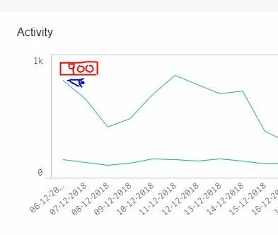
just a quick one: the content dashboard provides a nice trend-overview when you select several weeks or months. But with a large scaling (0-1k and nothing in between) variances at a lower level are so much smoothed out that they almost disappear - as an example in the below the topic creation (lower line) varies 17%, but it appears as almost flat
The value of the chart could be quickly enhanced by adding:
- Mouseover for daily numbers: when you point your mouse at a line, the day's numbers are shown
- Adding Likes as a trendline
- Adding Helpful as a trendline
Cheers,
Florian
