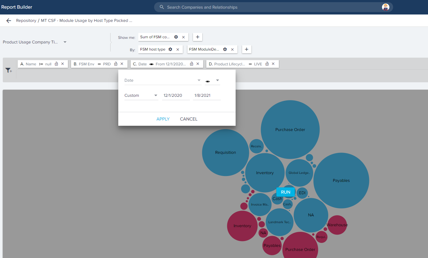
The bubble charts are great ways to see adoption of products/modules of products. But if you could pick a date range (e.g. last 6 months) and watch how the bubble chart evolves, day by day over that period - that would really help us understand how usage of modules/products has been evolving.
Dynamic Graphs
 +1
+1


Sign up
If you ever had a profile with us, there's no need to create another one.
Don't worry if your email address has since changed, or you can't remember your login, just let us know at community@gainsight.com and we'll help you get started from where you left.
Else, please continue with the registration below.
Welcome to the Gainsight Community
Enter your E-mail address. We'll send you an e-mail with instructions to reset your password.