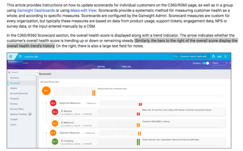
I'm finding many of my users on Scorecard 2.0 tend to scan the Scorecard history via the bar chart of the score. However, the Current Score is not on the chart, and it's slightly counter-intuitive that the Current Score isn't presented graphically alongside the Scorecard History, and thus a trend can be less obvious.
In this example below, the Current Score for this item is 30 (solidly Red). However, if you scan the history from left-to-right for a trend, the user can sometimes think it's green, because the last 5 datapoints from the scorecard history were 100 (solidly Green) and the current datapoint doesn't appear, signifying something is clearly up (or in this case, down) for a customer.
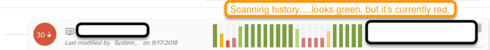
It's mildly counter-intuitive to read from left-to-right, where the user first encounters the current score, then jumps back 26 datapoints and then travels forward in time to the second-to-most-current datapoint. I'd gladly sacrifice the bar chart's left-most "26 datapoints ago" datapoint to gain the current datapoint along side the history.
Especially when the current comments are on the right, one ends up with (left-to-right): Current Score, Scorecard History without current datapoint, Current Comments. It's a bit jumbled to someone who is quickly scanning the page.
(Admittedly, even my Idea title is a bit of an oxymoron.)