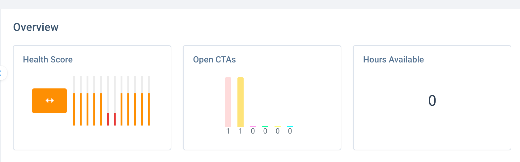
I would love (love love) it if we could use the same bar chart visualisation that CTAs are shown in when using the widget on the 360 for our own choice of metrics also.
Our customers purchase Professional Service hours from us, which are used when spending time with different departments, they fall in to 4 different “buckets” and when our internal users arrange and log meetings on the timeline they need to specify which type of hours to take from (Implementation, Customer Success, Sales Engineering, Data Science) currently we just show a total of all these hours, and they have to check one of the attributes sections to find out which type they specifically have. It would be great if we could just have it visually displayed at the top for them.