
Request For Consistency In Design

  • October 6, 2017
  • 3 replies
  • 19 views

kate_green
Forum|alt.badge.img
Hi Gainsight team,

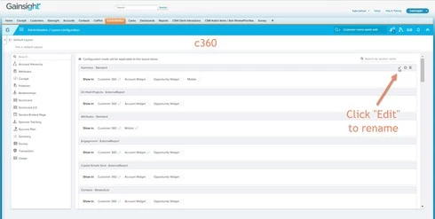
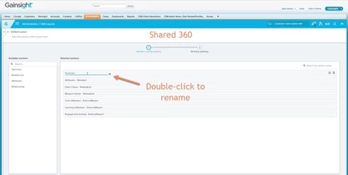
This is my official request for better consistency in the design of the various new features of Gainsight, as it relates to admin configuration.  It seems that on every page, the configuration settings are completely different.  A prime example is the Shared360 Layout configuration page.  You'd think, since it mirrors so closely the C360 Layout configuration page, that the two work in the same way.  However, something as VERY simple as "edit a section name" is different between the two:


While obviously this is a very simple example, more consistency would allow admins to learn (and adopt) new features much more quickly.  

Thanks for hearing me out :) 

3 replies

dan_ahrens
Forum|alt.badge.img+2
  • Expert ⭐️⭐️⭐️
  • October 6, 2017
Hi Kate, 

Thanks for calling this out and I agree that it is an inconsistency. I also noted that in the Available Sections navigation panel we have some inconsistencies in appearance as well. I'll make sure this gets the appropriate internal attention so we can make improvements. 

Thanks again and please keep your ideas and observations coming! :)

-Dan

darkknight
Forum|alt.badge.img+5
  • Expert ⭐️
  • February 26, 2018

darkknight
Forum|alt.badge.img+5
  • Expert ⭐️
  • August 15, 2019
Has there been any additional attention given to this? I notice in some areas of the tool you have a SAVE button, but in others you have a tiny checkbox in the upper right corner (i.e. Success Plan Plan Info)

Would be great to be consistent in all areas.