
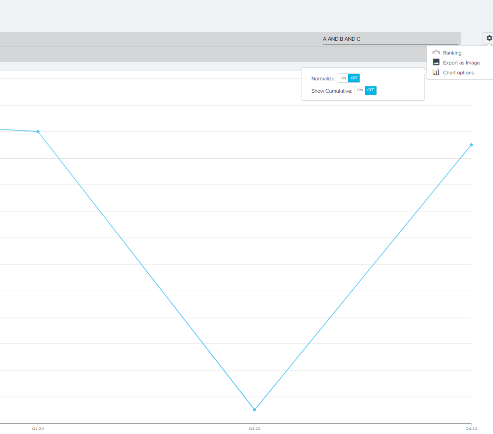
Right now the only option for a chart is “cumulative”, but when the measure is an average, it just adds the averages from each period together. Obvious usecase is rolling OSAT average. Right now I can just do period by period, and if there are only a few survey responses in a period it is very noisy. 


Hi 

Are you wanting to create something like this for your usage or support metrics data? In our purpose built module “Adoption Explorer” that we had built which  helps manage such data - we actually do allow you to say what type of aggregation or slice you want over the period. Can you share what type of reports are you wanting to use this for?

Regards


Hi - No i wanted this for standard report builder. Right now there are only two options, for example a simple line chart, and so when I’m showing an aggregated field (average Overall satisfaction from our survey responses) I can only take average from within the period or “sum up all the averages” which makes no sense. I just want a rolling average.