Scatter when using Date Aggregation (Min and Max)

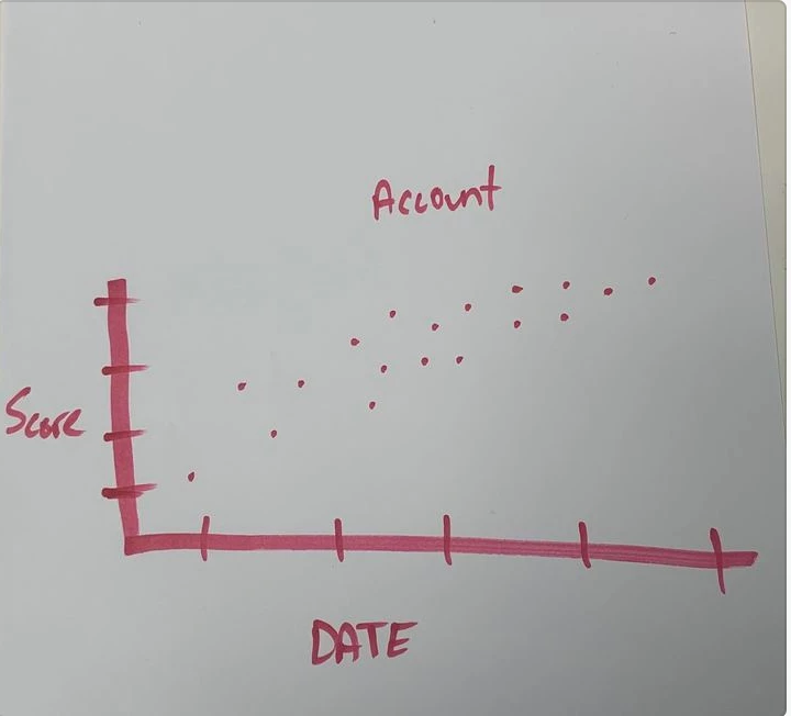
I was trying to help a customer with creating a report. We are trying to show the average health score over time (Min Start Date), by accounts. With the aggregation we are not able to use a scatter. This enhancement woud be to support aggregation on the date field in the MDA, and be able to apply a scatter graph to it. Ideally we would want the report to look like the below image.


Sign up
If you ever had a profile with us, there's no need to create another one.
Don't worry if your email address has since changed, or you can't remember your login, just let us know at community@gainsight.com and we'll help you get started from where you left.
Else, please continue with the registration below.
Welcome to the Gainsight Community
Enter your E-mail address. We'll send you an e-mail with instructions to reset your password.