
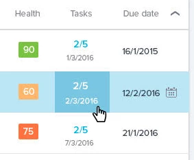
View & hide tasks pop-up boxes are confusing?

  • May 4, 2016
  • 6 replies
  • 4 views

elaine_cleary
The "view tasks" and "hide tasks" pop up boxes that are off to the side are a little confusing. I wasn't sure if I had to move my mouse over to the side to click on them to make something work/happen or not. Anything we can do to make this part of the navigation intuitive?

6 replies

manu_mittal
Forum|alt.badge.img+3
  • Gainsight Employee ⭐️
  • May 4, 2016
You mean the expand all/collapse all option?

elaine_cleary
  • Author
  • Helper ⭐️⭐️
  • May 4, 2016
Just clicking on the number of tasks for an individual CTA

dstokowski
Forum|alt.badge.img+5
  • Gainsight Employee ⭐️⭐️
  • May 4, 2016
i will add that the cursor was not an arrow but an edit line when I hover over Task count to expand it - not really visual cues you would expect.  Agree it was confusing to open the expand tasks and close them.

manu_mittal
Forum|alt.badge.img+3
  • Gainsight Employee ⭐️
  • May 5, 2016
Definitely something that we need to update. There's no indication that this area is clickable.

sidhu
Forum|alt.badge.img+1
  • Gainsight Employee ⭐️
  • May 5, 2016
Following is how we are planning to improve this behaviour.


When you mouse over onto task, the mouse pointer will change to indicate that that area is clickable. The existing tooltip will not be removed. 

steve_davis
Forum|alt.badge.img+2
  • Gainsight Employee ⭐️⭐️
  • May 27, 2016
Tagging this into an idea as it appears this has been addressed already and is no longer a question.