I've been working on some visualizations of customer data recently and wanted to create a visualization of customers by country and found there isn't really a nice way to do that.
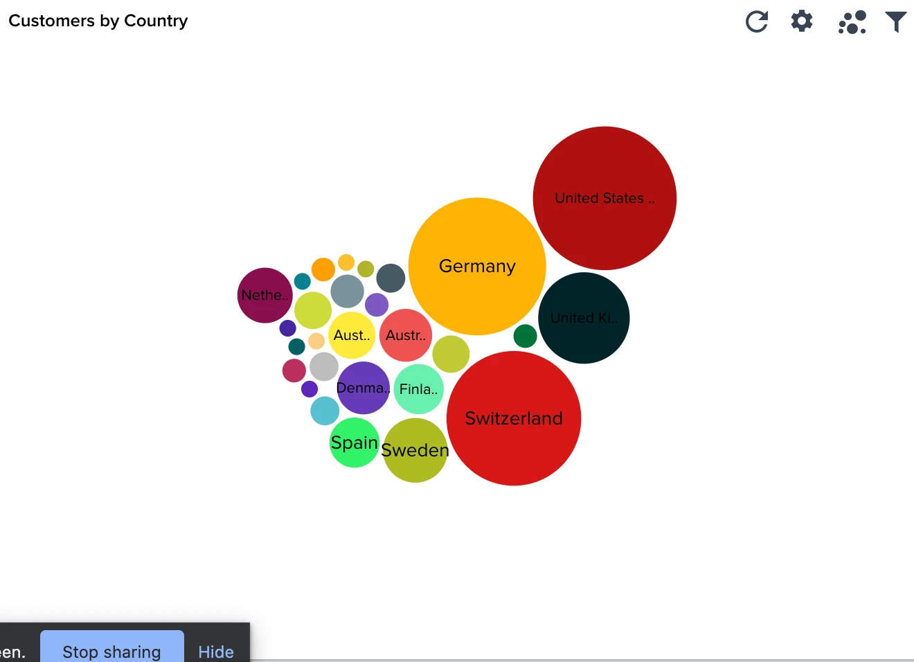
I tried a pie chart but it looks like a mess. I also tried the packed bubble visualization, which could be ok but doesn't take up all the space in the report area so is super difficult to read. Screenshot attached to show you what I mean (there’s really a lot of unused space when I use this visualization).
It would be really cool if there was a map visualization, like in every other BI tool that I've used in the past. This would make visualizing geographical data much easier to read.