
In my role as a TPM here at Gainsight, I often assist customers with strategizing and building their multiproduct integration. Recently, many customers who I previously worked with to establish PX+CS integration have resurfaced with integration issues and concerns. Some of these concerns include:
- The Gainsight Admin that I worked with to set up the integration is no longer with the company and their successor is unaware of pertinent integration information
- The data integration schedules are no longer in sync
- Additional rules have been implemented which are interfering with the integration
Upon reconnecting with customers on these issues, I’ve begun building out visuals to provide a clear, easy-to-understand representation of the data flow between the systems. Admittedly, this was a huge missed opportunity to provide a helpful service to customers the first time around.
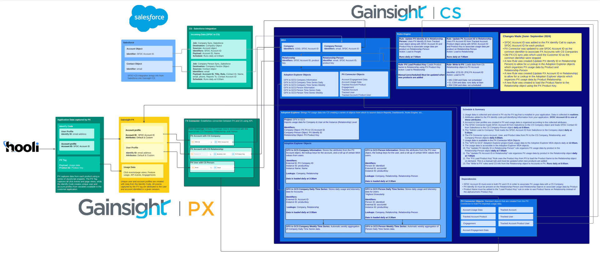
Why It’s Important to Have a Data Model Visual
-
🔎 Clarity & Alignment: Visualizing the data flow helps all stakeholders—product, customer success, and data teams—understand how data moves between PX and CS. It ensures everyone is on the same page about what information is being passed, where it’s stored, and how it can be utilized. This clarity prevents data silos and encourages cross-functional collaboration.
-
📉 Data Accuracy: A data model visual highlights potential gaps, inconsistencies, or misalignments in your integration. You can quickly identify incorrect mappings or missing data points that may affect reporting accuracy or customer health scores.
-
🚀 Optimization & Scalability: As your product and customer base evolve, your data requirements will change. Having a clear visual allows you to scale and optimize the integration efficiently, adding new data points or removing obsolete ones without disrupting the flow.
How & When You Can Use Data Model Visuals
-
🔌 During Initial Integration Setup: When first setting up the PX+CS integration, a visual data model is crucial for mapping out all the data points from both systems.
-
⚠️ For Troubleshooting & Monitoring: If you notice discrepancies in reports or customer success metrics, the data model visual can act as a blueprint for troubleshooting.
-
👩🏻🏫 For Team Training & Onboarding: When onboarding new team members to the Gainsight ecosystem, having a visual guide to the data model makes it easier for them to understand the integration without getting bogged down by technical jargon.
-
📈 When Expanding Features or Metrics: If your team introduces a new product or decides to track additional metrics in PX, updating the data model visual helps ensure these changes are smoothly integrated into CS without disrupting existing workflows.
What to Include in a Data Model Visual
- PX Account & User identifiers and important attributes
- PX Connector details
- Integration with other systems impacting the integration
- Adoption Explorer project details
- Relevant Rules and Rule Chains
- Affected objects and where/how data is populated
- Schedule- note the times that each job loads data
- Dependencies- which systems are dependent on one another?
- Recent changes/updates made to the integration (with dates)
Data Model Visual Tips
-
🗓️ Regular Updates: As your integration grows and evolves, regularly update the visual to reflect any changes in data points, flows, or metrics. Schedule a quarterly review of the integration to ensure your visual model is up-to-date with any product updates or customer needs.
-
🛠️ Use Dynamic Tools: Leverage diagramming tools like Lucidchart or Draw.io, which allow for easy modifications as your data model changes.
-
⚙️ Version Control: Keep track of different versions of the data model as your systems evolve. This ensures that if an update or change leads to an issue, you can easily roll back to a previous version and troubleshoot effectively.
Data model visuals are not just a technical aid—they’re a strategic asset for making the most out of your Gainsight PX+CS integration. By offering clarity, fostering collaboration, and ensuring data integrity, they provide a strong foundation for delivering better product experiences and improving customer outcomes. Take the time to build, use, and maintain your data visuals regularly, and you’ll see long-term benefits in your Gainsight operations.