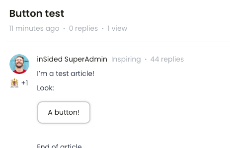
Not sure if this is possible because afaik you can't add HTML of CSS in an Article. Is there an easy-ish way to add CTA-buttons in de text of an Article? I think it would look clean and it would be more in line with our regular .com site...
You can make it look like it’s possible with a little bit of trickery :)
I’ve added the following CSS to my custom-css, which makes any of the red callouts, on a specific article (36), in a specific category (42) look like a sort of button.
/* add a button to a specific topic's cta */ body.category-42.topic-36 .callout-red{ background-color: white; border: 2px solid #CCC; padding: 0; border-radius: 10px; display:inline-block; box-shadow: 0 0 5px -1px rgba(0,0,0,0.2); } body.category-42.topic-36 .callout-red a { text-decoration: none; padding: 10px 20px; display: inline-block; }
Please adopt the style to your community, so that they look like your buttons! This really is meant as a proof of concept.
From what I can tell this isn’t currently possible. The best option is to add hyperlinked text using the link function. If you want to call it out as much as possible you can link text in a Callout feature in the text editor for articles!
There’s an Idea opened to allow for more robust editing using “Source”. Definitely take a look to see if it interests you! The comments might also have some helpful information for workarounds ?
From what I can tell this isn’t currently possible. The best option is to add hyperlinked text using the link function. If you want to call it out as much as possible you can link text in a Callout feature in the text editor for articles!
Hi! Yeah, that''s the way we do it now, but y’know, I like buttons. ? Looks a lot better imo.
This way is also handy, but it is a bit large.
There’s an Idea opened to allow for more robust editing using “Source”. Definitely take a look to see if it interests you! The comments might also have some helpful information for workarounds ?
Upvoted that one the moment I saw it. ;) I hoped there would be some work around but I guess not.
You can make it look like it’s possible with a little bit of trickery :)
I’ve added the following CSS to my custom-css, which makes any of the red callouts, on a specific article (36), in a specific category (42) look like a sort of button.
/* add a button to a specific topic's cta */ body.category-42.topic-36 .callout-red{ background-color: white; border: 2px solid #CCC; padding: 0; border-radius: 10px; display:inline-block; box-shadow: 0 0 5px -1px rgba(0,0,0,0.2); } body.category-42.topic-36 .callout-red a { text-decoration: none; padding: 10px 20px; display: inline-block; }
Please adopt the style to your community, so that they look like your buttons! This really is meant as a proof of concept.
Maybe this doesn’t help at all, but want to share what we’ve done to include buttons 😊
I have the same use-case as our main site uses buttons in texts.
What i have done instead is to customize the spoilers to look like buttons. It doesn’t work as a button where you are directed somewhere else, but I think it brings a more seamless experience between our two websites aestheticly. It looks like this:
So the standard heading-sizes in InSided is H1, H2 and H3. So when creating an article I thought maybe we could assign one heading as a “Button heading”. Lets choose “H6”, since we never use or have used the H6-heading.
Create the content of the article. The button in my case reads “Click here” and I have hyperlinked it using the “insert link” button:
Go to the HTML-editor, and change the “Click me” paragraph from “<p><a href=yourlink>Click here</a></p>” to “<h6><a href=yourlink>Click here</h6>”:
Now we have an article that looks something like this:
Now I add this styling in the custom-CSS panel, and directly towards the H6, and H6 Anchor tag - the styling is our brand styling, so you might want to change som colors and stuff:
If you already have a profile on Gainsight Community or Gainsight University, there's no need to create another one. If your email address has changed or you can't remember your login, email community@gainsight.com.
Otherwise, continue with the registration below.