I just started making an image template for articles but found different aspect ration between two post types. Do we know why the ratio is different? And can I set the Event image specs to the same ratio as the Article image specs?
Article = 1440 x 640
Event = 600 x 300
Page 1 / 1
Hi @juan.delrio
Firstly sorry for the delayed response here.
Secondly thanks for highlighting the difference.
I can only imagine the specs are different to cater for the different size of the display widgets.
The sizes are minimum to keep definition. But I get that the ratios are different.
We do have a style guide to assist on assets:
I am roping in our designer @Silviu for any input.
Hello @juan.delrio,
I must say as @Alistair FIeld mentioned that we just recommend the best sizes to ensure the best display on different screen sizes, but if I am not mistaken, you can upload any image size and it will be cropped accordingly to match the aspect ratio for Events or Articles.
I hope this helps.
Hello Silviu! I was just trying to be more efficient making graphics. If I set a single template for article thumb/header graphics, I could use the same template for all articles if the aspect ratio was the same. As it is not, I have to refactor the elements in the graphics to fit in different aspect ratios.
Multiple templates it is then. Thank you for your response!
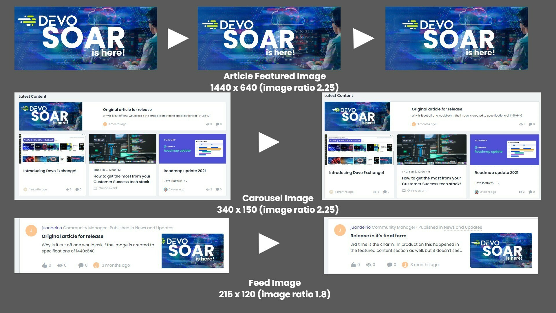
I am just revisiting this topic with a current example. I had to remake this image 3 times to get it to fit properly in the activity feed and the feature articles section. The guess work is not my favorite feature.
Hello @juan.delrio,
I must say as @Alistair FIeld mentioned that we just recommend the best sizes to ensure the best display on different screen sizes, but if I am not mistaken, you can upload any image size and it will be cropped accordingly to match the aspect ratio for Events or Articles.
I hope this helps.
Right, it is this cropping that is causing issues due to the different aspect ratios of the image slots in use by the post and the feed. Currently we have no tools to help fix these kinds of issues. What looks good for the post image does not work for the feed. You have to keep fixing in trial and error. The article featured image has a ration of 2.25 same as the carousel. But the feed has a ration of 1.8. This I argue should be corrected to 2.25 so we can use the same image with out corrections. I hope this image expresses my point.
If you ever had a profile with us, there's no need to create another one. Don't worry if your email address has since changed, or you can't remember your login, just let us know at community@gainsight.com and we'll help you get started from where you left.
Else, please continue with the registration below.