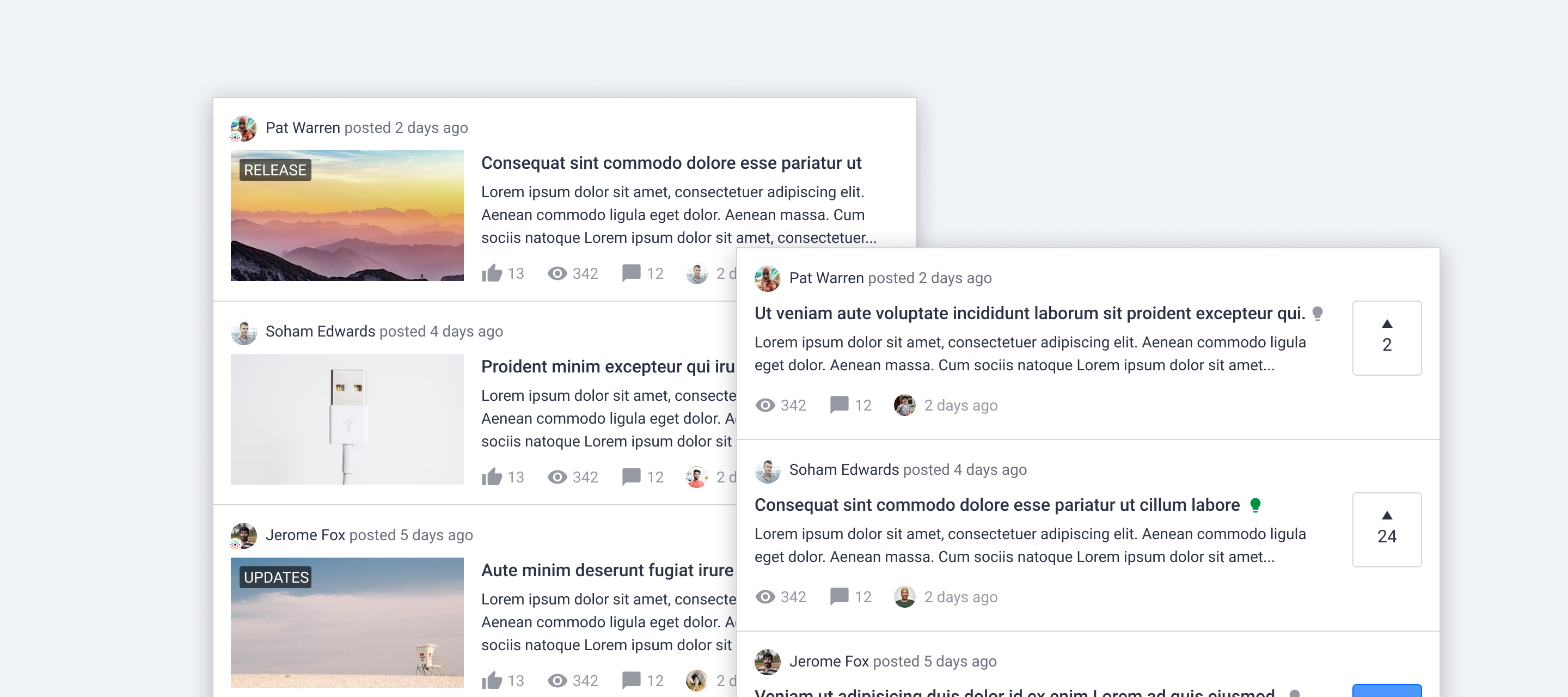
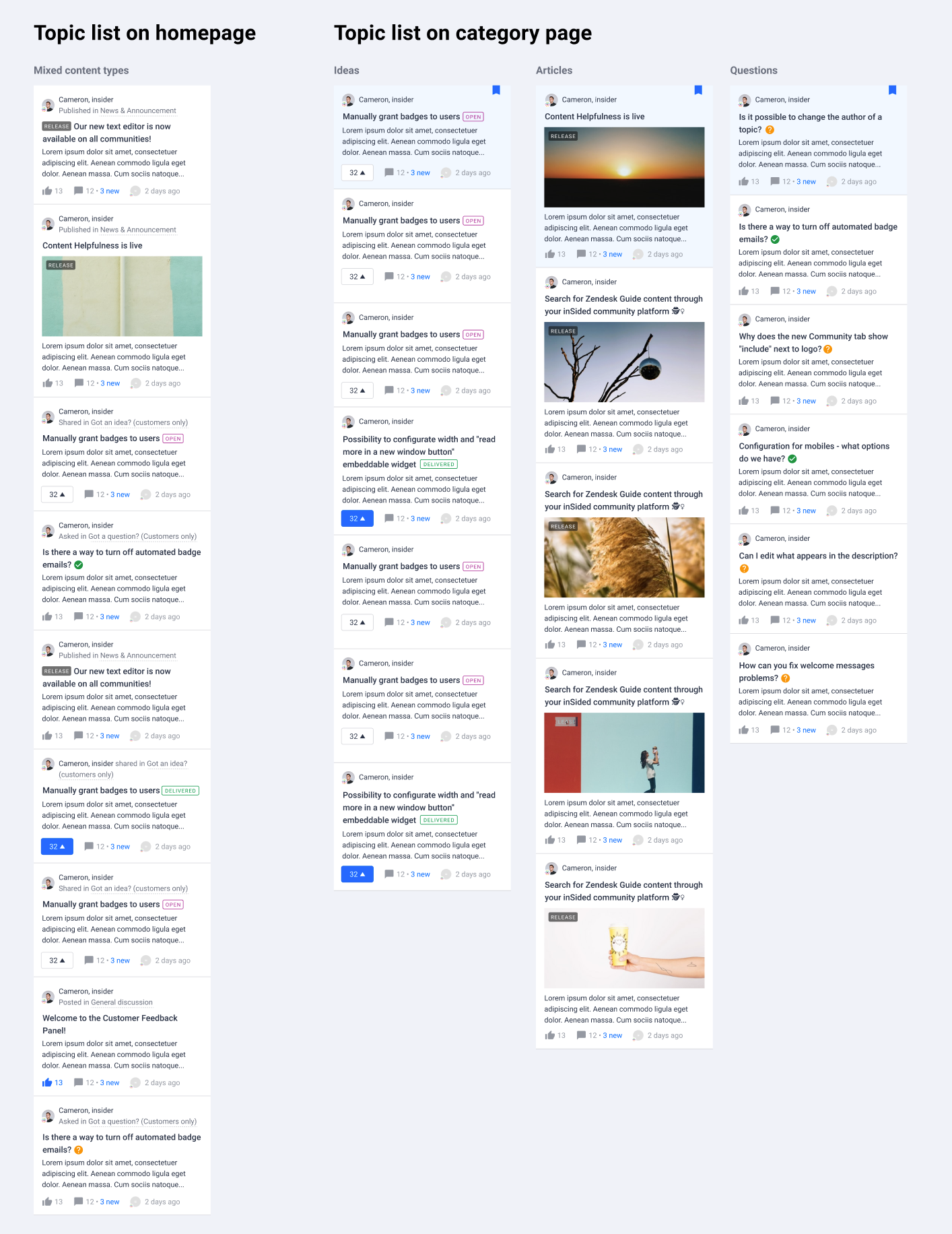
At this moment we are working on optimising the way to display topic lists. We came up with a new look for all content types, in order to:

  1. Make the user experience more consistent across the platform
  2. Distinguish different content types visually
  3. Make content easier to scan


💡 Concept

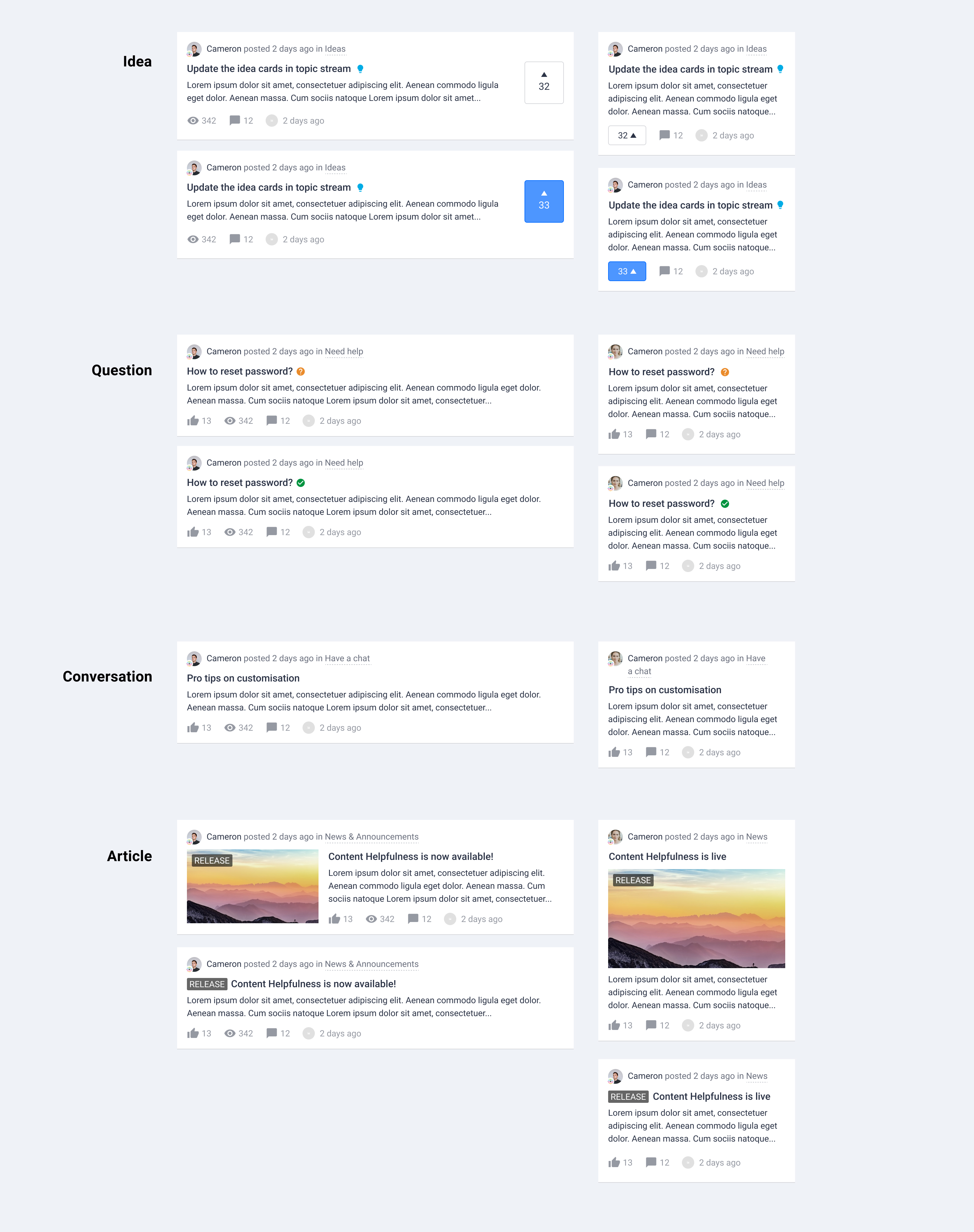
Different content types in topic list
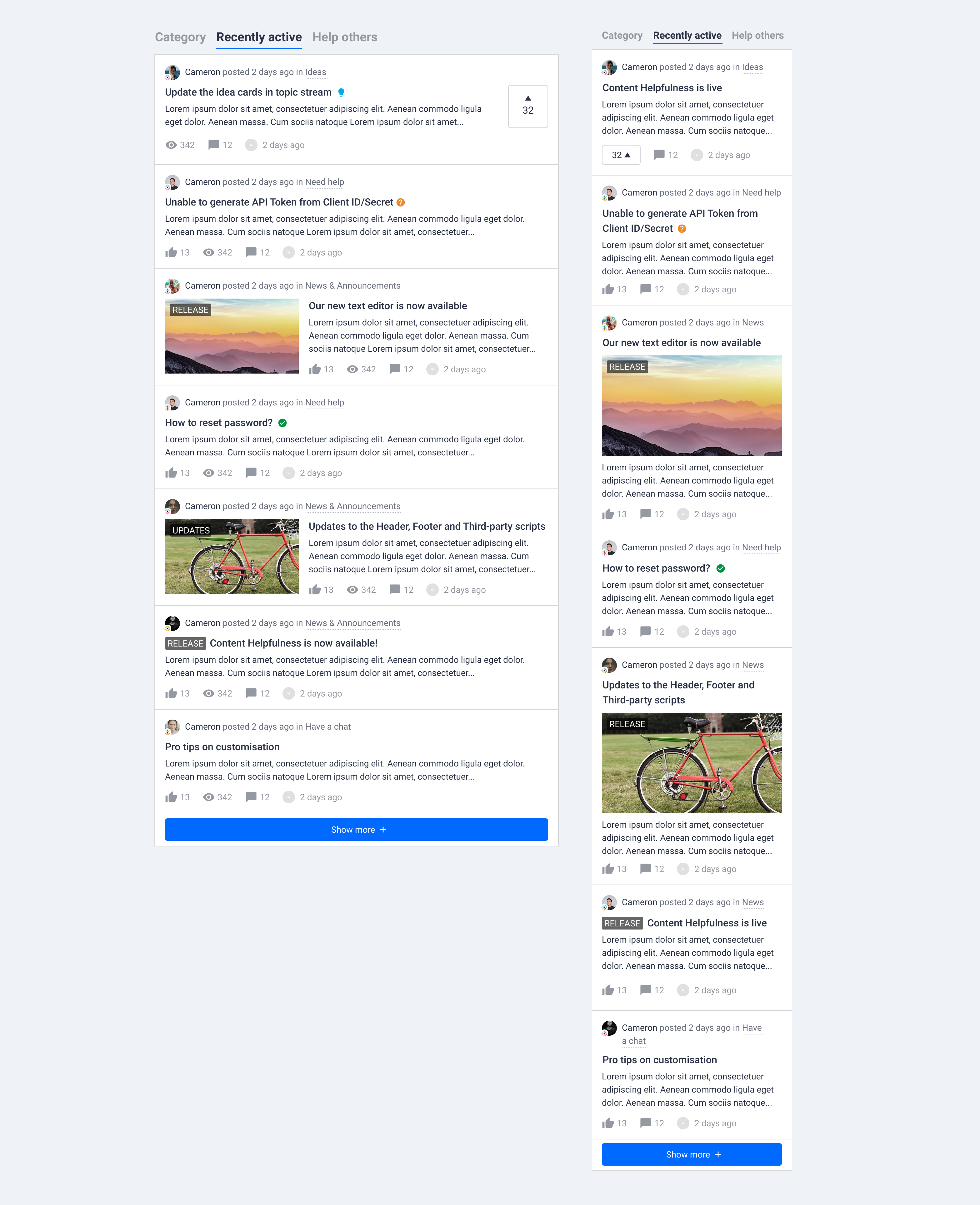
A topic list with different content types
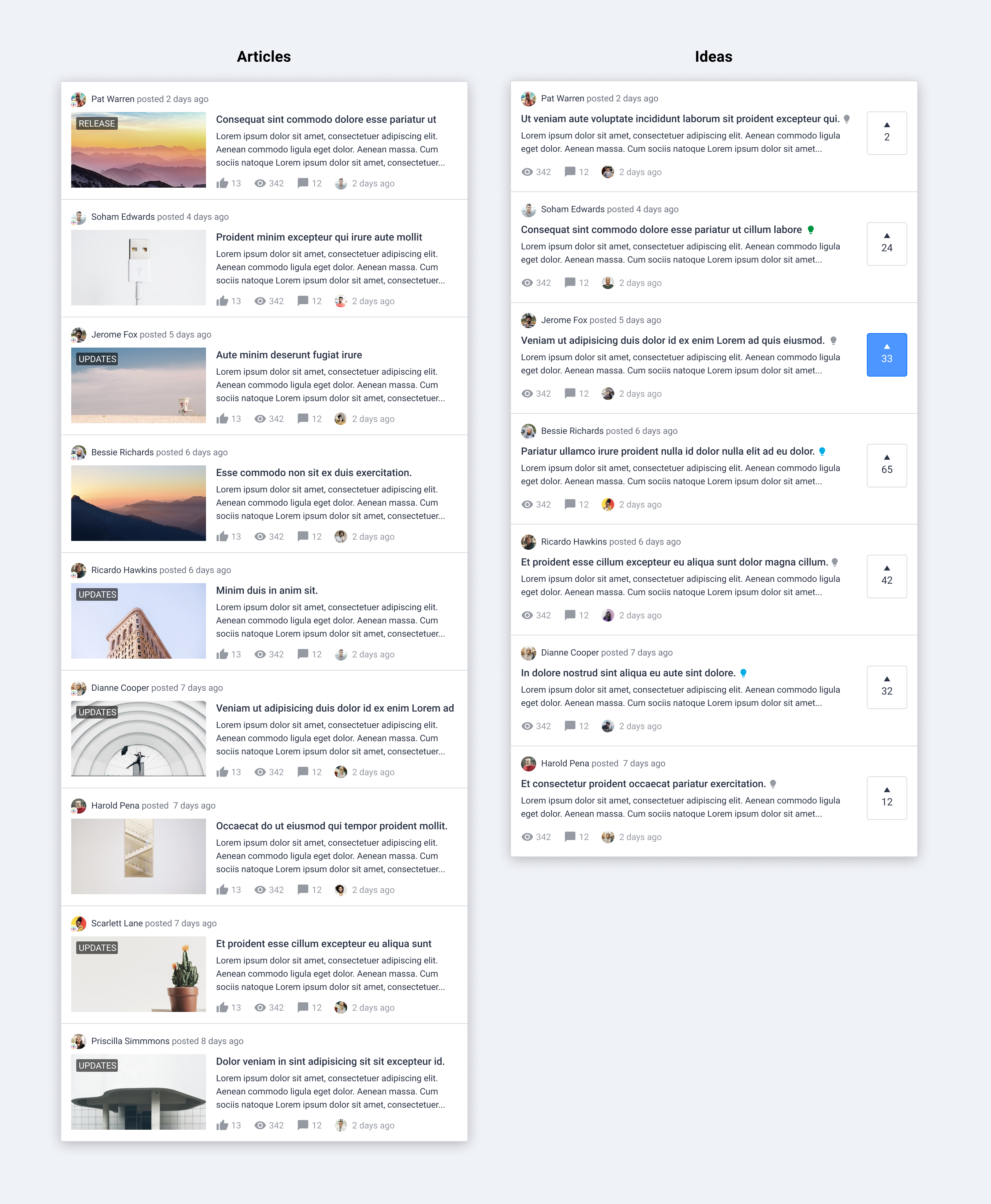
Topic list with all articles or all ideas in new layout
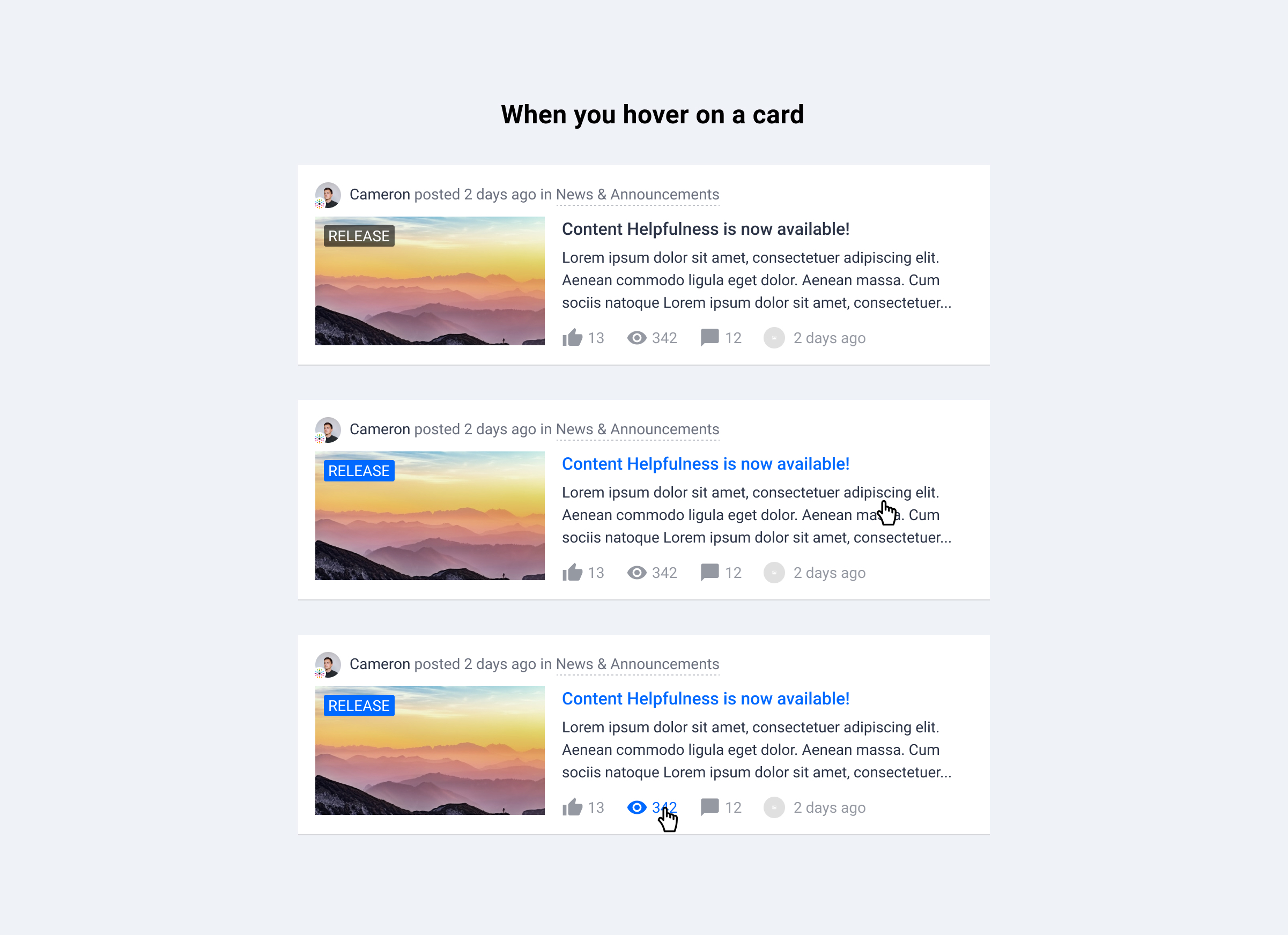
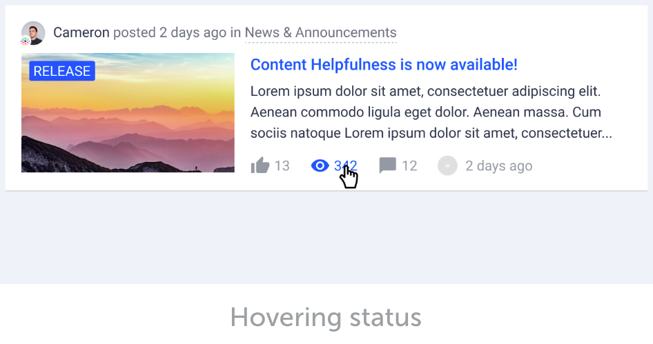
Hovering status

:clipboard: Changes

  1. General layout changes
    • Smaller author avatar
    • Rank title is removed, but rank icon will still be shown if available
    • Change the color of user name from brand color to text color
    • Display post date next to author
    • Display category info next to author, parent category is now shown
  2. Upgraded article card in topic list
    • Remove border around image and content
    • Show content right below the title
    • Show label on image if there is a featured image
  3. Upgraded idea card in topic list
    • Highlight the vote action as well as the amount of vote on desktop


:speech_balloon: Q&A

  1. Where would this change apply to? 
    • This change is planned for all the page with topic lists. For example, home page, community (parent) category page, search results, recently active topics, answered questions, etc.
    • Note: topic lists in knowledge base categories will not be updated. 
  2. Why smaller avatar?
    • We’ve noticed that a big amount of users in community don’t have an avatar. Additionally, a smaller avatar saves a lot of spaces in the topic card. 
  3. Why change the color of user name?
    • Instead of highlighting author’s username, we would like to guide user’s attention more towards the topic title and content. 
  4. Is there any plans to make idea status (light bulb icon) more clear? 
    • This is not covered in this project, but that’s something we have eyes on. 
  5. Why change the idea button?
    • Vote is the most important interaction for ideas. By highlighting it with a different position and bigger size, we would like to encourage interactions, and also make it easier to see and compare the amount of votes. 


:information_desk_person: Questions for you

  1. Do you miss any information from the new design?
  2. Is there any information you find not important to display in preview? 


We are happy to hear your feedback and answer any questions. Please drop a comment below and let us know your thoughts. :)

My first impression: I like it. It looks coherent and the focus is on the right information. I’ll take a closer look in a few days.

Questions, that initially popped into my mind:

  • How will titles with line-breaks behave? Will the title be cut so it’s always displayed on one line or will the block become larger?
  • How will preview texts with more or less content behave?
  • The article labels are quite dominant when they are placed on the small preview images, I feel they should have a smaller font-size (but that could make it incoherent compared to the label when there is no preview image)

Thanks for your feedback @bjoern_schulze !

How will titles with line-breaks behave? Will the title be cut so it’s always displayed on one line or will the block become larger?

That depends on the card style and viewport. The idea is to have a max amount of lines for title and content and cut the rest of the text to make sure the card won’t get too big. Is it something you would expect?

How will preview texts with more or less content behave?

If there is more content, it will be cut when it reaches the max amount of lines. If there is less content, we show it all. 

The article labels are quite dominant when they are placed on the small preview images, I feel they should have a smaller font-size (but that could make it incoherent compared to the label when there is no preview image)

The label size should remain the same as what we have now. I noticed that the label text in the designs above is a bit bigger. You are correct, they should have a smaller font-size. 


Yes, we desperately want our content to be easier to scan! One of the common complaints we get is that community members simply can’t find the content they’re looking for. It seems that currently there is a lot of white space that could go to good use. For this reason, this change, in particular, seems most valuable: Display category info next to author, parent category is now shown, as it’s no longer taking up its own line.

Just to clarify – the date that the topic (first post) was created is displayed along the top while the date of the most recent post (reply) is displayed along the bottom?

Most of our community members do not use profile pictures, so making the author avatar smaller is no problem, especially if it contributes to reduction of white space. 

I also like not highlighting the community member’s username as often I accidentally click that when I want to read the post itself.

I really like highlighting the vote button; we’ve gotten prior feedback from our community that they don’t see it or don’t even realize it’s a topic they can vote on.

Re: the hovering status – I like it! It’s not clear to me the value of highlighting in blue any of those items on the bottom line (in example, the # of views is highlighted), as these items do not lead to distinctly different places – why highlight one and not the others? I’d expect just the label and the title to be highlighted in blue. If one is highlighted, it suggests to me I’ll be led to different pages depending on whether I click when hovering over the likes, the views, or the comments icons.

One current behavior I’ve noticed in articles is that line breaks are not honored in the preview (when the post is featured or shown in a list). It would be really great if if this could be improved as it looks unprofessional, and I’m not in the habit of thinking “I need to add an extra space to the end of this line before I publish.” For example:


@LPortalupi Happy to see you’re positive about the new design :slight_smile:


For your questions:

Just to clarify – the date that the topic (first post) was created is displayed along the top while the date of the most recent post (reply) is displayed along the bottom?

You are right. The topic publish time is displayed on top, and the most recent reply time is displayed on bottom next to other metadata. 


It’s not clear to me the value of highlighting in blue any of those items on the bottom line (in example, the # of views is highlighted), as these items do not lead to distinctly different places – why highlight one and not the others?

These metadata icons will only be highlighted once a user hovers on it. If you hover on the card, only the label and title will be highlighted in blue. Does it make sense? 


One current behavior I’ve noticed in articles is that line breaks are not honored in the preview (when the post is featured or shown in a list). 

We are aware of this problem, and we are working on the fix currently. 


Looks alright. Nothing groundbreakingly awesome or weird. :)

I think that honoring the content creator, by ensuring that they’re easily recognised, is a decent thing to do - it’s a community after all, not a static support page. I already think the avatar is a liiiiittle too small, so making it even smaller won’t have my vote. vAlso, if you remove the users rank, it will only show up on the users profile page, as it’s not currently shown in topics. - again removing some key aspects of that sweet, sweet community feel. ] edit: I was looking at a topic with users that had their ranks taken off display.

I straight up don’t like the new ‘comments’ bubble. That whole line of icons and data points need a good do-over by someone with a ruler. 😃 Also, what is the point of showing views? Isn’t that some of the information that would be better shared, once the topic has been opened, to open up for some other information? For instance ‘number of participants’.
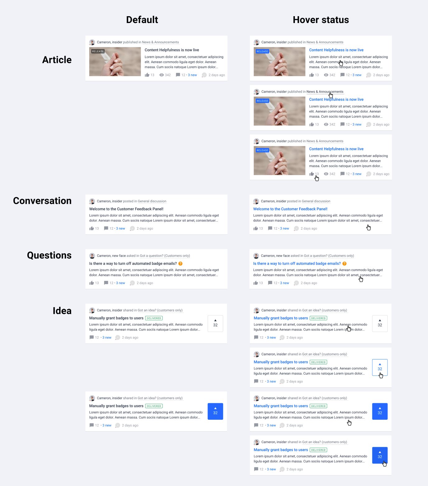
The color change on card hover has the potential to be rather explosive if it uses brand colors (and which brand colors?) - any chance it could slightly pop out on hover instead? (just a bit, not ‘96 web-design style)

Suggestion: As a way of differentiating between different content styles, you could change the “<username> posted # days ago” to:

Question: <username> asked # days ago

Discussion: <username> posted # days ago - (The same, original style)

Article: <username> published # days ago

Idea: <username> shared # days ago


With regards to the question mark and check mark on Question topics, can that be moved to be at the front of the topic title, instead of at the end? Those are the only two colors I’ve not been able to find a way to change, yet, so it looks rather jarring when they’re hovering in their brightness, in the middle of a page.

Cheers,

Ditte


@LPortalupi Happy to see you’re positive about the new design :slight_smile:

For your questions:

It’s not clear to me the value of highlighting in blue any of those items on the bottom line (in example, the # of views is highlighted), as these items do not lead to distinctly different places – why highlight one and not the others?

These metadata icons will only be highlighted once a user hovers on it. If you hover on the card, only the label and title will be highlighted in blue. Does it make sense? 


Yes, I understand that’s the expected behavior. However, the behavior doesn’t make sense to me. In my experience, hovering over something in grey and having it turn into a highlighted color like blue usually means it’s a link that can be clicked on. But if none of these items leads to a unique page with additional insights about views, comments, etc., then I think it is confusing for users. (It would be confusing for me.) If my explanation doesn’t make sense, please let me know and I will try again. :) 


@LPortalupi 

Your explanation is clear. It is a valid point that the meta doesn’t lead to unique page, e.g. views. Ditte also mentioned about this. I can think of 2 ways to display metadata ‘views’:

  • Display in topic cards only if this topic is an article
  • Or: Don’t display in topic list for all topic types but on topic page

What do you think?


@Ditte Nice feedback, thanks!

Suggestion: As a way of differentiating between different content styles, you could change the “<username> posted # days ago”…

Good idea! :)

With regards to the question mark and check mark on Question topics, can that be moved to be at the front of the topic title, instead of at the end? Those are the only two colors I’ve not been able to find a way to change, yet, so it looks rather jarring when they’re hovering in their brightness, in the middle of a page.

The placement of question and checkmark is not configurable at this moment. You can configured question mark color by Question color and check mark color by Success color. They can be found in ‘Appearance > Colors’ in control. 

Also, if you remove the users rank, it will only show up on the users profile page, as it’s not currently shown in topics. - again removing some key aspects of that sweet, sweet community feel.

I see your point. There are some different opinions about whether users rank should be shown in the topic cards. I would like to see more comments about it. 


There are some different opinions about whether users rank should be shown in the topic cards. I would like to see more comments about it. 


How about giving community managers the opportunity to choose what to show in the cards?

In general - please give community managers the opportunity to customize more things to personalize our communities :)


@LPortalupi

Your explanation is clear. It is a valid point that the meta doesn’t lead to unique page, e.g. views. Ditte also mentioned about this. I can think of 2 ways to display metadata ‘views’:

  • Display in topic cards only if this topic is an article
  • Or: Don’t display in topic list for all topic types but on topic page

What do you think?​​​


Hi @xiaoyu-shen. I would prefer to just keep the metadata icons grey when hovering over them. :) 


Hi @LPortalupi, the problem about space in preview is fixed. A space will be added automatically before a new paragraph. :slight_smile:


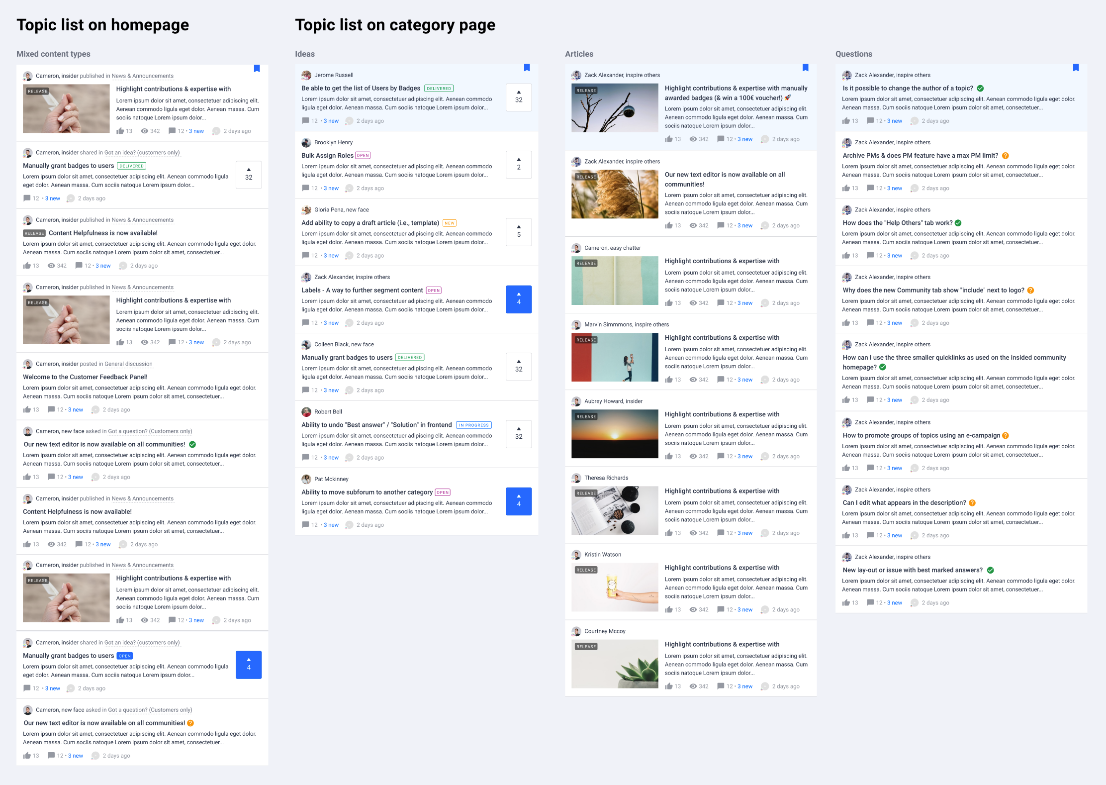
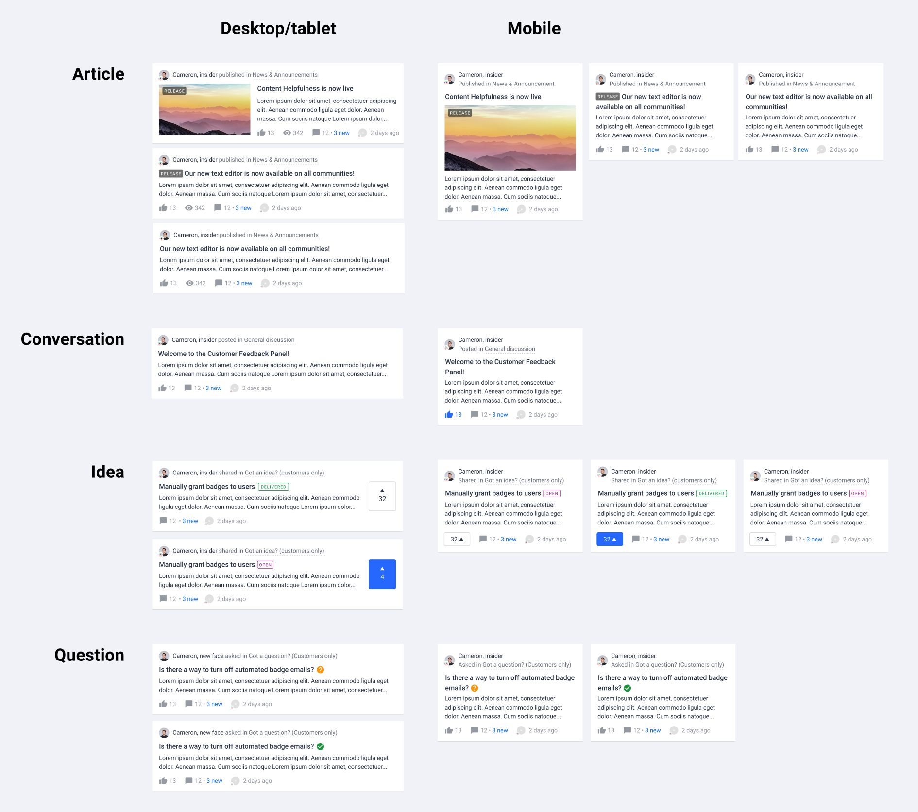
Thanks all for your great feedback and ideas! Here comes the topic list design 2.0. 🥁🥁🥁

🎨What’s changed comparing to the first version

  1. Display rank title next to user name
  2. Improve the mobile view of author and category information
  3. Improve idea status visibility using status label
  4. Subtle hover effect for metadata
  5. Amount of views are only displayed on desktop for articles
  6. Distinguish the content types using different verbs next to author information
Different content types in topic list
Hover status
Desktop/tablet view
Mobile view

We are super curious about your opinions. Let us know by leaving a reply below :)


Really like the new layout - looks clean. I might have missed it but when do you plan on rolling this out?


Edit: wrong topic 


Reply