

InSide Design: Topic list
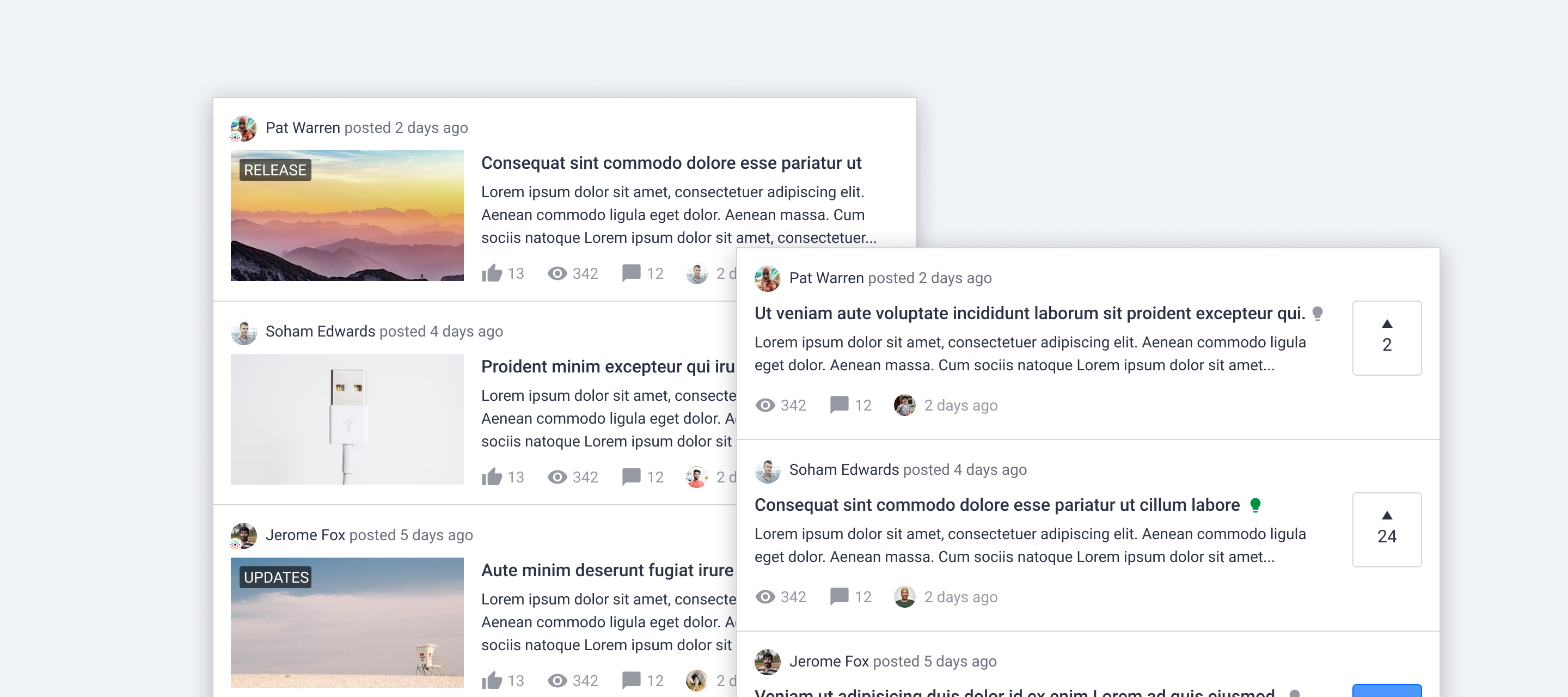
At this moment we are working on optimising the way to display topic lists. We came up with a new look for all content types, in order to:
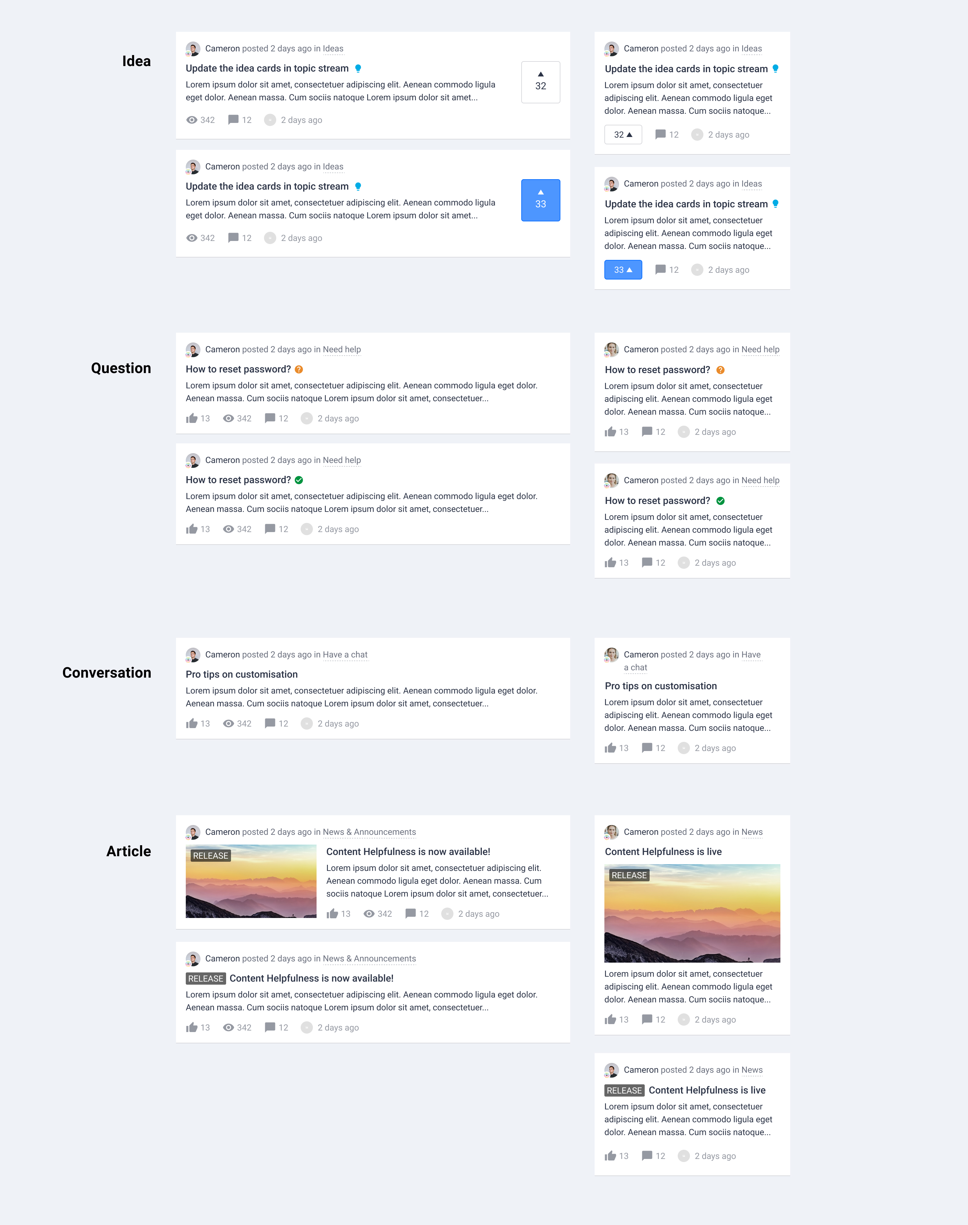
- Make the user experience more consistent across the platform
- Distinguish different content types visually
- Make content easier to scan
 Concept
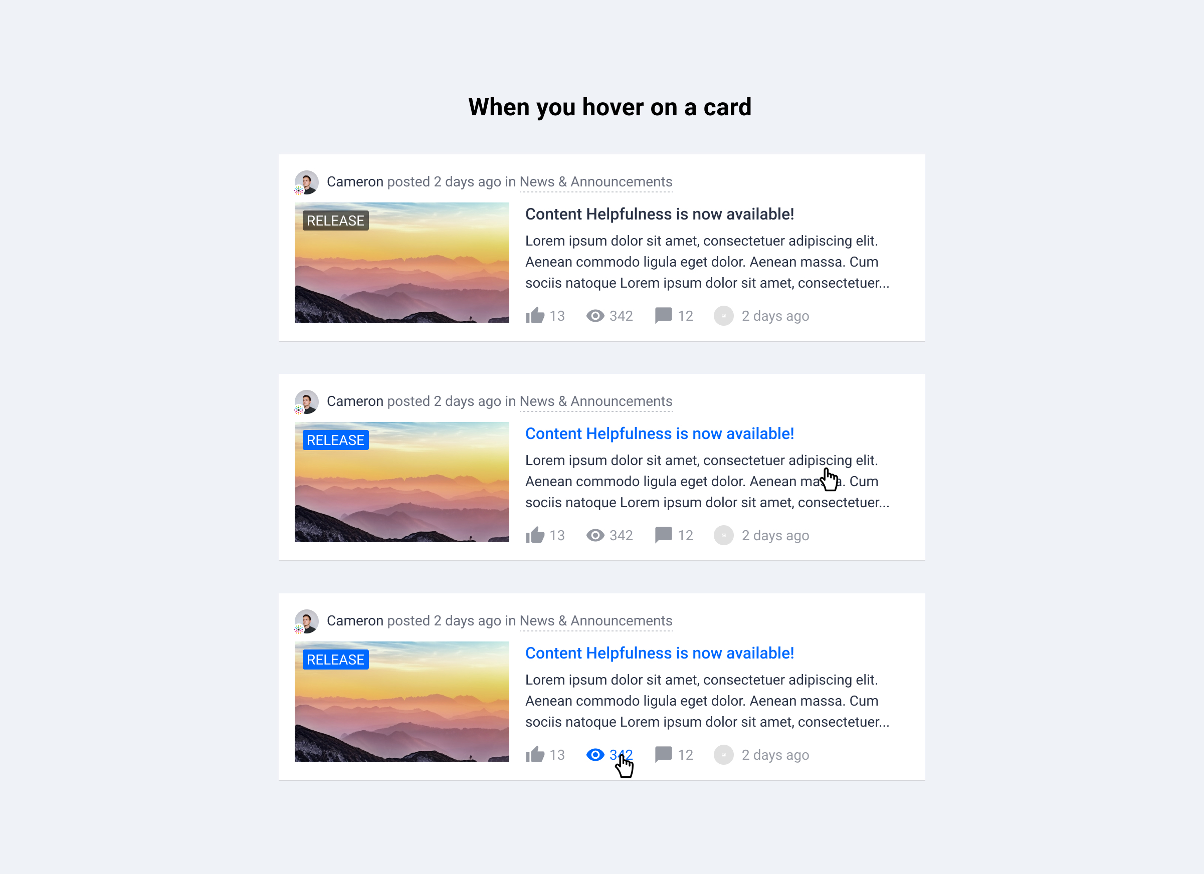
 Changes
- General layout changes
- Smaller author avatar
- Rank title is removed, but rank icon will still be shown if available
- Change the color of user name from brand color to text color
- Display post date next to author
- Display category info next to author, parent category is now shown
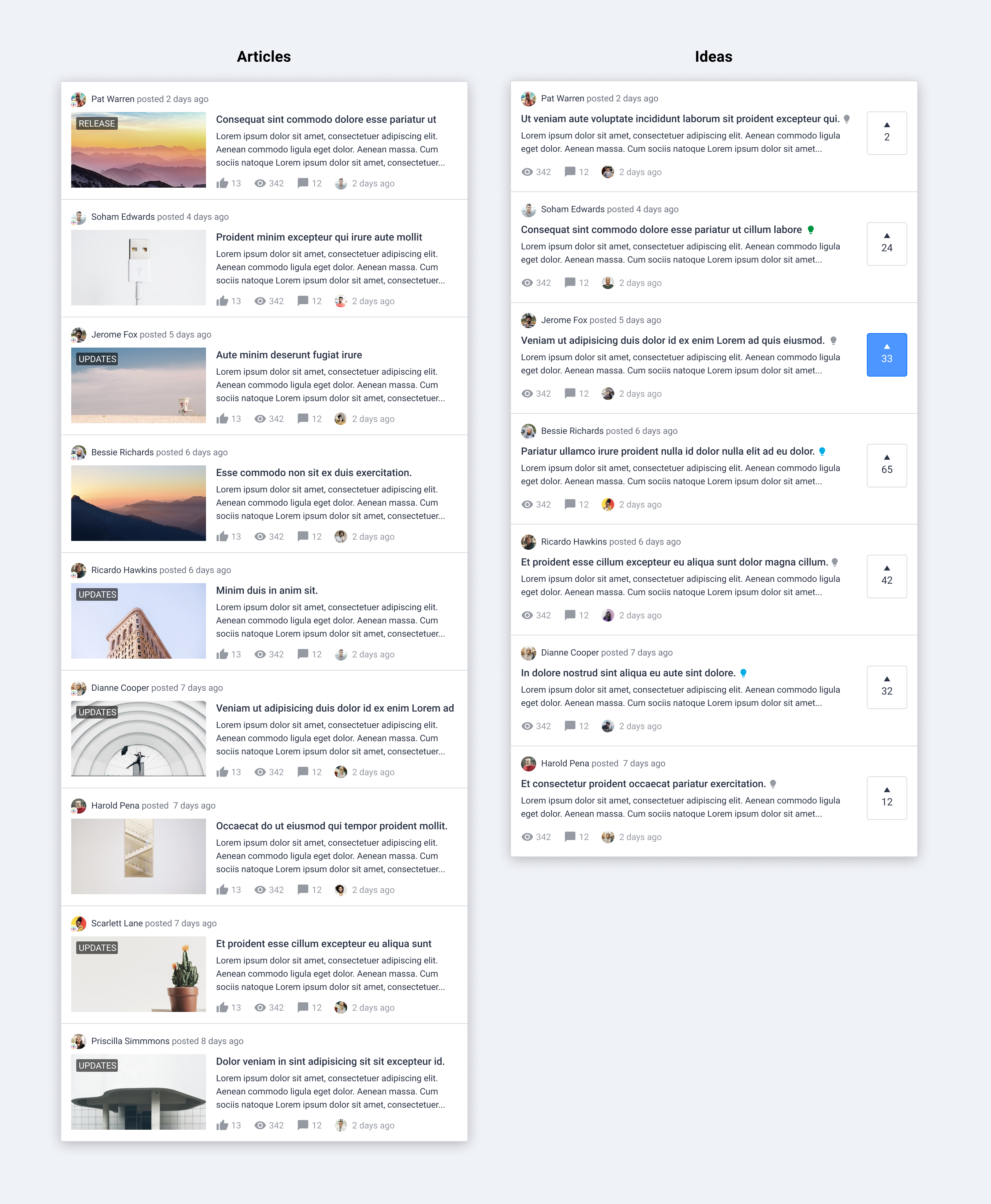
- Upgraded article card in topic list
- Remove border around image and content
- Show content right below the title
- Show label on image if there is a featured image
- Upgraded idea card in topic list
- Highlight the vote action as well as the amount of vote on desktop
 Q&A
Q&A
- Where would this change apply to?
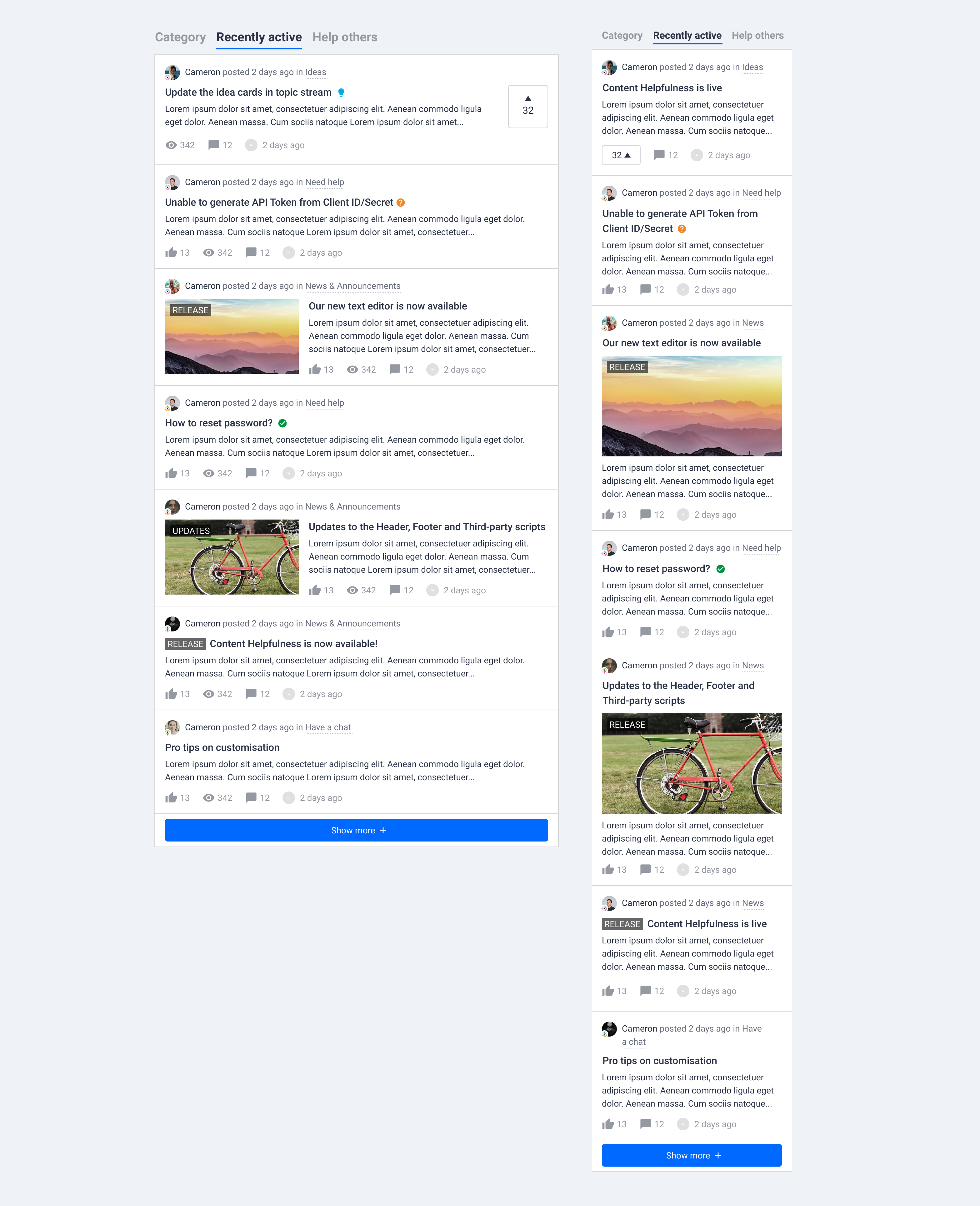
- This change is planned for all the page with topic lists. For example, home page, community (parent) category page, search results, recently active topics, answered questions, etc.
- Note: topic lists in knowledge base categories will not be updated.
- Why smaller avatar?
- We’ve noticed that a big amount of users in community don’t have an avatar. Additionally, a smaller avatar saves a lot of spaces in the topic card.
- Why change the color of user name?
- Instead of highlighting author’s username, we would like to guide user’s attention more towards the topic title and content.
- Is there any plans to make idea status (light bulb icon) more clear?
- This is not covered in this project, but that’s something we have eyes on.
- Why change the idea button?
- Vote is the most important interaction for ideas. By highlighting it with a different position and bigger size, we would like to encourage interactions, and also make it easier to see and compare the amount of votes.
 Questions for you
- Do you miss any information from the new design?
- Is there any information you find not important to display in preview?
We are happy to hear your feedback and answer any questions. Please drop a comment below and let us know your thoughts. :)