Good day!

Was there an update to either the Mega Menu or Custom Pages to change the spacing of the items within the Mega Menu?

Before, we had everything easily displayed on one line

but now everything is bumped up to two lines:

I do notice the addition of a Spaces section within the Mega Menu settings that wasn’t there before:
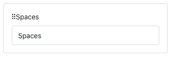
I don’t see a way to hide or disable this. I’d like to get things back to a single line, as multi-line looks messy.


Thoughts?

-Sam

Hey @Sam77 

You can make some changes via .CSS to have everything spaced together!
Below is an example that may help -


Here is what we are using in our community:

/* Center Top Mega Menu
------------------------------*/
.header-navigation-items-wrapper {
display: flex;
justify-content: center;
color: #FAFAFA;
font-weight: bold;
font-size: 14.5px;
padding: 20px;
margin-left: -5px; /* Adjust this value to fine-tune the spacing */
}

Thee margin-left:-5px adjust the values on your mega menu to left to create space. you could try values like -10px, -20px

The second thing I would try is font-size and adjusting it to be a lesser value than what you currently have it at!


Hope this helps and good luck!


Anthony


Good day, @Sam77 

As a quick solution, I can suggest to apply the following Custom CSS:

#customcss #root .header-navigation_list-item {
white-space: nowrap; /* forces text to be in one line */
}

#customcss #root .header-navigation_list_item > * {
margin-right: 16px; /* reduces the spacing between items */
}

In the meantime, we identified the way to improve Main menu responsiveness, so soon the custom css fix won’t be needed!


Thank you @CC Admin! That worked perfectly!!


Reply