I’m working on a new look and feel of our communities, and I’m wondering where I can see the Warning button in action? What do I have to do to get it to pop up?
Also, I don’t seem to be able to find where I can change the placement of, and customise the color scheme of the breadcrumb bar, any hints? :)
in addition I’m wondering how I can customize the side widgets? Currently they’re all just default text on default background, and they kinda drown amongst each other.
Thanks in advance for any information :)
Cheers,
Ditte
Page 1 / 1
Also, the Sub category stats/subscription bar - how do I customize that?
Hi @Ditte! Those are a lot of questions, I’ll try to answer each one below quoting each one:
I’m working on a new look and feel of our communities, and I’m wondering where I can see the Warning button in action? What do I have to do to get it to pop up?
I’m actually not sure how to pop-up this warning button, I believe this button might be currently disabled as it is an old feature - I will ask our team internally and get back to your here.
Also, I don’t seem to be able to find where I can change the placement of, and customise the color scheme of the breadcrumb bar, any hints? :)
For the breadcrumb bar, it is not possible to change the placement as far as I know but I’m not sure what you mean here? Are you looking to change the position the page?
For the colors scheme, you can use Custom CSS - as an example:
.breadcrumb-item-link { color: red !important; }
Also, the Sub category stats/subscription bar - how do I customize that?
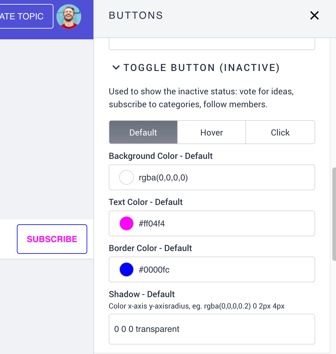
You can customize the subscribe button with the Buttons feature on the frontend:
in addition I’m wondering how I can customize the side widgets? Currently they’re all just default text on default background, and they kinda drown amongst each other.
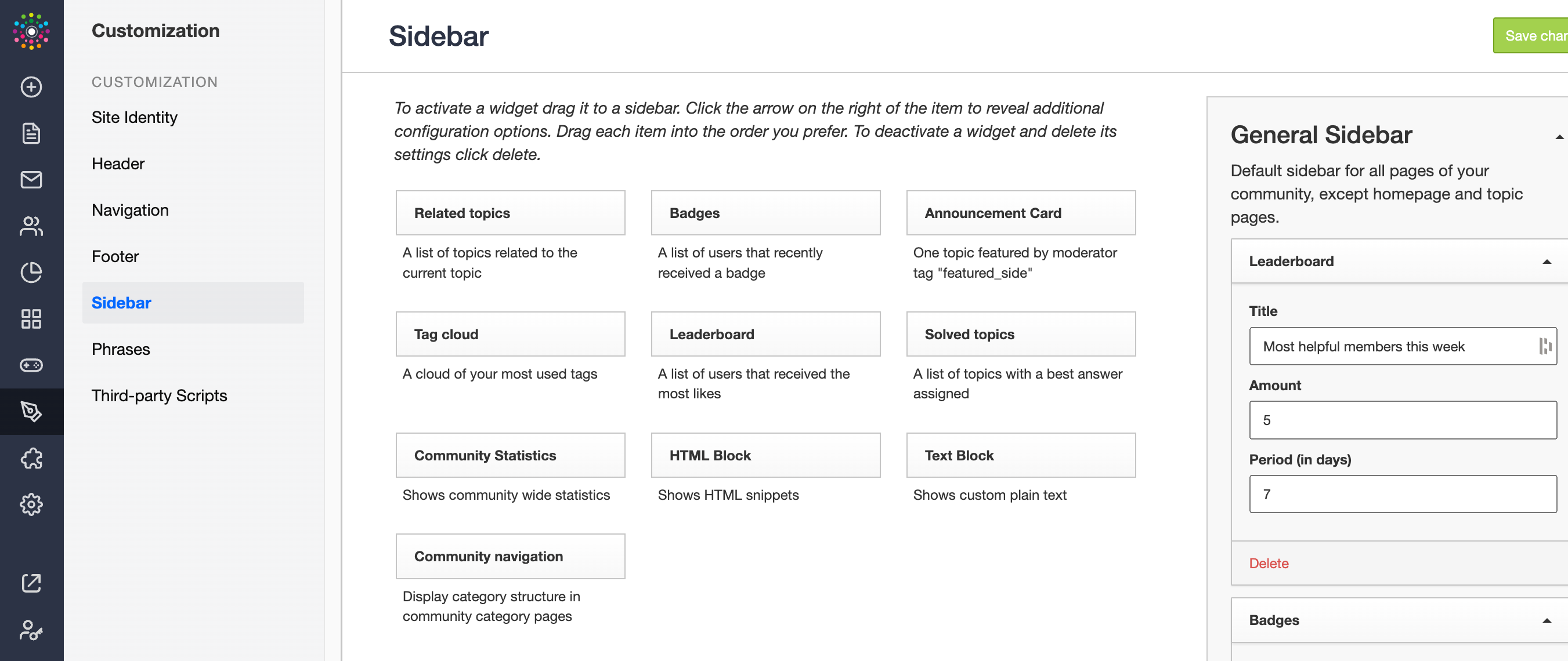
You can customize side widgets on the frontend in most widgets however you are also able to do this on control under Customization > Sidebar - image below:
Thank you, @leo-inspired :)
I'll ignore the warning button if it doesn't have any actions attached to it.
I would like to move the breadcrumbs down below the header and statistics, as it's not placed where it makes sense to me. It changes placement depending on which kind of category I'm in. In product updates it's below the category header, and in community sub categories it's above the category header. At the very least I need to be able to change the background color and the text color of it, without changing any other colors on the site - Do I need to do that with CSS or is there a style option in the customization tool that I have overlooked?
The subscription bar is not the button only, it's the whole bar where the Sub button is present - I believe it's called "statistics” when you open up the customization - I need to be able to change the background and placement of that bar, same as the breadcrumbs.
Lastly for the default side widgets (IE tag cloud, solved topics, community statistics) I'd like to be able to customize the container border (color and thickness), background color, text color, and for tags: the border color and thickness - CSS or customization? :)
Cheers,
Ditte
Hey @Ditte ,
Changing the breadcrumbs positioning may be a difficult task because it may affect the entire platform. I haven't seen a community do this before, but I can look into it and see if it's feasible.
I believe this would be possible with some custom CSS for the subscribe button, as well as the side widgets.
Could you create a support ticket at support@insided.com so we can assist you through there? I believe this will be beneficial as I can reach out to our engineering team for further assistance.
If you ever had a profile with us, there's no need to create another one. Don't worry if your email address has since changed, or you can't remember your login, just let us know at community@gainsight.com and we'll help you get started from where you left.
Else, please continue with the registration below.