Hi 
When I upload images for articles, they often appear grainy in the community when the quality of the original image is hi-res.
If I look at the events page in this Gainsight community, I can see the same happening there - some are super clear, others are grainy. I know that text isn’t recommended. Has anyone got any tips or guidelines around how to optimise image quality without the need for photoshop licences etc.?

Thanks 🙏

Hi @sarahmasterton-brown! Would love to look into that for you, but I’m having trouble reproducing it on my end. Maybe it’s because I’m on a MacBook Pro with a retina screen. Can you maybe share a few screenshots of where you experience this graininess from your side? 


Hello @Sebastian,

I am Sarah´s colleague, so let me jump in :) 

Check this page, where you can see the image with houses looks really bad, even though the quality is more than sufficient. The picture of the arrow on the left was converted to .png - before that it was also grainy. 

Thank you!


Interesting. When I zoom in to the images, I can see that we’re actually rendering the full resolution images versus a thumbnail. Depending on your own resolution (I’m on a retina display), it might look a bit distorted, which is not ideal.

Let me have a look at this with the team 🙂 I’ll circle back here,


In general usage, you want to use an image in the exact size as you display. Letting HTML resize your image usually degrades visual quality as it is doing it through math you don’t control.   


@MarkétaOupi Think you can share a screenshot of what you see on your end, so I can provide a bit more context to our engineering team?


Hello @Sebastian,

of course, here you go:


Thanks @MarkétaOupi! I’ve created a feature request for our team and we hope to address it soon. The root cause is that we don’t show thumbnails in the Events overview, which can lead to slower loading times, but also graininess in the image. 


Thank you @Sebastian!

Any workaround that comes to your mind? 🤔


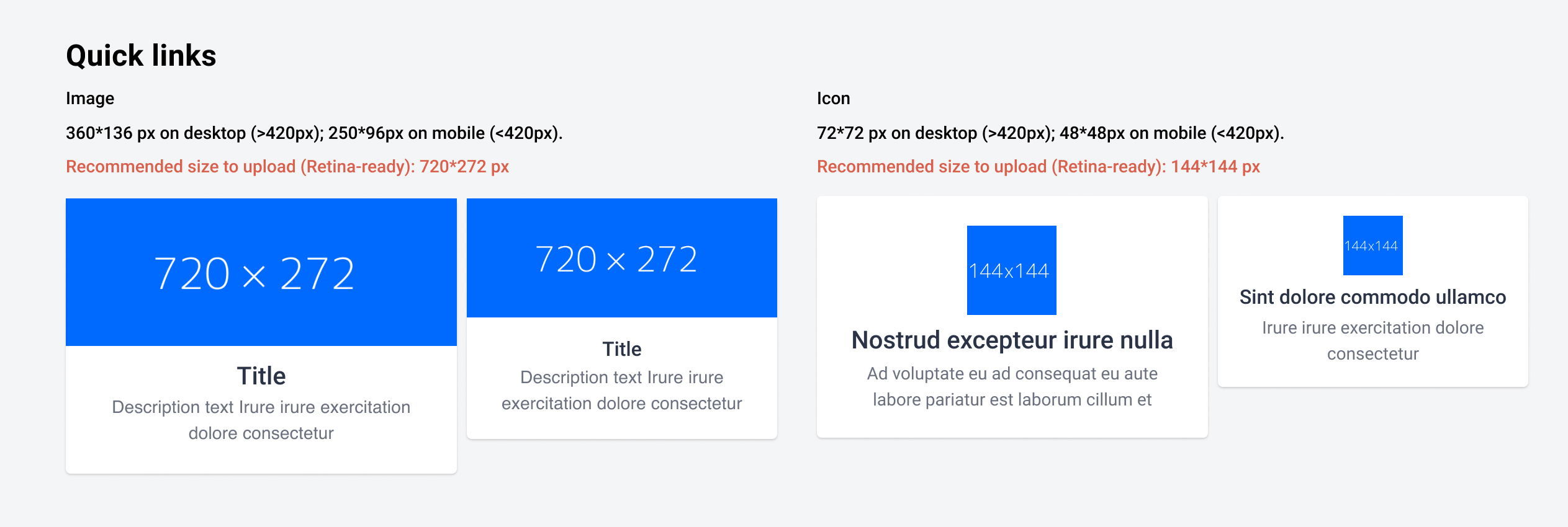
For quick links in particular, make sure you don’t upload images larger than the recommended size (see below). We currently don’t downscale it on your behalf, but if you make sure your image has this dimensions, it’ll look a whole lot better.


@sarahmasterton-brown @MarkétaOupi We’ve just deployed a way to downsize the images to the size of the thumbnails, which should prevent graininess. Can you confirm it looks better on your end?


For context, we’ve started on the Events page. We will extend the images for the other pages as well.


Hi @Sebastian,

I did not see the issue on Events page before, but only in the Product guides.

Once you update the Product guides page let me know and I will check 🙌


@Sebastian  Thanks for the info. Yes, it does look better this end on the thumbnails in the Featured topics widget.
The events image attached does seem grainy still - the below image is taken from our main events page. Do I just have text too small in this case? Thanks


Reply