
Helper ⭐️
June 22, 2020
Question

Creating a report that shows data points per month

  • June 22, 2020
  • 12 replies
  • 627 views

Hey all,


We are trying to create a report that will show the growth in accounts per month, meaning - for each month to show how many new accounts we have, how many churned (0, of course!) and how many active accounts we have overall each month.

At the moment we are doing this report manually in Klipfolio as it doesn’t seem like GS allows for historic data representation in graphs, but perhaps there is a way around it? Any suggestions?

This is an example of what the graph should look like visually, just ignore the parameters and imagine it shows - new accounts / churned accounts / overall accounts - per month.
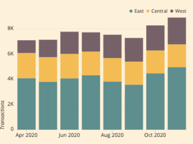


Any suggestions would be highly appreciated!

12 replies

sai_ram
Expert ⭐️⭐️
July 14, 2020

@matthew_lind Thanks for your quick response here! Did you get a chance to view comments posted by @TalAmor ?


matthew_lind
VIP ⭐️⭐️⭐️⭐️⭐️
July 14, 2020

@TalAmor Sorry...I missed the additional replies.

On the filters, you’re exactly right. “Less or equal to last day of previous month” would be much more logical.

On the # of existing accounts, I would build a Bionic Rule. Use COUNT against the number of existing customers you have (using whatever criteria denotes a current customer in your instance), then push that value on a monthly basis to the MDA object you generated in an earlier step.

Making people their best....currently disguised as a CS Ops Architect. How can I contribute to your success?