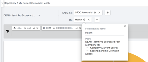
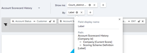
I am trying to build out a pie chart for each of our CSMs that show the percentage breakdown of their red, yellow and green accounts. However, the Scorecard Fact data source doesn't allow grouping (not possible to add fields in the "By" section). What data source can I use to accomplish this? I see GS scorecards and Account Scorecard History among other options, but I am confused on how these are different and which one would be the best to use here. 
This is possible, and you can use the Scorecard Fact object. I put the SFDC Account ID in the Show Me area. Then you put the Current Score in the By area. I then apply two filters: one for Label != null and CSM = Current User. Here is a screenshot of the setup:


The net result is a pie chart of healthy using the pre-defined ranges/labels you set. This is also a dynamic report that will show just the accounts of the person that clicks it. So CSM-A will see their pie chart only, meanwhile CSM-B can click it and only see his/hers. This is perfect for a CSM Dashboard showing KPIs.


Hope this helps!
Thanks a lot Ben! I realized the report type had switched to "scorecard mass edit" which is why the grouping got disabled. Would you know if we can click onto the pie chart and instead of the ids being displayed, we can see the account name? I want the CSMs to go to the account's C360 directly. Really appreciate your help!
You could probably do that by changing out "SFDC Account ID" in the Show Me to be Account Name (or the equivalent on the Company Object). The only downside is that it *might not be a truly unique field (i.e. two accounts with the same name can exist). I would imagine that is unlikely, but technically possible.
GREAT discussion!  @Ben, you rock!


@Sarah, one other thing to note about what shows upon drill down is that you can select this by clicking the three dots (on drill down screen) and then selecting / unselecting the fields you want.  If you save the report this config will persist. 
Oh, and don't forget that you can rearrange the columns on the drill down by dragging them.
Super helpful! Thanks Ben and Karl :)


Would you also know the difference between different data sources? I was using Account Scorecard History to build a similar pie chart and I also see GS Scorecard. I have limited experience building such reports so would love to understand the difference and the use case for each source. Much appreciated! 
Hi Sarah,


The Scorecard History stores the historical scores of the measures; Scorecard Fact (for Scorecards 2.0) stores the scores of the measures; Scorecard Master (Scorecards 2.0) stores all the scorecards. I used our object glossary for this info, and hopefully it helps you too!
Hi Sarah,


The historical scores for Scorecard 2.0 are stored "Account Scorecard History"  (this object stores a weekly snapshot of the measures, group scores & overall scores). 


If you are using Scorecad 1.0 the historical scores are available in the "GS Scorecard" object.


Could you provide some info on the report you are trying to build on this object? 
Thanks Lila! Need to spend more time with the glossary :)


@Aditya, we are using Scorecards 2.0 so no wonder our GS Scorecard is empty. When you say historical scores for "Account Scorecard History", I wonder what the current score label here means.


Also, our "Scorecard Master" is empty. Since we have 2 separate scorecards for pre and post onboarding, we would like a pie chart that accumulates information from both scorecards.

Reply