Solved

How do I change the color for CTA metadata in NXT?

  • 16 April 2020
  • 2 replies
  • 108 views

Userlevel 7
Badge +2

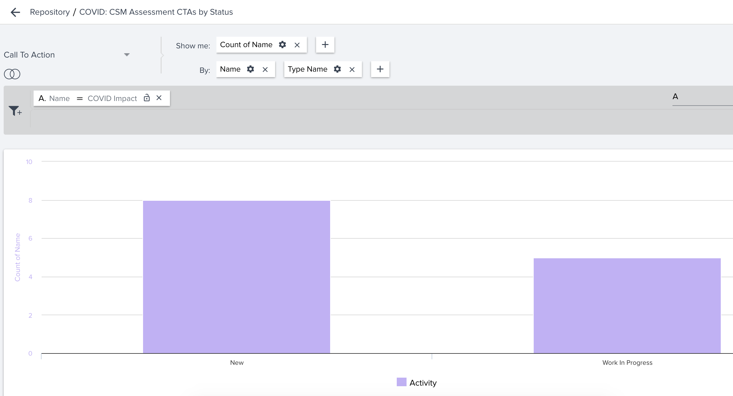
I’m trying to update the colors for different CTA Status values in NXT. Report Builder is not honoring the color configured for each status value in Administration > Calls to Action, so I figured I would try to just change it from the Report Builder custom color pallet. However, “status” on the Call to Action object looks up to DA Picklist, which is just an ID and is therefore a dead end.


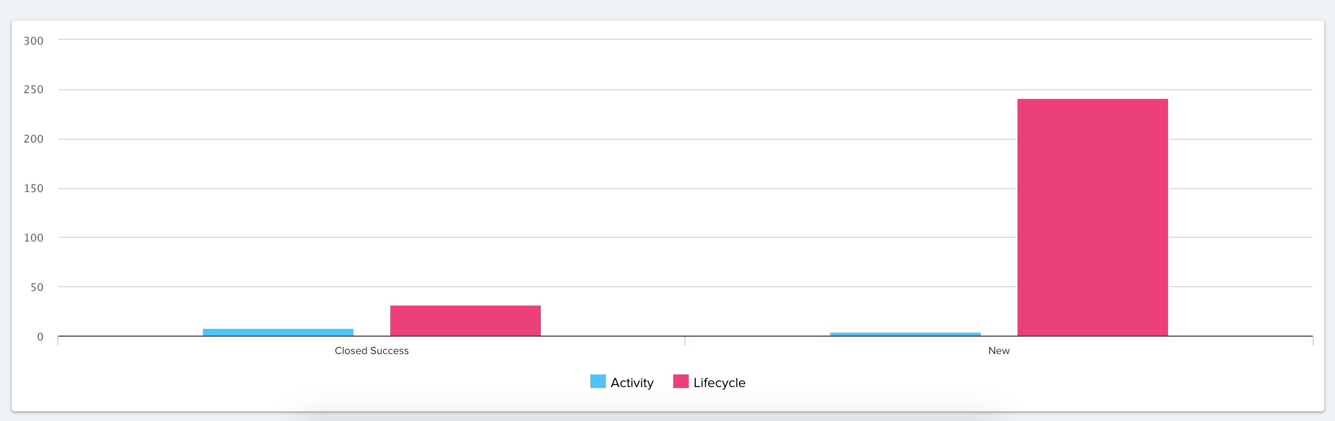
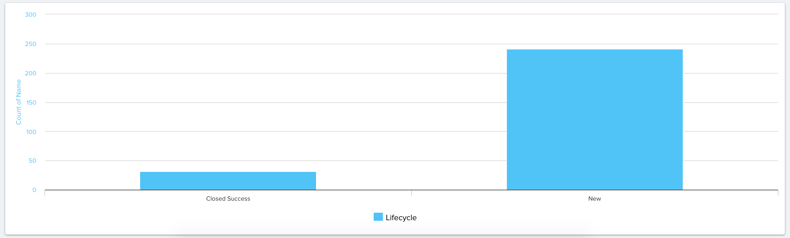
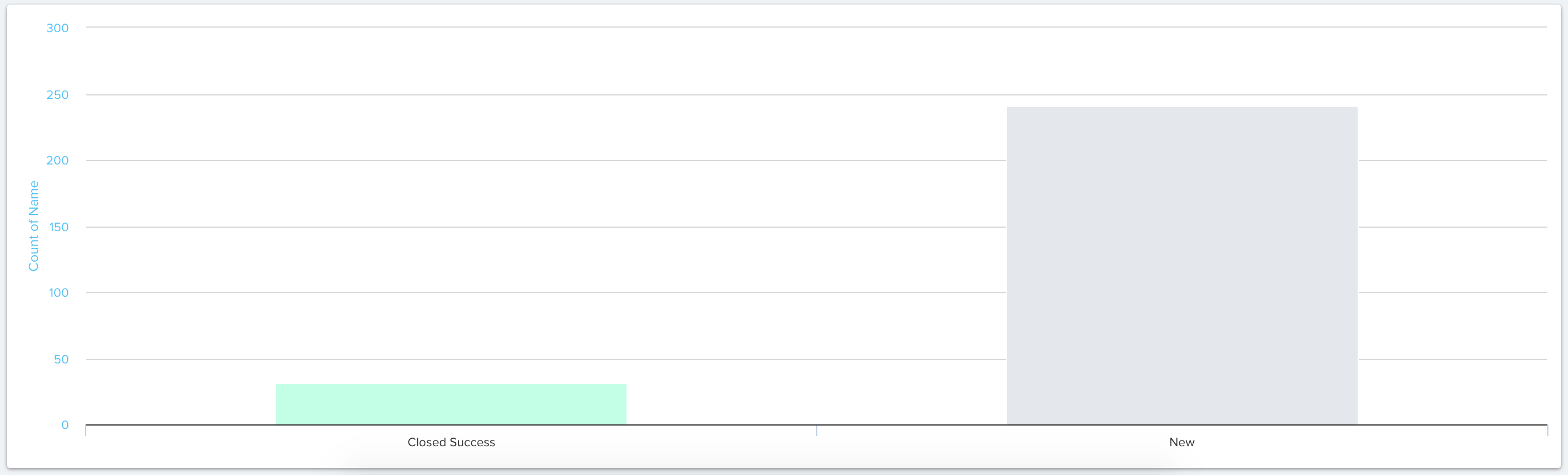
The end result is I can’t differentiate colors and get a report that looks like this. Am I doing something wrong, or is this a bug?


icon

Best answer by sriram pasupathi 12 January 2021, 13:40

View original

2 replies

@spencer_engel This is happening because you are trying to group by CTA type and there is only data of the type “activity”. Since there is only one CTA type “activity”. you can remove the ‘Type name’ under group by and it should work. 

For example, if you had multiple types, your visualization will look like this:
 

If you have only one CTA type (I have filtered only life cycle CTAs here), then it looks like below. 


You trying to group by CTA type and all the bars of same CTA type will show up in the same color. Since you have only Activity type CTA, it feels like all the bars are in the same color. The solution is to remove the ‘Type name’ under ‘group by’. Then it should look something like this:


Userlevel 7
Badge +1

@spencer_engel This is happening because you are trying to group by CTA type and there is only data of the type “activity”. Since there is only one CTA type “activity”. you can remove the ‘Type name’ under group by and it should work. 

For example, if you had multiple types, your visualization will look like this:
 

If you have only one CTA type (I have filtered only life cycle CTAs here), then it looks like below. 


You trying to group by CTA type and all the bars of same CTA type will show up in the same color. Since you have only Activity type CTA, it feels like all the bars are in the same color. The solution is to remove the ‘Type name’ under ‘group by’. Then it should look something like this:


@spencer_engel hope your query is answered here.

Reply