Question
New Graph Colors make Data Points hard to see
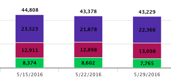
One feedback from CSM's (and something I agree on) is that the new color scheme on graphs make it significantly harder to see data points, especially the dark text magenta background (Attaching screenshots for comparison).
Karl Rumelhart mentioned customized color scheme for graphs during the Product Roadmap showcase at Pulse, is this something that'll be made available to the Early Access customers?
Pre-5.0
5.0
Karl Rumelhart mentioned customized color scheme for graphs during the Product Roadmap showcase at Pulse, is this something that'll be made available to the Early Access customers?
Pre-5.0

5.0