I have a scorecard history report that I’m sending in a JO email internally.  I’m having issues with all the names showing up in the report, and so I wanted to rank it to remove the long tail, but I can’t seem to figure out how to rank it without losing some of the data.

Example of report without ranking - the By is Name and Label and the Show is Count of SFDC ID.  As you can see, there are more bars than names:
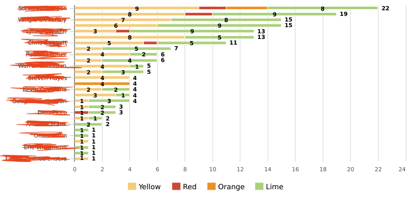
Ranking by Count of SFDC ID looks like it’s using the count of the labels instead of the overall count of that bar, and ranking by Name or Label doesn’t work either.  If I flip the chart to be vertical instead, it then cuts off people’s names making it even harder to read.  Any suggestions for how I could adjust the view so that it displays appropriately?

I’ve had this exact same issue for a while. I think it’s officially a limitation, although I’m hopeful Horizon Analytics solves for it (not sure though)


Since Horizon Analytics didn’t solve the issue, is there any plan on rolling out a fix in the future?


Hi @lesliesmith 


There are 2 issues mentioned here. Horizon Analytics solves this specific issue

If I flip the chart to be vertical instead, it then cuts off people’s names making it even harder to read.  Any suggestions for how I could adjust the view so that it displays appropriately?


An easy way to visualize how ranking works is to convert the chart to a table, sort it by the field and show top x or bottom x in that. We cannot make ranking work on a window sum of one dimension only ignoring the others. This might need pre-aggregations (Data Designer or rules). 


Reply