We’ve added some great new features and improvement in Control in the past week. A feature that allows you to take more control over your moderation workflow and features that allow you to change the appearance of your community. Let’s get started.
Moderation labels
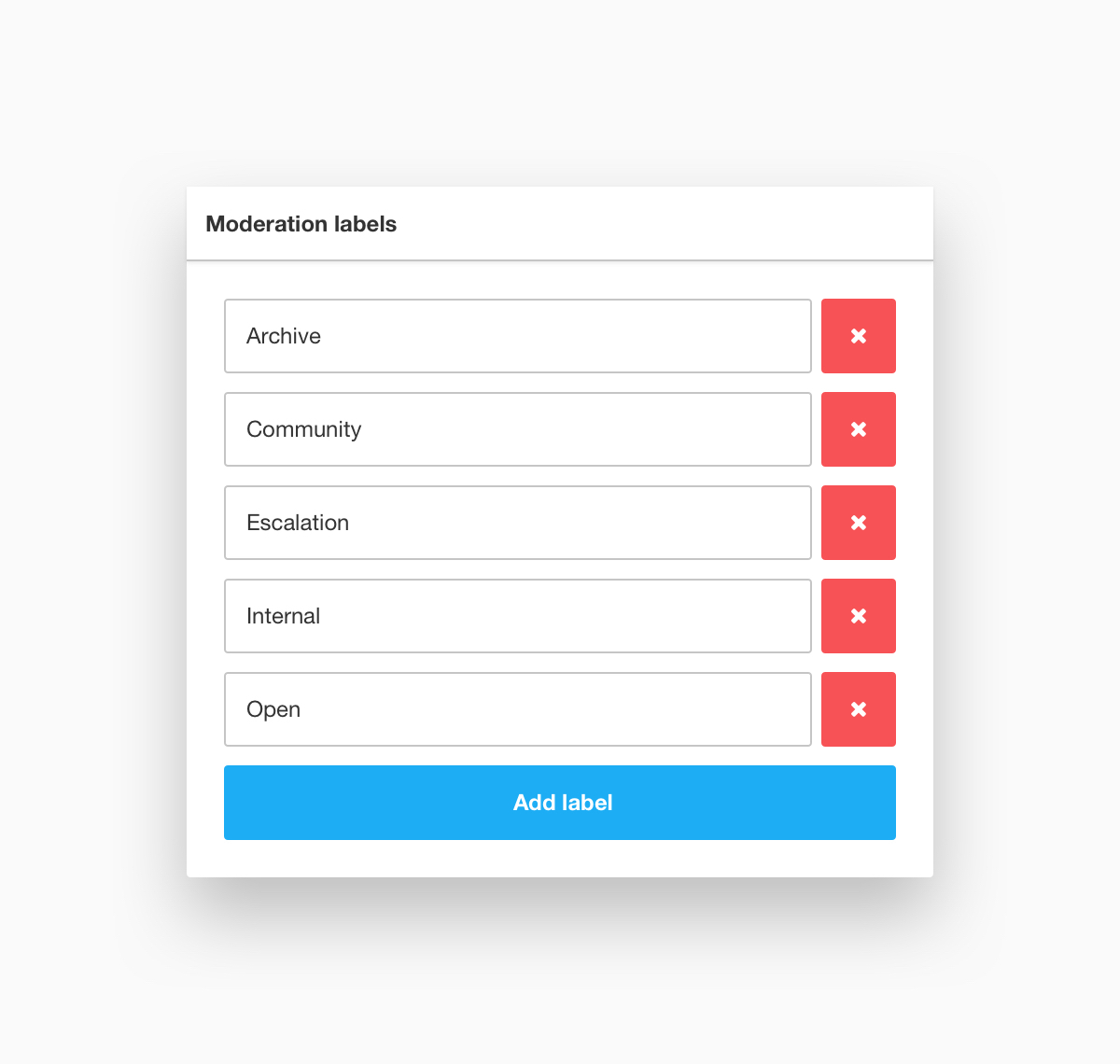
It is now possible to view and manage moderation label in Control. Use Moderation Labels to mark the status of topics in order to support your moderation workflow and ensure that it’s more ‘flow’ than ‘work’. Read How To Manage The Status Of A Topic (With Moderation Labels) to learn more.
Color scheme
Colors have a big impact on the look of your community - think vibrant flower power, washed retro or duo-tone minimalistic. Want to have more control over the color scheme of your community? That’s possible with this new feature. Read How To Change The Color Scheme Of Your Community to learn more.
Button configuration
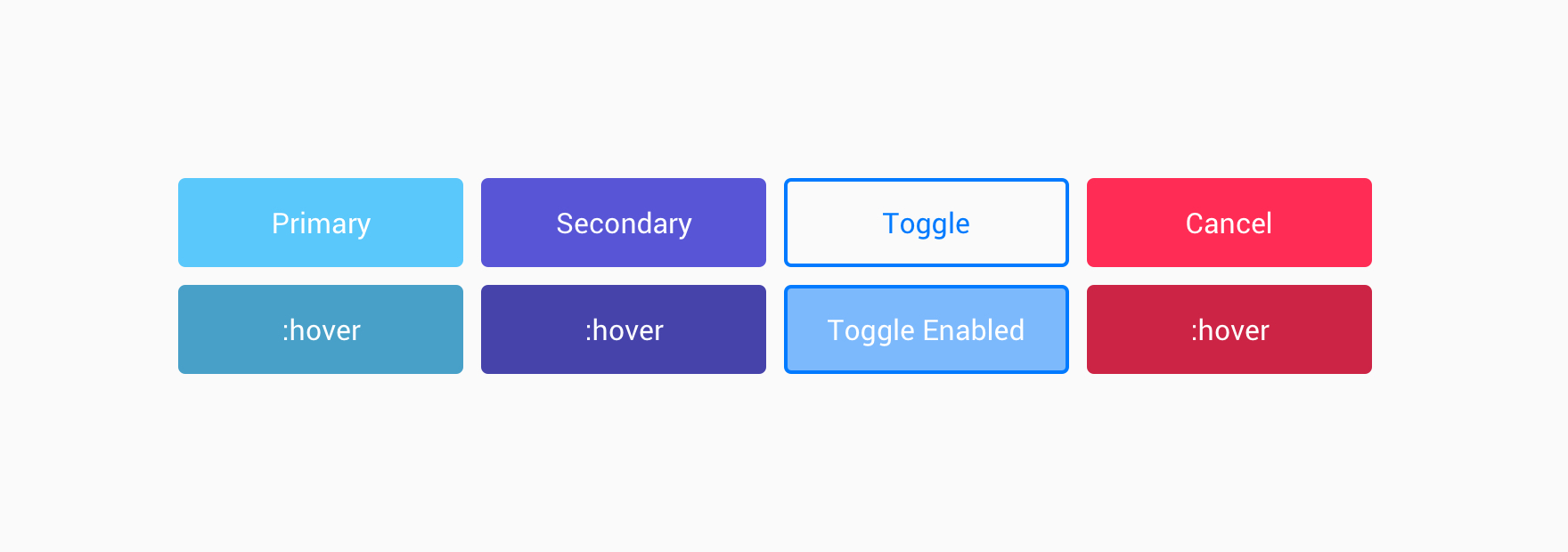
This one's for all you button fanatics out there. What should your buttons look like and how should they respond to mouse overs and clicks? With this feature the power is in your hands. Read How To Change The Look And Feel Of Your Community Buttons to learn more.
Improvements 🤒
- We’ve added a list of voters next to the vote button. You can now see which users voted for an idea.
- Added share via WhatsApp to the sharing options on mobile devices
- Viewing the Content Analytics dashboard in Control is now a individual session. When another user is looking at the dashboard and changes the view it does not affect your own view.
- Styling of topic titles in featured_side and featured_banner is now equal to the styling of topic titles in category pages.
Fixed 🐛
- Position of the ‘New replies’ label on topic pages. It didn’t look good and broke on 2 lines.
- UI issue where the blog label on the recently active tab in the homepage displayed on 2 lines.
- Redirect issue where users were taken to the homepage rather than the topic page after login.
Related How tos 🎓
How To Manage The Status Of A Topic (With Moderation Labels)
How To Change The Color Scheme Of Your Community
How To Change The Look And Feel Of Your Community Buttons
We value your feedback. If you have ideas or suggestions for improvements let us know in the comments below 👇
Sign up
If you ever had a profile with us, there's no need to create another one.
Don't worry if your email address has since changed, or you can't remember your login, just let us know at community@gainsight.com and we'll help you get started from where you left.
Else, please continue with the registration below.
Welcome to the Gainsight Community
Enter your E-mail address. We'll send you an e-mail with instructions to reset your password.


