Currently KPI widgets have a ton of whitespace in them which is begging you to make the widget as small as possible. Doing so however presents several problems:
- Titles get messed up as discussed here:
- If you enable the goal and/or variance features (which are pretty neat btw) the description text vanishes, and you also don’t get anything useful when you mouse over
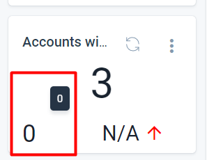
It would be great if the text can either just be included or (probably the cleaner solution visually) the description text (Goal or Variance) be added on mouse over.
Thanks!


