New Idea

Make Rule Chain Administration More Friendly

Related products:None
  • November 1, 2021
  • 21 replies
  • 204 views

spencer_engel
Forum|alt.badge.img+5

I appreciate the new UI in the Rules Engine, but it feels like we’ve taken a step backward in some ways. 


Two examples, specifically regarding Rule Chains: 

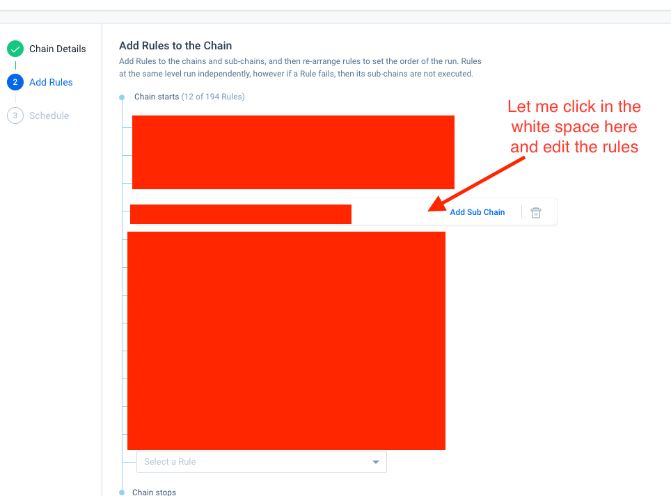
  • I used to rely quite a bit on being able to preview rules from the Rule Chain view. I can no longer do that with this new UI, which means I have to go back to my Rules list and search around for the rule(s) in question that I simply want to either preview or edit straight from the Rules Chain page. This results in extra clicks and tabs. 
  • I recently had to go in and remove a few outdated rules from a Rule Chain. I wanted to deactivate the rules as well, but I can’t do that from the Rule Chain menu. I also can’t deactivate a rule from the Rules List without removing it from the Rule Chain first. So either way, I’m having to click on both tabs, find the rule in question in both places, and do the necessary task. Why not just let me take care of both things (removing the rule from the rule chain and deactivating it) in one place?

21 replies

darkknight
Forum|alt.badge.img+5
  • Expert ⭐️
  • November 1, 2021

The new UI is such a pain


gunjanm
Forum|alt.badge.img+13
  • Expert ⭐️
  • November 1, 2021

The new UI is such a pain

Quoting just to emphasize.


heather_hansen
Forum|alt.badge.img+14
  • VIP ⭐️⭐️⭐️⭐️⭐️
  • November 1, 2021

+1 - I’ll add to this with my use case for the edit functionality - I have rules in a rule chain that I want to trigger with the receipt of an S3 file.  I had built the rules to use the date pattern initially, and when I went to add them to the chain with the S3 trigger, I get the message that I can’t use the date pattern, so I have to go back to the Rules list to edit all the rules, and then, come back to the Rules Chain to make the adjustments.


saltamash
Forum|alt.badge.img+8
  • Helper ⭐️⭐️
  • November 1, 2021

Definitely can related to to #1 raised by Spencer. It is frustrating when you were able to do something and due to an upgrade/update you can know longer do it. 


bradley
Forum|alt.badge.img+8
  • Expert ⭐️
  • November 1, 2021

The new UI is such a pain

Quoting just to emphasize.


emphasis intensifies


Forum|alt.badge.img+2
  • Expert ⭐️
  • November 1, 2021

In addition to this why did we put all the icons into a click through menu? I spend most days in rules and it has doubled the amount of click I have to do on that page.


Addition two, the Summary Ribbon is nice. But, if I turn it off it should remember I have it turned off. It resets every time I go to the page and then I turn it off every time.


matthew_lind
Forum|alt.badge.img+11
  • VIP ⭐️⭐️⭐️⭐️⭐️
  • November 1, 2021

I’ve observed that each recent adjustment to the Rules Engine UI adds to my efforts as an admin. It just keeps getting harder, little by little, to efficiently administer the Rules Engine. Recent examples:

  • Summary “Analytics” Ribbon cannot be permanently dismissed
  • Inability to de-activate from places where that functionality used to exist
  • More clicks than previous UI for same efforts
  • Rule Name usually truncated, and column width cannot be permanently widened

I know plenty of folks on this thread, and elsewhere, would come to the table for feedback and positive changes within Rules Engine. I do hope Gainsight is able to take this feedback and/or set some Advisory Committee time to collect input.


darkknight
Forum|alt.badge.img+5
  • Expert ⭐️
  • November 1, 2021

I’ve observed that each recent adjustment to the Rules Engine UI adds to my efforts as an admin. It just keeps getting harder, little by little, to efficiently administer the Rules Engine. Recent examples:

  • Summary “Analytics” Ribbon cannot be permanently dismissed
  • Inability to de-activate from places where that functionality used to exist
  • More clicks than previous UI for same efforts
  • Rule Name usually truncated, and column width cannot be permanently widened

I know plenty of folks on this thread, and elsewhere, would come to the table for feedback and positive changes within Rules Engine. I do hope Gainsight is able to take this feedback and/or set some Advisory Committee time to collect input.

:100:  Also, filters are more robust but take more effort to manage. Why do I have to open the filters up in order to clear them?


Forum|alt.badge.img+2
  • Expert ⭐️
  • November 3, 2021

Another thing, on the Rule overview screen didn’t we use to have a run button there? If we didn’t can we get one? I normally have two tabs open the execution logs and the actual rule opened up so I can do some adjustments and then run. But now I have to click out of the overview, click the three dots, click run, then click back into overview.


darkknight
Forum|alt.badge.img+5
  • Expert ⭐️
  • December 16, 2021

@rakesh 


anirbandutta
Forum|alt.badge.img+2
  • Expert ⭐️
  • December 20, 2021

Hey @spencer_engel , I had a connect with PMs on this request. Definitely under consideration but we need more time to share any updates in this direction.


anirbandutta
Forum|alt.badge.img+2
  • Expert ⭐️
  • December 20, 2021

I’ve observed that each recent adjustment to the Rules Engine UI adds to my efforts as an admin. It just keeps getting harder, little by little, to efficiently administer the Rules Engine. Recent examples:

  • Summary “Analytics” Ribbon cannot be permanently dismissed
  • Inability to de-activate from places where that functionality used to exist
  • More clicks than previous UI for same efforts
  • Rule Name usually truncated, and column width cannot be permanently widened

I know plenty of folks on this thread, and elsewhere, would come to the table for feedback and positive changes within Rules Engine. I do hope Gainsight is able to take this feedback and/or set some Advisory Committee time to collect input.


@matthew_lind I believe these enhancements have already been shipped.


darkknight
Forum|alt.badge.img+5
  • Expert ⭐️
  • December 20, 2021

@andutta the rule name does default to widened now -  but if you adjust the size of the browser at all it reverts back to the narrow view. 


anirbandutta
Forum|alt.badge.img+2
  • Expert ⭐️
  • December 21, 2021

Thanks @darkknight , I will have this feedback routed to the team. cc @rakesh 


Forum|alt.badge.img
  • Contributor ⭐️⭐️⭐️⭐️
  • January 11, 2022

Whoever thought this rule chain redesign would make admins life easier was sooooooo wrong! 

I’ve spent hours trying to figure how to add a rule as a subchain without having to rearrange or re-add the rest of the rules and still not able to do it. I have 11 rules in the chain and feel dizzy trying to follow the blue lines down to figure where to add a subchain. It feel like walking on eggshells trying not to delete something by accident. Please bring the old design back. Ditto to all other issues uncovered here.


spencer_engel
Forum|alt.badge.img+5
  • Author
  • Expert ⭐️
  • February 24, 2022

Another thing that has been a thorn in my side recently: There is no easy way to see whether a rule is actively running. There is a “Next Scheduled Run” column available, but it shows as “Not Scheduled” for rules that are part of an active rule chain. This means it’s next to impossible to easily figure out which rules are part of an active rule chain vs. which rules are just old and should be deactivated. 


I feel like this needs to fixed, or at the very least give us a “Last Run Date” column. 


bradley
Forum|alt.badge.img+8
  • Expert ⭐️
  • March 3, 2022

Another thing that has been a thorn in my side recently: There is no easy way to see whether a rule is actively running. There is a “Next Scheduled Run” column available, but it shows as “Not Scheduled” for rules that are part of an active rule chain. This means it’s next to impossible to easily figure out which rules are part of an active rule chain vs. which rules are just old and should be deactivated. 


I feel like this needs to fixed, or at the very least give us a “Last Run Date” column. 

Yes, this is super obnoxious and unintuitive.


anthonysabato
Forum|alt.badge.img+2
  • Helper ⭐️
  • March 28, 2022

@spencer_engel  I have the same issue and concern that this is misleading if there is a next run even if part of a Rule Chain. It should indicate it is Scheduled. I did notice the next scheduled run does appear in the Rule Analyzer. Without the Next Run info, it can be difficult to troubleshoot complicated issues. Definitely a product miss here.


sarahmiracle
Forum|alt.badge.img+11
  • VIP ⭐️⭐️⭐️⭐️⭐️
  • October 24, 2022

I feel like this needs to fixed, or at the very least give us a “Last Run Date” column. 

Quoting for emphasis and linking back to a related request:


anirbandutta
Forum|alt.badge.img+2
  • Expert ⭐️
  • October 26, 2022

+@rakesh 


john.cowles
Forum|alt.badge.img+3
  • Helper ⭐️
  • May 13, 2025

Gainsight,

Is there an update on this one?

I have faced many of these issues and can share frustration on some of them.  The small one that gets me though is how the rule chain names are cut off and there is now way to widen the view to see them fully.  Then it is a bit more frustrating because there is so much whitespace on the right that could be used to expand the view.  See the screen shot here and notice how you can’t see the full names of the rules.  This feels like it would be a small change to make in the product, but maybe not.