New Idea

UI improvements for how users see Recommended Content in the KC bot

Related products:PX KC Bot
  • May 10, 2023
  • 1 reply
  • 76 views

mmarques
Forum|alt.badge.img

I did a POC on the recommended content, and I noticed a few issues with the UI that I need improved before I would use. Note that I would like to use recommended content for engagements that do not show up in other areas of the KC bot. 

KC bot badge should indicate if there is new unseen recommended content. Currently, it does not.

This bot icon should have a badge for 1 content

Badge section options should included Recommended content as an option, and we should see the badge as a number in a circle (per our badge branding), and not just a parenthetical number.

Not sure if the (1) next to “Just for you” is because there is 1 piece of content or because it is unseen content. Unseen content should have the number in a circle, just as it does for the categories below​​​​

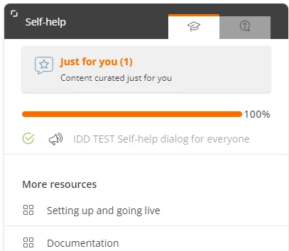
Recommended content categories with 0 content should not show up

Why am I seeing that there are 0 articles and 0 links? 

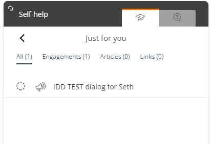
Better yet, if there is only one type of content available (such as engagements), just show that content and don’t have any tabs.  Or offer an option to display all content without tabs. I’m not sure that our customers will know what “Engagements” are.

1 reply

mmarques
Forum|alt.badge.img
  • Author
  • Helper ⭐️⭐️
  • November 1, 2023

Today, I learned that I can configure the labels for the tabs in Search, and the labels apply here. So, it’s possible to rename “Engagements” as more appropriate. 😀

However, for “Articles,” the label is more problematic. We are using the Google Integration, so if we use the integrated search, we might change the label to “Doc portal” or something else that is clear where the results come from. However, that label would make no sense in Recommended content.