Currently KPI widgets have a ton of whitespace in them which is begging you to make the widget as small as possible. Doing so however presents several problems:


  1. Titles get messed up as discussed here: 


  2. If you enable the goal and/or variance features (which are pretty neat btw) the description text vanishes, and you also don’t get anything useful when you mouse over 
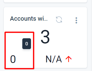
 

It would be great if the text can either just be included or (probably the cleaner solution visually) the description text (Goal or Variance) be added on mouse over.


Thanks!

@bradley I think the widget size can be adjusted, let me recheck and get back to you.


@bradley I think the widget size can be adjusted, let me recheck and get back to you.

Yea, you can change the size of the widget but that isn’t the solution. You just end up with a huge amount of whitespace, which is the first thing I bring up in the post.

I think some updates to the design elements would go along way to knocking these out of the park.


Would also be nice if the title could wrap!


Would also be nice if the title could wrap!

Ooh good call. I have a separate post about the post linked above, could be a good alternative.


It would be nice to have the ability to create more dense dashboards in general, but definitely agree with this one.  We have executives that would like to see lots of metric charts in a single view, but we require them to scroll a bunch to see things given all the white space in general for all the charts / KPIs.