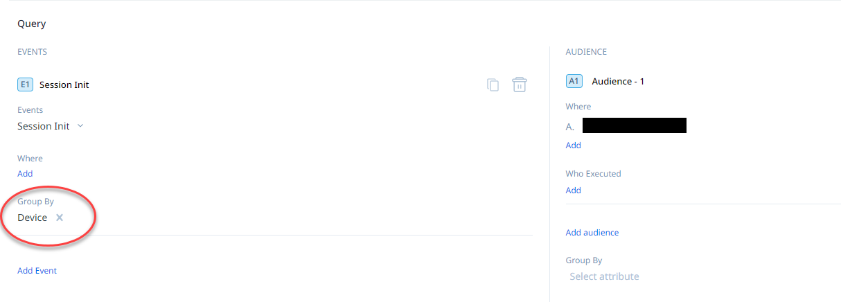
Current situation: I created a query to show as a bar chart in a dashboard. I grouped the events by device. The X-axis labels are ridiculous, because they all truncate and show exactly the same information - I need to hover in order to see the full value.
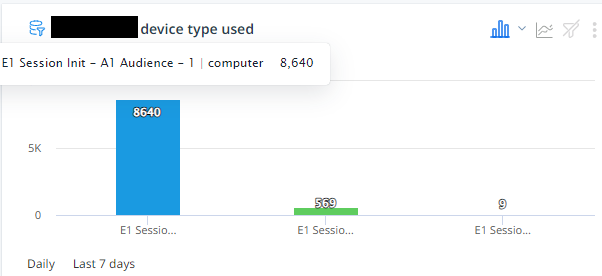
Idea: If there is a “Group by” value, show that value (or show it first), so that it can be seen at a glance. If someone groups by both event and audience, provide a toggle to select which value to show.